Construction is well underway for KPF's Lotte World Tower in Seoul, however the mysterious appearance of sinkholes in the surrounding area - as reported by CNN - has brought on a slew of safety concerns. Authorities have been unable to determine the cause of the sinkholes which have appeared in a number of locations around Seoul's Songpa District, although they have ruled out sewerage as a possibility. To learn more about the bizarre phenomenon putting the 123-story tower under scrutiny, click here.
Seoul: The Latest Architecture and News
KPF's Lotte World Tower Jeopardized by Mysterious Sinkholes
UNStudio Revamps Hanwha Offices with Shimmering LED Facade
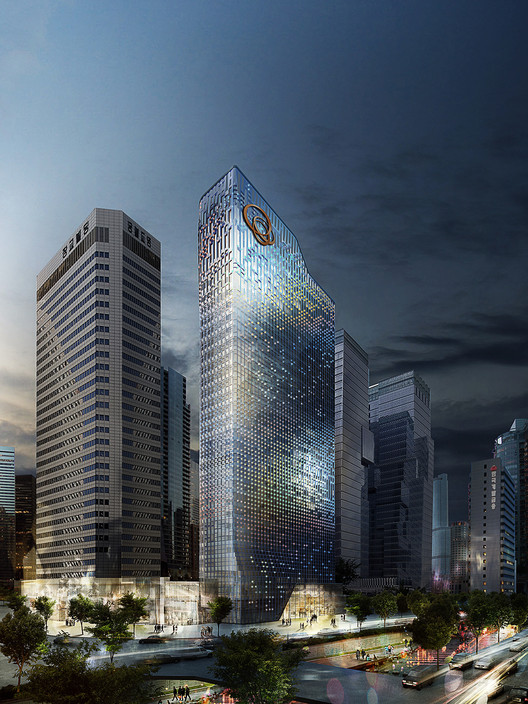
With a glittering exterior that benefits both the interior and the exterior, UNStudio’s renovation proposal for Hanwha headquarters has recently won them first place in a competition to redesign the company’s office tower. Located in Seoul, South Korea, the tower is sited in the busy Cheonggyecheon district of the city. The new design will help to visually reestablish Hanwha as a leader in environmental technology, both in Korea and internationally.
Tree-Like Skyscraper Takes Urban Farming to Next Level
Urban farming is nothing new, but Aprilli Design Studio's proposal for a completely open-air skyscraper does put a novel spin on the sustainable ideal. Instead of tacking greenery onto roofs and balconies, they incorporate agriculture into cities by dedicating entire buildings to the cause. To learn more about the tree-like design, check out Fast Company's article here.
The Power of Paint: Three Case Studies on Colour in Architecture
Based at the Architectural Association school of Architecture and linked to the Phd research program at UIAV, Saturated Space takes a comprehensive look at the “grammar” and history of colour in architecture, the perceptual and phenomenological principles of colour in relation to the human subject, and the socio-political aspects of colour as a culturally active agent. This article, written by architect and CLOG editor Jacob Reidel, originally appeared as “Powerful Colours” on Saturated Space‘s website, a forum for the sharing, exploration, and celebration of colour in Architecture.
Let’s admit it, architects are suspicious—if not a little scared—of colour. How else to explain the default contemporary architect’s preference for exposed finishes such as concrete, brick, COR-TEN steel, stone, and wood? Perhaps this is because an architect’s choice of applied colour may often seem one of the most subjective—and hence least defensible—decisions to be made over the course of a project.* Indeed, applied colour seldom performs from a technical standpoint, and it is the architect’s taste, pure and simple, which is often on the line whenever a specific colour is proposed to the client. Or perhaps architects’ mistrust of applied colour owes something to the profession’s well-known controlling tendencies and the fact that colour is one of the most mutable aspects of a building; better, we architects are instructed, to focus on “important” and “architectural” decisions such as form, space, materials, program, and organization. Indeed, it is far easier for a future owner to repaint a wall than it is to move it.
Dobongsan Car Park / Jae Kim | CoDeAU + Namoa Architects
-
Architects: Jae Kim | CoDeAU, Namoa Architects
- Year: 2013
War & Women's Human Right Museum / Wise Architecture
-
Architects: Wise Architecture
- Area: 785 m²
SAI Playground / Moon Hoon
-
Architects: Moon Hoon
- Area: 330 m²
- Year: 2013
-
Professionals: SDM Structural Engineering, L Sungwon
Danuri Kangnam Store / Hyunjoon Yoo Architects
-
Architects: Hyunjoon Yoo Architects
- Area: 257 m²
- Year: 2013
International Competition for Rehabilitating Mapo Oil Depot into a Cultural Depot Park
The Mapo Oil Depot is a valuable industrial legacy of Seoul but has been forgotten for quite some time since its original purpose was terminated. In an era of economic growth in Korea, a fresh approach is needed regarding this industrial legacy, which, ironically can survive in having been forgotten.
ABC Building / Wise Architecture
-
Architects: Wise Architecture
- Area: 163 m²
- Year: 2012
Gilmosery / Kim in-cheurl+ARCHIUM
-
Architects: Kim in-cheurl+ARCHIUM
- Area: 1029 m²
- Year: 2012
-
Professionals: MASIL, COAZ Construction, ENG Energy Design Lab, SEN Structural engineers Co.LTD
5 Years Later, A Look Back on OMA's Prada Transformer
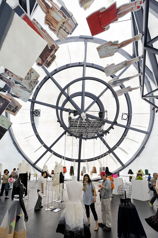
Today marks the fifth anniversary of the opening of OMA’s Prada Transformer. This fantastical temporary structure, erected in 2009 adjacent to Gyeonghui Palace in Seoul, Korea, is one of Rem Koolhaas’ most popular projects to date. Composed of a stark white membrane stretched across four steel frame shapes, The Transformer was often referred to as an "anti-blob" --a hexagon, a rectangle, a cross, and a circle leaning against each other to create a tetrahedron-like object reminiscent of a circus tent. The name Transformer came from the idea that any one of the pavilion's sides could serve as the building's floor, allowing for four unique spaces in one building devoted to exhibitions of modern art, fashion and design.
The Prada Transformer played host to four such events, being lifted up and repositioned onto a different face each time via crane. The first was a garment exhibition, displayed using the hexagonal floor plan. The second, a film festival that took place on the rectangular floor plan. A fashion show was staged using the Transformer's circular floor plan, and an art installation was shown using the cruciform floor plan. As patron Miuccia Prada stated in an interview with The New York Times, “In my mind they [the arts] may be mixed but I want to keep them separate… So the Transformer concept was not for a generic space, but to be very specific, with all things separate in one building.”
We asked OMA's Vincent McIlduff to tell us more about this project. See his answers, a photo gallery and a time-lapse video of the transformation after the break!
UNStudio’s Responsive Facade to Transform Seoul Office Tower
UNStudio has won a competition to remodel the Hanwha headquarters in Seoul. With an aim to transform a building into a symbol of the leading environmental technology company’s values, UNStudio's winning scheme will replace the skyscraper’s opaque panelling and single layer of dark glass with an animated facade designed to reduce solar gain, increase natural light, generate energy, and interact with its surrounding.
Urban Hive / ARCHIUM
-
Architects: ARCHIUM
- Area: 10166 m²
- Year: 2008
-
Manufacturers: Alto
-
Professionals: MASIL, SEN Engineering Group
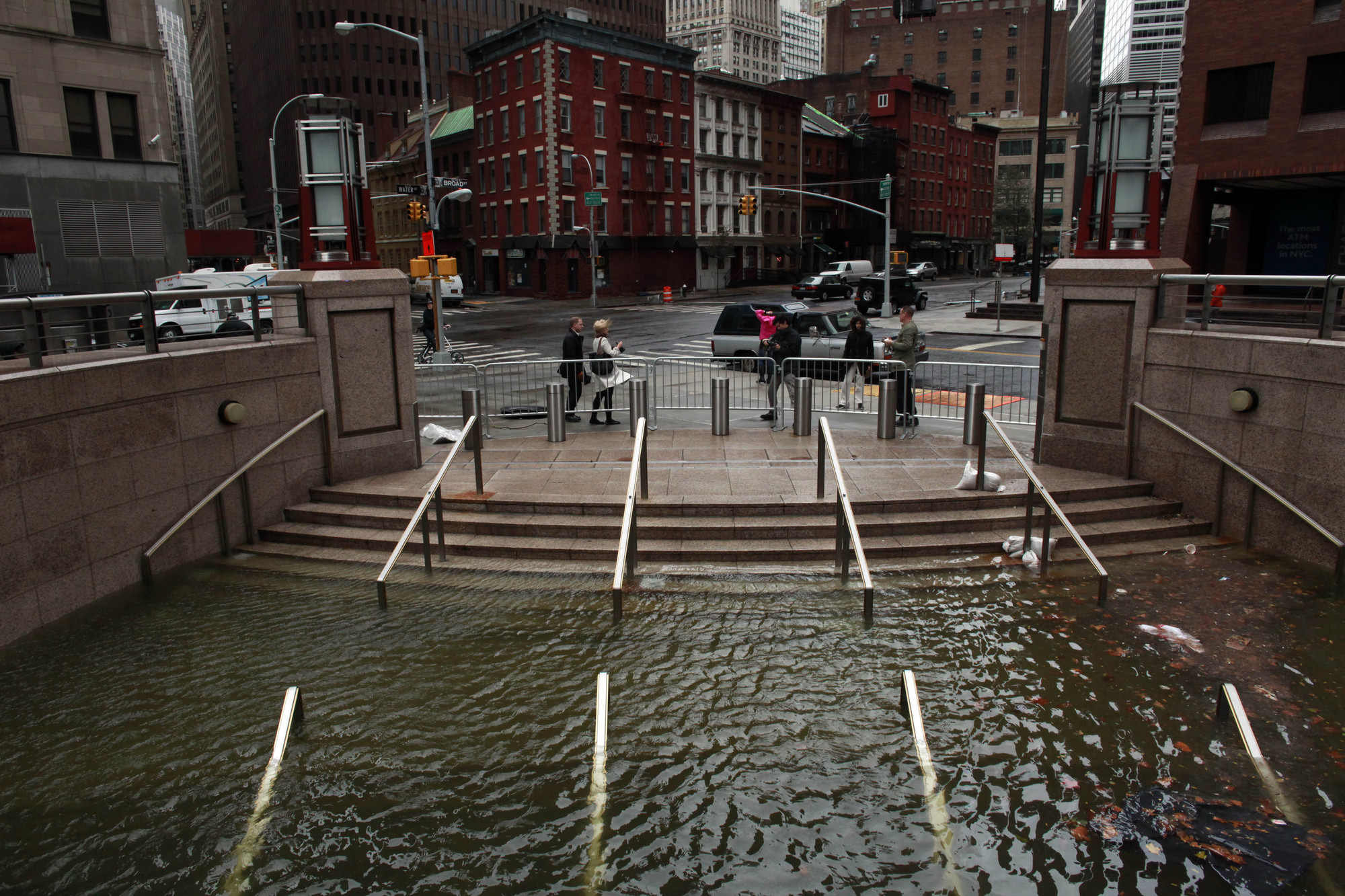
Case Studies in Coastal Vulnerability: Boston, Seoul, Hamburg, Bangladesh & New York
This article originally appeared in the latest issue of ArchitectureBoston as “Troubled Waters."
The challenges of sea-level rise cross boundaries of all sorts: geographic, political, social, economic. Proposed mitigation strategies will also necessarily shift and overlap. Here, we present five case studies from across the globe that offer intriguing ways—some operational, some philosophical—to address the threats associated with climate change. Drawing on a research initiative focused on vulnerabilities in Boston, a team at Sasaki Associates developed these additional design-strategy icons to illustrate the layered approaches. They are adaptable, the better to meet the unique demands of each coastal community.
PAPYRUS Glasses Shop / Archi@Mosphere
-
Architects: Archi@Mosphere
- Area: 59 m²
HUB / Hyunjoon Yoo Architects
-
Architects: Hyunjoon Yoo Architects
- Area: 3200 m²
- Year: 2013