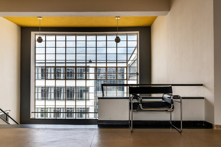
Bauhaus's designs have influenced our contemporary society in obvious and subtle ways. Iconic examples include Marcel Breuer’s Wassily Chair, the B55 Chair, the Bauhaus typeface, and the graphic design principles emphasizing clean lines, primary colors, and geometric shapes. However, the architectural construction details of the Bauhaus movement are much less discussed. While most can readily identify modern or Bauhaus buildings by their geometric forms, functionality, and industrial materials, their architectural details are often overlooked. They not only echo the design language of Breuer’s renowned furniture pieces but also have influenced the much-celebrated architectural glass details of Mies van der Rohe. How were Bauhaus's details executed, and how might they be translated into contemporary details today?
Adolf Meyer: The Latest Architecture and News
AD Classics: Haus am Horn / Georg Muche
In 1919, at a time in which Germany was still in upheaval over its defeat in the First World War (and compounded by the loss of its monarchy), the Academy of Fine Arts and School of Applied Arts in Weimar, Germany, were combined to form the first Bauhaus. Its stated goal was to erase the separation that had developed between artists and craftsmen, combining the talents of both occupations in order to achieve a unified architectonic feeling which they believed had been lost in the divide. Students of the Bauhaus were to abandon the framework of design standards that had been developed by traditional European schools and experiment with natural materials, abstract forms, and their own intuitions. Although the school’s output was initially Expressionist in nature, by 1922 it had evolved into something more in line with the rising International Style.[1]
Harvard Museums Releases Online Catalogue of 32,000 Bauhaus Works
In anticipation of the 100th anniversary of the founding of the Bauhaus school in 2019, Harvard Art Museums has released an online catalogue of their 32,000-piece Bauhaus Collection, containing rarely seen drawings and photographs from attendees and instructors of the revolutionary German design school.
The collection features work from the likes of Mies van der Rohe, Bertrand Goldberg, Marcel Breuer, and Bauhaus-founder Walter Gropius himself, and can be navigated through a search bar and an easy-to-use set of filters, allowing you to categorize work by topic, medium, date or artist.
Alternative Realities: 7 Radical Buildings That Could-Have-Been
In It’s A Wonderful Life the film’s protagonist George Bailey, facing a crisis of faith, is visited by his guardian angel, and shown an alternate reality where he doesn’t exist. The experience gives meaning to George’s life, showing him his own importance to others. With the increasing scale of design competitions these days, architectural “could-have-beens” are piling up in record numbers, and just as George Bailey's sense of self was restored by seeing his alternate reality, hypothesizing about alternative outcomes in architecture is a chance to reflect on our current architectural moment.
Today marks the one-year-anniversary of the opening of Phase 3 of the High Line. While New Yorkers and urbanists the world over have lauded the success of this industrial-utility-turned-urban-oasis, the park and the slew of other urban improvements it has inspired almost happened very differently. Although we have come to know and love the High Line of Diller Scofidio + Renfro and James Corner Field Operations, in the original ideas competition four finalists were chosen and the alternatives show stark contrasts in how things might have shaped up.
On this key date for one of the most crucial designs of this generation, we decided to look back at some of the most important competitions of the last century to see how things might have been different.