Alternative Realities: 7 Radical Buildings That Could-Have-Been

In It’s A Wonderful Life the film’s protagonist George Bailey, facing a crisis of faith, is visited by his guardian angel, and shown an alternate reality where he doesn’t exist. The experience gives meaning to George’s life, showing him his own importance to others. With the increasing scale of design competitions these days, architectural “could-have-beens” are piling up in record numbers, and just as George Bailey's sense of self was restored by seeing his alternate reality, hypothesizing about alternative outcomes in architecture is a chance to reflect on our current architectural moment.

Today marks the one-year-anniversary of the opening of Phase 3 of the High Line. While New Yorkers and urbanists the world over have lauded the success of this industrial-utility-turned-urban-oasis, the park and the slew of other urban improvements it has inspired almost happened very differently. Although we have come to know and love the High Line of Diller Scofidio + Renfro and James Corner Field Operations, in the original ideas competition four finalists were chosen and the alternatives show stark contrasts in how things might have shaped up.

On this key date for one of the most crucial designs of this generation, we decided to look back at some of the most important competitions of the last century to see how things might have been different.

Alternative Realities: 7 Radical Buildings That Could-Have-Been - More Images+ 11

The High Line

Design for the High Line by Zaha Hadid Architects with Balmori Associates, Skidmore, Owings & Merrill LLP and studio MDA. Image via University of Adelaide on Cargo Collective

“High is to New York what wet is to Venice,” says writer Adam Gopnik in the opening to his essay A Walk on the High Line/The Allure of a Derelict Railroad Track in Spring, "the necessary condition that has become the romantic condition.” With such assertions it's difficult to believe that the High Line, a park redefining how we perceive urban greenspace, and a self-seeded oasis, was ever perceived as a demolition-ready eyesore.

While the collaboration by Diller, Scofidio + Renfro and James Corner Field Operations is the darling of New Yorkers, several alternatives could have produced a quite different park, with an unpredictable set of outcomes.

Zaha Hadid’s swooping and curvaceous platforms would have created a park of instant novelty, but perhaps without the staying power of a sensitive approach.

Steven Holl's 1982 "Bridge of Houses" proposal for the High Line. Image © Steven Holl Architects

Having a special affinity for the High Line, Steven Holl is credited with two proposals: one, in the early 1980s, would have put a row of post-modern single-residency houses in a line along the platform - not a green space. The second, a finalist in the competition for the redevelopment, would have provided a simple meandering path with architectonic interruptions. The results are slick, but lack the effortlessness found in the winning design.

Design for the High Line by Steven Holl Architects with Hargreaves Associates and HNTB. Image via University of Adelaide on Cargo Collective

At the opposite end of the spectrum, TerraGRAM (Michael Van Valkenburgh Associates with D.I.R.T. Studio and Beyer Blinder Belle) proposed a nearly hands-off approach, but the mere act of intervening on something natural requires a larger commitment.

Design for the High Line by TerraGRAM: Michael Van Valkenburgh Associates with D.I.R.T. Studio and Beyer Blinder Belle. Image via University of Adelaide on Cargo Collective

In a subtle balance of preservation and change, the realized version of the High Line exists in a delicate equilibrium between design and nature so, even though parks and New York real estate have a storied history, it's difficult to say if a bolder or more passive design would have held the same allure.

Chicago Tribune Tower

Designs for the Chicago Tribune Tower by Walter Gropius and Adolf Meyer (left) and Max Taut (right). Image via skyscraper.org

In what was arguably the first highly-publicized architecture competition of modern times, the contest for the fate of Chicago’s Tribune Tower also had some of the greatest implications on the discourse of architecture. Offering $50,000 in 1922, the design process attracted 263 entries from 23 countries.

The winning-design of John Mead Howells and Raymond Hood, modeled on the Butter Tower of Rouen Cathedral, furthered a precedent for skyscrapers that looked like Gothic churches stretched to the heavens. By then though, Cass Gilbert’s Gothic Woolworth Building was a decade old, and with its nod to Rouen the Howells/Hood design arguably played it safe.

However, the Chicago Tribune contest is arguably more famous for an alternate design by Walter Gropius and Adolf Meyer which would have allowed the International Style to flourish in Chicago, decades before its wide-adoption in the late-forties and early fifties. Many have considered the implications of this unsuccessful design on Modernism's early rise, but better yet let’s consider the outcome of a win by Adolf Loos. His proposal for a monolithic, Doric column manifests an early tangent to existing design tropes that were soon to be eclipsed by Art Deco. Fetishizing symbols in a yet-unknown way – decades before Philip Johnson and John Burgee’s AT&T building – Loos presaged a life for architecture after modernism.

Designs for the Chicago Tribune Tower by Adolf Loos (left) and Bruno Taut, Walter Gunther, and Kurz Schutz (right). Image via skyscraper.org

If Loos had won, the effects would have been unpredictable. With the great fervor generated by the design process, Loos would have created one of the most widely recognized skyscrapers in a nascent period for their design. Envy would have likely produced many knock-offs and had lasting implications on commissions of all degrees of importance.

Sydney Opera House

Joseph Marzella's second-place design for the Sydney Opera House. Image via The Daily Mail

A building that from its inception was bound for canonical importance, Jørn Utzon’s design for the Sydney Opera House is one of the most easily recognized buildings in the world and a beloved a landmark of the city, the country, and even the continent. As a judge for the design competition in 1956, Eero Saarinen selected Utzon’s scheme from a pile of rejected proposals, instantly calling it a masterpiece.

Although now so thoroughly embedded in the canon of modern architecture that it is difficult to perceive a world without it, Utzon faced competition from an astoundingly more conventional design by Joseph Marzella.

Taking its cues from a burgeoning New Formalist architecture, visible in many civic projects of the same era, Marzella’s design would have simply provided a solution to a request. Certainly, it would have been a boon for the arts in Sydney, but it likely would have faded into the background of architectural discourse in contrast to the innovation and visual poetry of Utzon’s design.

Decades before Deconstructivism and computer-aided design added unprecedented dimensions to architectural forms, Utzon was a pioneer of shape and precision. More immediately, the forms seems to hold similarities to Saarinen’s design for the TWA Terminal at Idlewild Airport (now JFK), begun the same year.

While certain could-have-been proposals are melancholic, in that they are wildly more radical than the resultant designs, the Sydney Opera House is a reversal of fortunes. It’s as impossible to imagine a bolder design as it is to conceive of a world where Utzon’s vision did not so dramatically change the preconceptions and perceived possibilities of architecture.

Centre Pompidou

Moshe Safdie's design for the Centre Pompidou. Image Courtesy of Safdie Architects

A new building in Paris is usually cause for uproar. Anything that lays roots in the city’s historic core is immediately judged by the Haussmann spawned mandate of the City of Light. It happened last year when Gehry’s Fondation Louis Vuitton landed in the Bois de Boulogne, The Eiffel Tower was not immune, and the Tour de Montparnasse is easily despised. However, few equal the controversy tied to the opening of Rogers and Piano’s Centre Pompidou in January 1977.

Moshe Safdie's design for the Centre Pompidou. Image Courtesy of Safdie Architects

This early foray into what has come to be known as High-Tech was initially a tough-pill to swallow for much of the world, but an image-conscious Paris in particular. Sending its building systems to the exterior, it pridefully showered attention on elements that were traditionally relegated to the hidden interior.

Moshe Safdie's design for the Centre Pompidou (section). Image Courtesy of Safdie Architects

An equally compelling, lesser-known alternative is the utopian museum within a park design of Moshe Safdie. Years before green building became a primary concern of architects, Safdie proposed a shifting plan of tetrahedral plates, splitting and expanding above the ground plane. The surfaces, layered with greenery, would have created a dialogue between interior and exterior. Safdie’s design is without obvious precedent.

Moshe Safdie's design for the Centre Pompidou (section). Image Courtesy of Safdie Architects

It could have a been a bold foundation for future designs that were decades away from development. One need only look at the green roofs sprouting across the San Francisco Bay Area to see where this radicalism might have lead.

Guggenheim Bilbao

Coop Himmelb(l)au's design for the Guggenheim Museum Bilbao. Image © Markus Pillhofer

A paradigm shift in more ways than one, the Guggenheim Bilbao redefined its Basque host city, the art museum, and architectural discourse the world over. Then-Guggenheim director, Thomas Krens, prophetically stated from the outset that the museum would be "the greatest building of the 20th century.” While such a definitive claim may be controversial, the building is certainly one of the most important buildings of the last twenty-five years, and has had astounding implications on the current architectural landscape.

The idiomatic “Bilbao effect” lead us to an all-or-nothing architecture of the iconic. Put simply, after 1997, everyone wanted a Guggenheim, a transformer that could change the fate of a city. Though the question lingers: was the Bilbao effect the result of the design of Gehry’s building, its location in a fading industrial city, or the support of one of the most lauded museums in the world - or all three?

Proposals by Coop Himmelb(l)au and Arata Isoki are the lesser-known finalists in the Guggenheim competition, both proposals for what would have certainly been a more sober outcome. Yes, Bilbao would have landed a Guggenheim, and yes, people would have certainly flocked to the city, but it's doubtful that either of those alternate realities would have produced the fervor that Gehry’s building has.

Museum of Modern Art

OMA's design for the Museum of Modern Art. Image Courtesy of OMA

In its short but illustrious history, the Museum of Modern Art has amassed what is arguably the world’s greatest collection of twentieth century art. Unfortunately, spatial limitations are part of the culture of congestion, and the museum's expansion in the early 21st century arguably created more problems than it fixed.

Known for a characteristic Japanese subtly on projects of a much smaller scale, Yoshio Taniguchi’s 2004 redesign is out of scale in Manhattan, and leaves the museum feeling stunted. It is worth saying this, only because Taniguchi’s selection was not a cop out, the competition was fierce, and his selection was more a grave misstep than purposeful catastrophe.

OMA's design for the Museum of Modern Art. Image Courtesy of OMA

There were a number of vaunted architects who submitted proposals, however maybe the most interesting came from Rem Koolhaas and Office for Metropolitan Architecture. Having written Delirious New York, Koolhaas was the heir apparent for design innovation that only the limits of the Manhattan grid could inspire.

Cheekily reminiscent of one of Hugh Ferriss' drawings of skyscrapers adhering to New York’s 1916 Zoning Resolution, OMA proposed a building that would not rise gradually in a series of setbacks, but would instead be dramatically steep, with the sheerness of cliff face and a precise pinnacle.

While it’s unlikely that a changed design would have changed the museum’s agenda over the course of the last decade, hostilities towards the museum’s current expansion plan, including the demolition of the adjacent Folk Art Museum, might not have been so urgent. Wise to a new set of roles and expectations for museums of the twenty-first century, OMA was eager to design and build for these unprecedented changes.

The World Trade Center

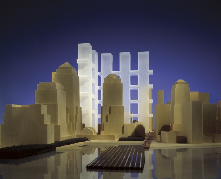
Masterplan for the World Trade Center by Richard Meier & Partners, Eisenman Architects, Gwathmey Siegel and Associates, and Steven Holl Architects. Image © Jock Pottle. Courtesy Richard Meier & Partners Architects

On a site fraught with controversy, the radical design of Daniel Libeskind’s World Trade Center master plan has given way to the bland, value-engineered towers that have been built in its place, a group of buildings that speak the language of a corporate, profit-centric America where design is treated like an afterthought, staid and uninspiring.

While the implications of the World Trade Center site made any proposals difficult, the Twin Towers as designed by Minoru Yamasaki, were shocking and revelatory - a miracle of engineering that made their brutish scale and simple design forgivable. Honoring that tradition, a collaboration between Richard Meier, Peter Eisenman, Steven Holl and Gwathmey Siegel proposed another pair of towers. These, however, were large grids like a game of tic-tac toe or the impression of a waffle iron, not monoliths.

When the original World Trade Center was built, it reduced the gridded streets of the Radio Row neighborhood into a sixteen-acre superblock. The plan of Meier, Eisenman, Holl and Gwathmey Siegel, would have inverted the architecture of Manhattan. The superblock destroys the grid, but a tower made of grids swaps the x and y-dimensions.

Although the scale of the design may have required a larger and more expansive piece of land, the towers' would have given the World Trade Center site a sense of heritage and continuity that has been lacking in the current design. The new Bjarke Ingels Group proposal for 2 World Trade Center, gives not a twin, but a “sibling” to the lanky and lonesome 1 World Trade Center - whether it can correct the course of Libeskind's much-compromised masterplan to finally outshine the much more radical losing masterplan proposal remains to be seen.

About this author
Cite: Vladimir Gintoff. "Alternative Realities: 7 Radical Buildings That Could-Have-Been" 21 Sep 2015. ArchDaily. Accessed . <https://www.archdaily.com/773828/alternative-realities-7-of-the-most-radical-could-have-been-buildings> ISSN 0719-8884

Masterplan for the World Trade Center by Richard Meier & Partners, Eisenman Architects, Gwathmey Siegel and Associates, and Steven Holl Architects. Image © Jock Pottle. Courtesy Richard Meier & Partners Architects

幻想代替现实:7个差点建成的激进建筑作品

You've started following your first account!

Did you know?

You'll now receive updates based on what you follow! Personalize your stream and start following your favorite authors, offices and users.