-
Architects: ODA - Oficina de Arquitectos Lanzone - Gabarro
- Area: 100 m²
- Year: 2019
-
Photographs:Facundo Mauricio Soraire
-
Manufacturers: Holcim, Aluar, Ascindar, Cerro Negro, Durlock, FV, JOHNSON, Klaukol, Palmar, Perfecto, ferrum
-
Lead Architect: Luciana Lanzone, Max Gabarro
Text description provided by the architects. This project arises from the commission to build a house with a limited budget, where a comfortable life can be enjoyed. We agree that luxury lies in living in a context surrounded by mountains, pastures, and carob trees, and this responds to the highest expectation:
[The place is more important than the house]
Located on a steeply sloping terrain, the challenge is to achieve the least impact, to be a body capable of getting lost in the landscape.
The first decision is the positioning of the house on the plot. From the northeast point, the architecture begins to levitate with respect to the inclined plane. This allows evening out the gap, a “wild card space”, as we like to call it:
"...We thought that this should be used as an opportunity, a space that over time is capable of materializing any desire: an atelier, a storage area, an office, a workshop, a games room..."
With a regular geometry, the volume is gradually deconfigured in planes that reveal the structural rhetoric: inverted beams, slabs that are projected as seats, unevenness, and a series of columns that delimit the façade enclosure.
To lose ourselves in the landscape, concrete and transparencies take over the material, which in the absence of aestheticism, reads:
[ rough, (in)conclusive, stationary, mutable.]
The first plane is configured from four bars that make up the slabs in one direction, while another three are positioned perpendicularly, intersecting with the previous ones, and acting as inverted beams that hide the inclined metal roof.
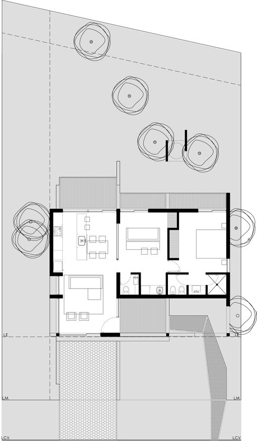
The perimeter is materialized by configuring the habitable enclosure, appearing in a minimal and indispensable way. The result is a space devoid of dividers, making it possible to mutate its internal organization.
"...The tour carries a story, an interpretation of the landscape, where descending allows you to discover a deeper horizon..."
The first space is a void (another wild card), a kind of reception portal, which can serve as a terrace or a place for the staircase to a future upper floor.
[ Projecting means designing with impermanence in mind ]
The second space is a continuous interior, where the life of the house passes from the social to the private.
[ Upon entering, two corner windows show the spirit of Techi: a stage, a great transparency that reveals the limit between heaven and earth. ]
The spaces are oriented, illuminated, and ventilated towards the north, capturing the greatest amount of light. The openings are materialized as successive frames, which vary their incidence depending on the orientations.
To the south, a strip brings together the services, except for the kitchen, which is separated from this strip. Instead, it is located in a strategic place, next to the window that emphasizes the wavy line of the horizon.
“…In the end, each project allows us to explore a design exercise, which through a series of known elements, and under a specific context, enables the synthesis between the living and the inert, the intimate and remote.”