-
Architects: Atelier Pupa
- Area: 559 ft²
- Year: 2019
-
Photographs:Do Mal o Menos
-
Manufacturers: JRBOTAS, Koklatt, Superbotânica

Text description provided by the architects. The apartment located in the characteristic Alvalade district of the '40s has an area of 48 m2, which became a challenge for a project aimed at creating a two-bedroom apartment with an expansion of the existing room.

The biggest challenge consisted exactly at this point, creating a living/dining room, maintaining two bedrooms, and a more functional kitchen. In this sense, the design and a versatile piece that became the "spine" of this space was the solution found to solve the problems of definition and transition of areas, as well as storage.


The kitchen remained in the original area of the house, but with a completely contemporary design, enhancing the storage through niches and optimizing the space while producing a lightness that previously did not exist. The bench was enlarged, through the installation of a peninsula that also includes the refrigerator and storage also. The shelf placed under the window allows quick meals, without the use of the dining room.


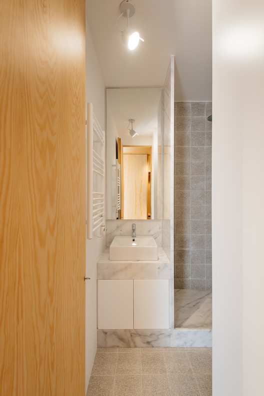
Separating the kitchen from the rest of the area is this piece in birch plywood that begins in the hall by making a cloakroom and that, combined with the differences of dimensions on the floor (due to technical issues), allows the transition of areas and organization of spaces. This "box" that runs through the whole house houses the laundry room, a bookcase for the living room, and the entrances of the rooms and sanitary installation. The material contrasts with the rest of the predominantly white apartment, which also hides the entrances in the most private areas of the house, since the pivoting doors, in the same material, function as practically hidden planes in the configuration of the piece. Thus, the occupation of the living room/ dining room becomes vastly wider, as the corridor is destroyed, both physically and visually.

In addition to the rooms and sanitary installation, where the spaces were used to maximize storage functionality, a closet was built in the same carpentry.
In regards to the materials, the original wood floor was maintained (with a new draw) and the walls painted white, evidence the central element in birch plywood, enlarging the natural light that enters through two chest windows and a balcony. In the kitchen and sanitary installation, we opted for materials with neutral tones, such as Ibiza marble stone and ceramics with gray patterns, in order to enhance the light, due to the small area of these spaces.


