-
Architects: PROMONTORIO
- Area: 1750 m²
- Year: 2016
-
Photographs:Fernando Guerra | FG+SG
-
Manufacturers: Saint-Gobain, Lindo Serviço, Modulyss, Mota Engil, Otis, Tecniclima

Text description provided by the architects. GS1 Portugal is the Portuguese counterpart of the non-profit global body in charge of implementing the technological licensing origin identification systems of companies and products, promoting, among others, the renown barcodes, now designated qr codes.

Its new headquarters, are the outcome of the 1st-prize in a competition held in 2014, in collaboration with artist Alexandre Farto aka Vhils. The building is located in the IAPMEI (Agency for Competitiveness and Innovation) Lisbon campus, in the Lumiar district. This campus, which is one of the first in Portugal specifically created for business innovation, is located on the surroundings of an 18th-century farmhouse on the boundaries of the city and was planned in the early 1970s based on an orthogonal grid largely inspired in the Anglo-Saxon university model.


The new building makes use of the concrete structure of an existing 1980s office building which, in the meantime, became physically and technologically obsolete. The formerly called K3 building was a two-storey rectangular volume with a simple column grid holding a waffle slab system. In terms of programme, the building has three distinct areas, also corresponding to the different floors. The ground floor concentrates the public sphere of the centre’s activities, namely a showroom equipped with value-chain simulators and applied and interactive isles of multimedia information technology; it also includes a multi-purpose auditorium and technical areas. The second floor accommodates management and services in a fluid and informal open space, whereas meeting rooms, stationery and toilet areas are confined in opaque islands. Finally, the rooftop holds the social area with a bar/coffee shop opening onto a shaded terrace. Inside, the building is unified by two large circular voids cut-off from existing slabs visually enlarging the experience of space and user interconnectivity.


In terms of finishing, the interior of the building intentionally plays on the idea of material reuse of the pre-existence. The rawness of the exposed concrete elements as well as the absence of false ceiling, thereby exposing all the electricity cable trays and AC ductwork, contrasts with the comfort and tactility of materials and finishes at users’ hands reach such as linoleum, cork, textiles and carpets.


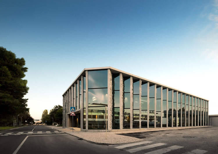
The facade zigzag system alternating between concrete panels and floor-to-ceiling glass panes, respectively facing North-South, reconfigures the relationship of the building’s views with the campus, while protecting the workspaces from excessive sunlight and yielding a luminous relationship with the garden.

On the exterior, a part of the concrete panels has a bas-relief by VHILS, an art project on the outcome of a longstanding collaboration between the architects and the artist, namely on technology-based research for large scale precast concrete moulding. VHILS’ work and this project in particular, proposes a contemporary critic on the chaos of information and visual noise while questioning its disruptive role, which in turn is counterpoised by the presence of the human eye.


