-
Architects: Paulo Merlini arquitetos
- Year: 2013
-
Photographs:João Morgado - Architecture Photography

The uncommon form, narrowness, vertical amplitude of the space and the two big glass façades placed on the main and back façade defined mainly the organization of the spaces.

The reception and waiting room it’s characterized by a big white box that floats in the air playing with the vertical amplitude of the space. The interior of the box mimetizes the idea of being under a roof, giving the user a familiar sensation of comfort, and helping I’m to calm down before the treatment. From the “roof” a series of lamps float in the air, filling the space with light. The floating box stops the excessive light and consequent heat, coming from the main facade by the end of the day, on the other hand her big mass pushes the rest of the working spaces to the back façade. This receives a great sky light, with the ideal conditions for working.

Under the stair a mirror wall creates the illusion of a broadest space solving the narrowing sensation that one could feel on entering the room.

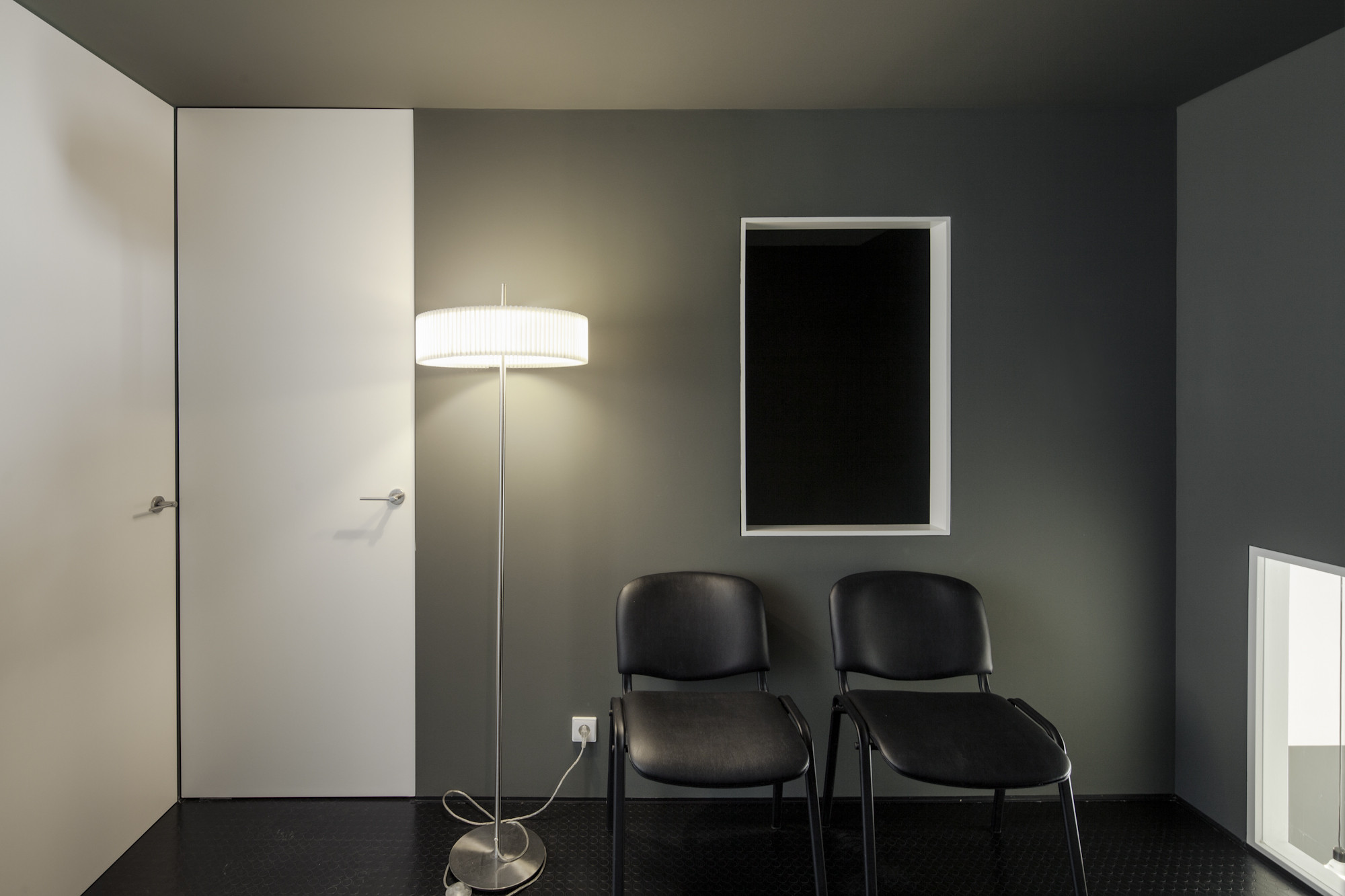
A very thin and elegant stair guides us to a resting/waiting room on the upper floor. Where we can find a window placed at feet level, this creates a strong visual relation with the ground floor letting us have a glance at the lamps from above. From the entrance perspective the window is a very important element, because it leads the eyes of the observer into a diagonal position. This movement of the head reinforces the importance of the box ceiling, and on the other hand brakes with the enclosure of the box giving the user the real notion of the all space.

On the stomatology room the user is placed facing a vegetation curtain. The idea is to create a distraction based on the movement of the leaves so that the patient can focus on something else than the treatment itself, hopefully diminishing any unpleasant sensation caused by it.


