-
Architects: Boogertman + Partners Architects
- Area: 22000 m²
- Year: 2012
-
Photographs:Michael Schmucker
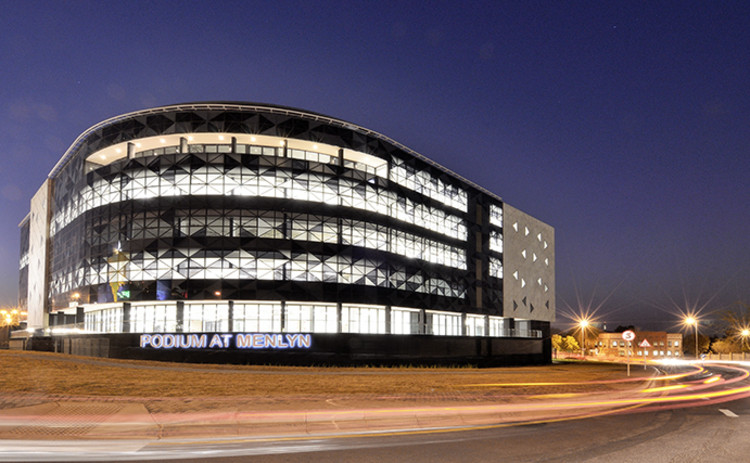
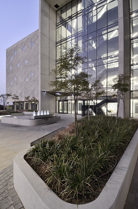
Text description provided by the architects. Podium at Menlyn aspired to incorporate a triangular geometry into the use of low-maintenance materials. The use of the triangular geometry in the design of the curtain wall was one that was simplistic, however remained only 2 dimensional. The Design Team was looking for a material that would be able to incorporate a third dimension to the triangular forms of the façade. What better material to select other than raw concrete in order to achieve this. The raw concrete is juxtaposed with the smooth curtain wall which creates a harmonious balance in the design, leaving passers-by with a sense of curiosity and wanting to know how this building’s concrete forms were actually created.
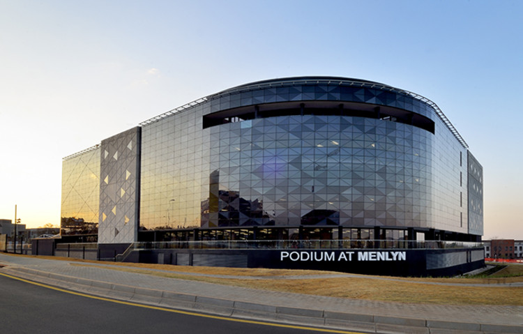
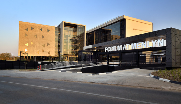
The two-part Brief from the Client was one that might have seemed simple enough at the time - Firstly to design a Flagship Building that would not date and will become an Icon in Pretoria and Gauteng. Secondly to deliver a product that will be low on maintenance. It’s 2012 and phase one of Emira Property Fund's new office development, Podium at Menlyn, has successfully been completed. This iconic building has been a talking point ever since the first off shutter concrete facade was revealed. The seamless triangular union of glass and off-shutter concrete was inspired by ancient engraved artworks found in the Blombos Caves on the Southern Cape coast of South Africa. This symbolizes a bridge between a 77 000 year old culture and the future of South Africa. Inspiration was also drawn from the ancient Chinese Tangram dissection puzzle. This puzzle, consisting of seven flat shapes called tans, are put together to form shapes. The design team met the client’s brief by transforming this ancient game into a magnificent triangular grid which features on the eastern and southern facades of the building in Phase 1. The abstract design is produced as a modular unit that can be configured into a geometric grid, making the implementation of the design an exact science and representing a synthesis of mathematics, symbolic systems and art. Even the basement and lift lobby artwork makes use of these tans to create a "geometrical garden” within an urban space, giving one the feeling of being in a digital landscape. The artwork transforms a once dull basement into an exciting space, through which one enters for a day’s work. The design suggests both the archaic nature of its origins and the sophistication of 21st century technology.
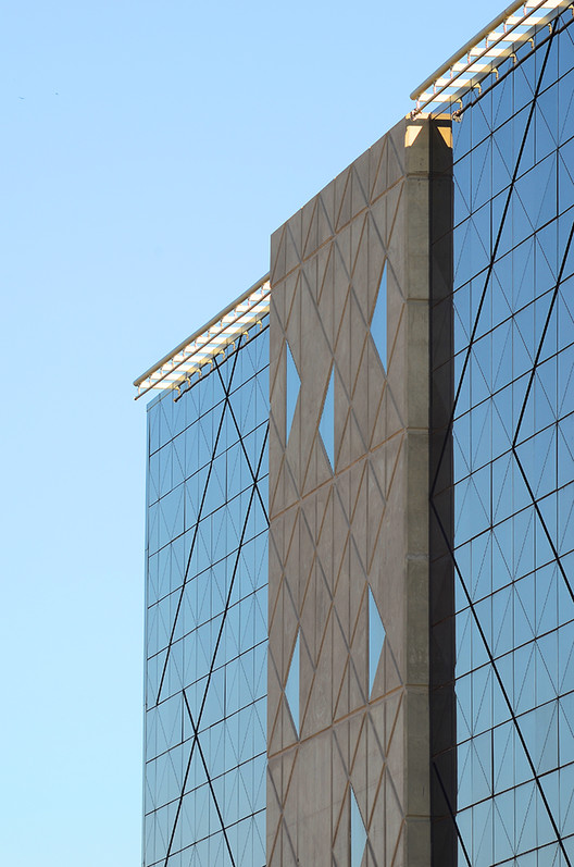
The monochromatic triangular facade consists of a 3 shaded curtain wall of grey glass which spans the soft curve of the building on the corner of Atterbury Road and Lois Avenue, as well as the south façade. This striking feature takes full advantage of its prime location directly across from Menlyn Park Shopping Centre. The curtain wall acts as a mirror to the sky, evolving in colour and intensity as the sun moves across the African sky. In some instances the mottled facade appears as a single uniform colour from the outside. The internal face of the triangular façade is in sharp contrast with the exterior – instead of the grey colours of the exterior, the interior is in fact shades of white. This is function of the construction process of the laminated safety glass that was used, whereby the lamination film is grey and/or black facing the outside of the building, but the internal faces of the laminates are white. This sharp contrast also assists in accentuating the grid of the aluminium structure. There was a definite decision made in the design phase to accentuate the aluminium structure on the inside of the building, resulting in the triangular façade also being experienced by the end-user of the building. Breaking the length of the southern facade, and anchoring the building on the northern side, the off-shutter concrete feature walls amplify the triangular module of the facades, whilst at the same time complimenting the curtain walls. The triangular forms of the façade are now seen as a 3 dimensional shape as opposed to the 2 dimensional form of the curtain wall’s triangles. The creation of a 3 dimensional triangle was a construction feat in itself. The triangular forms in the concrete façade were defined by means of creating 35mm deep recesses. A further resolution for triangular windows is to allow natural light to filter into the internal office space, coupled with the walls being an integral part of the structural frame of the building, made for an interesting design solution.
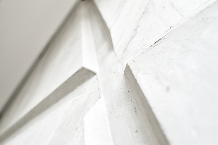
The methodology of the construction of these concrete features had to address the following aspects of the design/construction, which were resolved by means of the construction of a sample panel prior to the end product being produced. Creating the recessed lines which define the triangular geometry meant that once the shutters were removed there was a risk that the concrete could break out and leave the face of the walls with areas that looked ragged and which would require patching. The patching of the concrete is one element that the entire Team wanted to avoid at all costs. The beauty of off-shutter concrete lies in the seamless and sculptural appearance and texture of its materiality. During the construction of the sample panel, different methods were explored in order to obtain the required effect. The Structural Engineer required the concrete feature walls to be part of their structural framework of the building, and hence the Contractor was required to cast portions of the feature wall simultaneously with the main frame of the building.
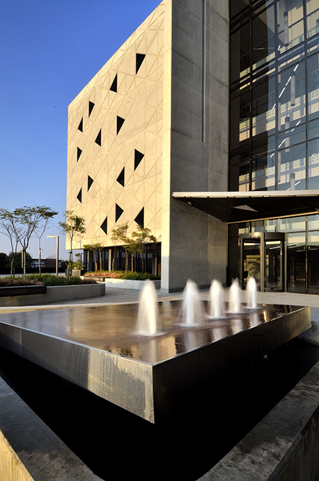
The downstand portions of the feature walls were cast at the same time as the First Floor slab, which meant construction with regular premixed concrete rather than using self-compacting concrete due to the fact that the Structural Engineer required a contiguously cast concrete structure to this area. In addition, due to the added cost of self-compacting concrete, it could not be used for the casting of the floor slabs. The second cast (First Floor to Second Floor level) of the feature wall were completed using self-compacting concrete. In the top portion of the feature wall, a polystyrene pocket was left on floor slab level which served as a permanent shutter for the concrete of the Second Floor slab. The Second Floor slab was cast using regular pre-mixed concrete, with splicing of reinforcing done above the floor slab level. This procedure was repeated for the Second, Third and Fourth Floor pours (to the underside of the Roof slab) However, as with the most bottom portion of the wall, the most upper portion of the wall similarly required to be one continuous pour for the roof slab’s upstand to work structurally. This upper portion was again cast using regular pre-mixed concrete due to cost constraints. What makes this methodology so unique is the fact that the Building’s entire façade’s grid was set out using the geometrical grid of the concrete feature walls. The construction joints in the concrete walls were required at very specific heights in order not to impact the Contractor’s program. Numerous consultations were held between the Structural Engineer, the off-shutter concrete Specialist, the Contractor and the Architect. In the end the solution that was agreed upon had no impact whatsoever on the program of the Building. One would have expected that the grid of the triangles on the feature walls would have been constructed only on the external faces in order to save time and reduce the cost of the shuttering. However upon entering the interior of the building, it becomes apparent that the space directly behind the feature walls, is in fact a continuation of the grid of the triangles as well. Yet again it becomes evident that due to good planning and good construction methodology this feat was achieved without impacting on the Contractor’s program and remaining within the Budget. Two sets of shutters were used for the construction of the 3 feature walls: a single set of shutters were used for both the eastern and western façade’s feature walls. The eastern and western feature walls were phased by levels, i.e. once the first downstand was complete on both the eastern and western facades, the first wall cast on the western wall’s shuttering was used on the eastern wall’s first cast, and so the process continued. The design of the walls is therefore a mirror image of the other. The second set of shutters were used for the construction of the fire escape stairwell on the southern façade. By utilising the same shutter for the construction of the two walls meant a cost saving of 40% on the shuttering. The Contractor approached Lafarge Readymix Gauteng, and in the end it was decided to use Lafarge’s Agilia Vertical self-compacting concrete solution. Of the total volume of 11 500qm of concrete used, 360qm was Agilia Vertical.
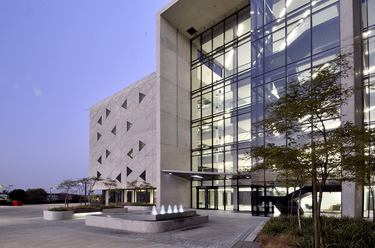
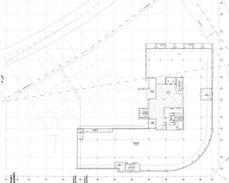
The building's northern facade is divided into two main sections. The first section has affectionately become known as the "egg-crates", which are simplified off-shutter concrete sun-shading devices created by a combination of concrete overhangs which protect the office space from the midday sun throughout the year. Equally deep concrete sunscreen walls also provide shading from the early morning and late afternoon sun. The combination of the walls and the overhangs create the "egg-crates", which has also become a multi-functional space being utilised as patio’s overlooking the main intersection of Lois Avenue and Ingersol Road in Menlyn. The northern facade is exposed to direct sunlight throughout the day. To avoid excessive heat buildup, a double curtainwall system was designed. The facade is therefore built up of 2 curtainwalls 1 metre apart, which naturally ventilate and disperse the building heat build-up. The top and bottom of the curtain wall is open to assist the stack effect of heat dissipation within this void. The main entrance to the building is a celebration of space with the bold concrete entrance towering the full height of the 5 storey building. This rather humbling entrance is a grand welcome to each visitor entering the Jewel of Pretoria. Upon entering the building, one cannot help but feel as if you have stepped onto the set of a 70's science fiction movie. A dramatic transition is made from the darker more powerful external facades to a much lighter and friendly interior. The geometric grid continues throughout the interior of the building. Spontaneous triangular monochrome floor tiles contrast playfully on the floor of the lobby and pure white glass wall cladding subtly mimics its big brother, the exterior facade. The facade is visible from the office space during the day, adding texture and contrast to the interior. At night, the bright playful interior draws passing eyes like moths to a flame. Therefore the focal point of the building shifts from the dark and powerful exterior in the day, to the bright and playful interior at night - an inverse contrast.
Although the building is not Green Star rated, many Green Principles have been implemented. These include T5 light fittings, a VRV HVAC system, the double curtain wall facade, 765mm bulkheads and similar sized spandrel panels on every floor reduces the effective area of the facades, passive sunshading on the northern facade and performance glazing which reduce heat loads substantially. The Podium at Menlyn has become the gateway to the Menlyn node, which is to become an A-Grade business hub with in excess of 300 000 square metres of mixed use development including retail, offices, hotels and residential units being planned. The success of the project can be attributed to the unbeatable combination of limitless creative talent in the form of Francois Bredenkamp, technical and project management expertise in the form of Frans De Klerk, and a client who had complete faith in the both of them. Support from an equally talented technical and interior design team made the implementation of the original concept a reality. There is a saying that goes "Be so good they can't ignore you". We believe Podium at Menlyn has made this saying its own.
