-
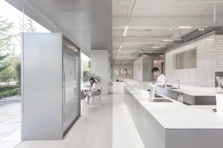
Architects: SPSS Design
- Area: 110 m²
- Year: 2013


At first glance, it seems that Apple's strong retail design has derived from consistent design. But since Steve Jobs opened the first Apple Store in 2001, the brand has changed its store and lighting design concept five times. Thereby change appears as a central factor when a brand grows and expands internationally. For each period Apple developed sophisticated details and has strived for the perfect sky in their store - a smart strategy to enhance naturalness and sustainability.

The Louis Vuitton Maison Seoul, imagined by architects Frank Gehry and Peter Marino has just opened in the South Korean capital. Celebrating Korean heritage and culture, the design puts in place a curved glass facade, perched atop a white cubic mass.


City of the Future is a bi-weekly podcast from Sidewalk Labs that explores ideas and innovations that will transform cities.
In the second episode from season 2, hosts Eric Jaffe and Vanessa Quirk discuss the future of retail with author Mark Pilkington, social entrepreneur Sarah Filley, Sidewalk Labs’ Director of Development Carrie Jackson, and others.

_OMA.jpg?1570009419&format=webp&width=640&height=429)
OMA's proposal won the competition for the new KaDeWe department store and hotel in Vienna’s Museumsquartier. Led by Ellen van Loon, Ippolito Pestellini Laparelli, and Laurence Bolhaar, the project will be OMA’s first venture in Vienna, upon its completion.
_Tim_Griffith_(4).jpg?1564671406&format=webp&width=640&height=429)
The Robinson Tower, a 24 000 m² boutique retail and office tower, was inaugurated in Singapore. Designed by the international firm KPF or Kohn Pedersen Fox Associates, and executed in collaboration with Associate Architect A61, the building addresses the cultural and social aspects of the city, creating a singular and refined experience. The tower stands out from its context showcasing novelty in form and function, changing the city’s skyline.

YACademy launches the first edition of Architecture for Food, a high-level training course offering 8 scholarships and internships in internationally-renowned architectural firms.
102 hours of lessons, a 30-hour workshop, lectures and placement opportunities in internationally-renowned architectural firms like L22, MVRDV, Snøhetta, and Barozzi Veiga.


Douglas and King Architects master plan to reinvigorate Shoreditch takes on a complex dual challenge. Broadly, there is the challenge at the core of any masterplanning project: creating a set of elements that flow together seamlessly with one another and their overall context. But more specifically, the project grapples with a tight triangular site and an already-lively urban context.

As mentioned in our previous article on retail stores under 100 square meters, the spatial distribution of commercial spaces is a determinant for its success. Not only does it address adequate logistics and the circulation of customers, but the variations and innovations that will enable a more efficient and original space.
Below, we've selected projects from our site, with their plan and section, that can help inspire your next project.

Nike House of Innovation 000 continues the athletic brand’s redefinition. As a company that prides itself on the innovative design of its foot and athletic wear, Nike has chosen to design its retail locations to reflect a new generation in sports performance. The House of Innovation maintains a foundation in flexible design, allowing the retailer to provide its patron with an immersive brand experience.
The store concept is described as “one floor, one world.” Each floor, inspired by the sounds and movement of New York, highlights different collections within the Nike brand. The retail program of each floor gets more specific as the levels increase. The 68,000 square-foot, six-level destination is the second Nike House of Innovation. The first was opened in Shanghai last month. These stores are the first of a new generation of sport retail experiences for Nike, numbered sequentially around the globe.

Los Angeles-based KTGY Architecture + Planning’s Research and Development studio has unveiled an idea to reuse millions of square feet of empty retail stores as housing for the homeless. The “Re-Habit” concept calls for the installation of bathrooms, dining, sleeping, gardening, and job training facilities, transforming obsolete big-box stores into agents of social change.
The concept comes at a time when vast big box stores such as Macy’s, JC Penney, and Sears are closing in record numbers, leaving large vacant footprints throughout the urban landscape.


New images have emerged of the revised Foster + Partners-designed Apple Global Flagship Store at Federation Square in Melbourne after the original proposal attracted criticism and comparisons to a “Pizza Hut Pagoda.”
The revised scheme has been the result of workshops involving Fed Square Management, the Victorian Government, the City of Melbourne, and Apple, with input from Donald Bates, chair of architectural design at the University of Melbourne.