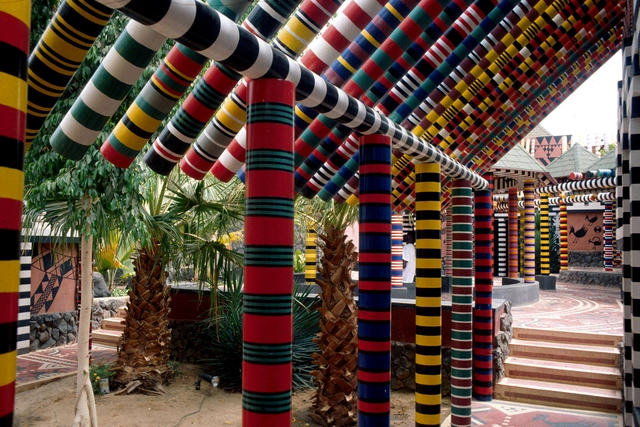
Advancements in 3D printing technology are progressing at an unprecedented pace, accompanied by a parallel surge in computational power for manipulating and creating intricate geometries. This synergy has the potential to offer architects an unprecedented level of artistic freedom in regards to the complex textures they can generate, thanks to the technology's remarkable high resolution and rapid manufacturing capabilities. If the question of production was out of the way, and architects could now sculpt virtually anything into a facade effectively and efficiently, what would they sculpt?
Ornament: The Latest Architecture and News
Crafting for Contemplation: The Minimal vs. The Ornamental
A few weeks ago, this year’s edition of the Serpentine Pavilion opened to the public. Designed by Chicago-based artist Theaster Gates, it’s an evocative project, its cylindrical form referencing American beehive kilns, English bottle kilns, and Musgum adobe homes found in Cameroon.
What the pavilion is named tells the viewer a lot more about its intentions as a spatial experience. Titled Black Chapel, it houses a spacious room with wraparound benches, and an oculus above that allows daylight to filter into the space. It’s a fairly minimal interior – designed as a site for contemplation and reflection. This minimal quality of Gates’ Serpentine Pavilion raises particularly interesting questions. How artists and architects opt for a “less is more” approach when designing meditative spaces, but also how these introspective spaces have been equally enhanced by ornamentation.
Decoration Deserves to Be Celebrated for What It Is, Rather Than Dismissed for What It Isn’t
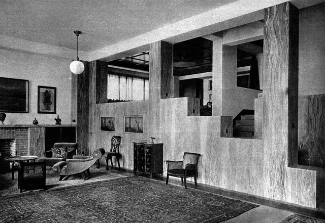
Beginning with the moral indignation expressed in Adolf Loos’s 1910 lecture “Ornament and Crime” and Le Corbusier’s 1925 The Decorative Art of Today, decoration has been attacked from every possible angle. Driven by the heroic male architect, Modernist dictates of good design—functionalism, truth to materials, purity of form—quickly took over and continue to be the dominant ideology today in the way architecture and interiors are taught and practiced. If Modern architecture was rational, masculine, and structural, then decoration was considered emotional, feminine, and shallow. Or, according to Loos, it was flat-out degenerate.
Ornament, Crime & Prejudice: Where Loos' Manifesto Fails to Understand People
This article was originally published on CommonEdge as "African Architecture: Ornament, Crime & Prejudice."
The Long(ish) Read: "Ornament and Crime" by Adolf Loos
Welcome to the fourth installment of The Long(ish) Read: an AD feature which presents texts written by notable essayists that resonate with contemporary architecture, interior architecture, urbanism or landscape design. Ornament and Crime began as a lecture delivered by Adolf Loos in 1910 in response to a time (the late 19th and early 20th Centuries) and a place (Vienna), in which Art Nouveau was the status quo.
Loos used the essay as a vehicle to explain his distain of "ornament" in favour of "smooth and previous surfaces," partly because the former, to him, caused objects and buildings to become unfashionable sooner, and therefore obsolete. This—the effort wasted in designing and creating superfluous ornament, that is—he saw as nothing short of a "crime." The ideas embodied in this essay were forerunners to the Modern movement, including practices that would eventually be at core of the Bauhaus in Weimar.
What Happens When Light Starts to Create Brand Experiences?
Global companies often exploit architectural icons to transform physical form into their desired brand reputations. To help achieve this goal, after twilight, the natural qualities of buildings have often been supplemented by architectural lighting, as the facades call unmistakeably for attention with their colorful and dynamic illumination. Representation has become the leading motivation for upgrading the lighting at headquarters and retail outlets. But when the illumination evolves into spectacular gestures, the brand identity and architecture itself starts to fade. Hence, the struggle for individuality has revived the discussion about ornament – though ornament appears now as light.
AR Issues: Why Ornament vs Icons is the Wrong Debate Entirely
ArchDaily is continuing our partnership with The Architectural Review, bringing you short introductions to the themes of the magazine’s monthly editions. In this introduction to the September 2015 issue, Editor Christine Murray discusses the postmodern reappraisal of ornament that has recently returned to architectural consciousness, arguing "what is disappointing is that we are still stuck discussing how a building looks."
The return to ornament is an evolution of the "icon" building. The emphasis may be on craft rather than form, but these buildings still clamour for attention, shouting "I am here." They share with the icon its selfie-friendly facade. This is architecture destined to be photographed, perhaps even nicknamed, heralding its presence as a landmark through the use of decoration, from brick mosaics to gilded towers.
Where it differs from the icon is in the emphasis on ‘making’; the craftsmanship or process by which the decorative element was created. The ornamentation may also feature on only part of the building, whereas an icon always refers to the whole.