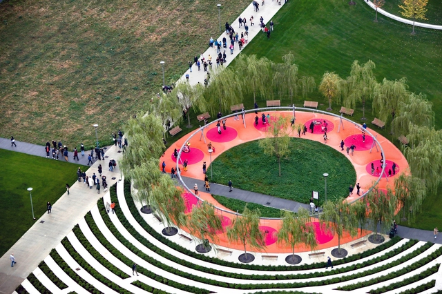
Milan stands as a beacon of mainstream fashion and economic vitality, drawing visitors from around the globe. As Italy’s second most populous city, it serves as the stage for some of the world’s premier fashion and design events. To kick off the 62nd edition of Milan Design Week, we partnered with Felt to create an interactive map highlighting some of the city’s most iconic tourist attractions, as well as contemporary landmarks designed by renowned local and international architects such as Aldo Rossi,Gio Ponti,Stefano Boeri, Mario Cucinella, Zaha Hadid, Grafton Architects, Herzog & de Meuron, and Foster and Partners, amongst others.
https://www.archdaily.com/1015736/discover-milans-architectural-gems-with-this-interactive-city-guideArchDaily Team
Map of Hurricane Sandy Impact Analysis. Courtesy of Felt
Sightseeing is an activity closely intertwined with architecture and cities. So much is that Guiliana Bruno adapts the term to site-seeing in her comprehensive book Atlas of Emotions: Journeys in Art, Architecture and Film, emphasizing the link between tourism and the urban landscape. Traveling and exploring new places is not something only architects like, it's among the most enjoyable activities for anyone. It's no coincidence that city guides are consistently among the most visited articles on ArchDaily, offering curated collections of iconic buildings for people to explore.
Now, some of our most popular city guides will not only provide a list of buildings, but also feature interactive maps that position each of the architectural masterpieces within the territory. Powered by Felt, these maps cater to the needs of the architects and curious travelers alike.
https://www.archdaily.com/1014699/felt-a-tool-that-will-revolutionize-mapping-for-architects-and-urban-practitionersArchDaily Team
Cartography, or map making, has played a critical role in representing spatial concepts for thousands of years. While the earliest forms of maps displayed geographic information carved into clay tablets and etched onto cave walls, the maps we use today have significantly evolved to creatively show a range of different information. These visualizations draw conclusions about population sizes, historical events, cultural shifts, and weather patterns to help us understand more about our world and how we impact it.
World map of 1300. Image via Wikicommons, under domain
Cartography consists of the flat, simplified and conventional geometric representation of the earth's surface, presented in the form of maps, charts or blueprints. Because it is a two-dimensional representation of something that is three-dimensional, all representations undergo some kind of deformation, so that the choice of a method takes into account not only technical aspects, but also political ones.
In New Mexico, irrigation channels that have been in continuous operation for three centuries replenish and nourish the wetlands of the American Southwest. These channels are known as Acequias – communally managed water systems built on democratic tradition. Members of the community own water rights, who then elect a three-person team to oversee the channels. In Cairo and Barcelona, Tahrir Square and Plaza de Catalunya have acted as important sites for voicing political dissatisfaction. The Tahrir Square protests of 2011, for instance, resulted in the eventual toppling of an almost 30-year-old government.
Understanding how shadows will act in and around an area is a necessary understanding to ensure greater spatial quality. Shadows can influence natural lighting - therefore, the perception of space - and also issues of thermal comfort. Thus, mapping your projections and visualizing their movements during each season of the year can be fundamental to improve your project. The good news is that there are simple tools that help you visualize this in your city and in natural environments.
https://www.archdaily.com/979759/mapping-shadows-in-cities-the-solar-trajectory-in-digital-and-interactive-toolsEquipe ArchDaily Brasil
New Orleans was designed by its early settlers in 1721 as a Cartesian grid. You know it as the famous French Quarter or Vieux Carré. Such grids are named for the Cartesian coordinate system we learned to use in algebra or geometry class, perpendicular X and Y axes, used to measure units of distance on a plane. The invention of René Descartes (1596–1650), these grids reflect his rationalism, the view that reason, not embodied or empirical experience, is the only source and certain test of knowledge. William Penn used a similar grid in 1682 in selling Philadelphia as an urban paradise where industry would thrive in the newly settled wilderness. And just as the massive buildings of Italian Rationalist (i.e., Fascist) architecture express authoritarian control, so, too, Cartesian grids implicitly say: Someone is in charge here. We’ve got this. Trust us.
Frank Lloyd Wright was one of the most internationally influential American architects and is considered the forefather of organic architecture as well as the Modern and Prairie School Movements. Throughout the years, Wright's works have been awarded even more importance, with 8 gaining entry into the UNESCO World Heritage Site registry.
The way our world looks like today is a result of centuries and centuries of human migration, of complex natural phenomena that has resulted in the geographic appearance of the world’s continents today. We understand this world through our lived experiences, but we also understand this world through a two-dimensional man-made invention – maps. Maps define the many contested borders of the world and have been used in an oppressive capacity, in particular places, for example, segmenting off sections of a place from marginalised societal groups.
Martin Pederson interviewed this week Antonis Antoniou and Steven Heller, author of Decoding Manhattan, a new book that compiles over 250 architectural maps, diagrams, and graphics of the island of Manhattan in New York City, talking about the origin story of the book, the process of research, and the collaboration.
App update provides CO2 emission data on chosen routes. Photo: Pixabay
The GoogleMaps application will direct drivers to more eco-friendly routes that generate the lowest carbon footprint using mainly traffic data, road slopes and inclines, and other factors.
The eco-friendly option will be the application's default route if comparable options take about the same time. When alternatives are significantly faster, Google will offer choices and let users compare estimated emissions.
https://www.archdaily.com/960036/google-maps-to-start-showing-routes-with-the-lowest-carbon-footprintEquipe ArchDaily Brasil
The cartographies reveal different facets of Brazil and examine the nature of the visible and invisible walls that define the country. They were produced by the exhibition’s curators Gabriel Kozlowski, Sol Camacho, Laura González Fierro and Marcelo MaiaRosa in collaboration with 200 professionals from 10 different disciplines
https://www.archdaily.com/945860/brazilian-maps-from-the-venice-biennale-2018-on-sale-to-fight-coronavirus-in-the-amazonEquipe ArchDaily Brasil
Hungarian analyst and cartographer Robert Szucs shared with ArchDaily another of his series of maps, this time addressing the population distribution on Earth. A large blackboard, identifying only the geopolitical boundaries of countries and continents, reveals bright constellations, representing human agglomerations and the world's great voids.
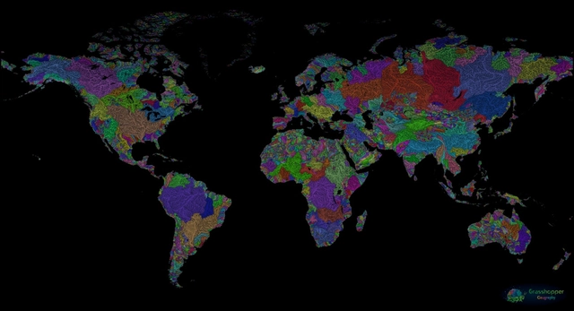
GIS analyst and Hungarian cartographer Robert Szucs has shared an impressive collection of maps that bring together all the drainage basins of the world in vibrant colors. Titled GrasshopperGeography, the maps showcase the rivers and watercourses of the world, featuring the basins of selected regions, countries and continents.
New Bilingual Guide Celebrates Architecture and Design of Paris Metro
Transport design historian and broadcaster Mark Ovenden has curated Paris Metro Architecture & Design Map, the fourth in Blue Crow Media’s new series of cartographic guides dedicated to the architecture and design of the world’s finest public transport systems. With original photography by Nigel Green this two-sided guide is an original and fascinating insight into the architecture and graphic design of the Paris Metro for transport lovers, students of design and anyone interested in the history of London.
The bilingual, English and French, guide includes a geographical Metro map with featured stations
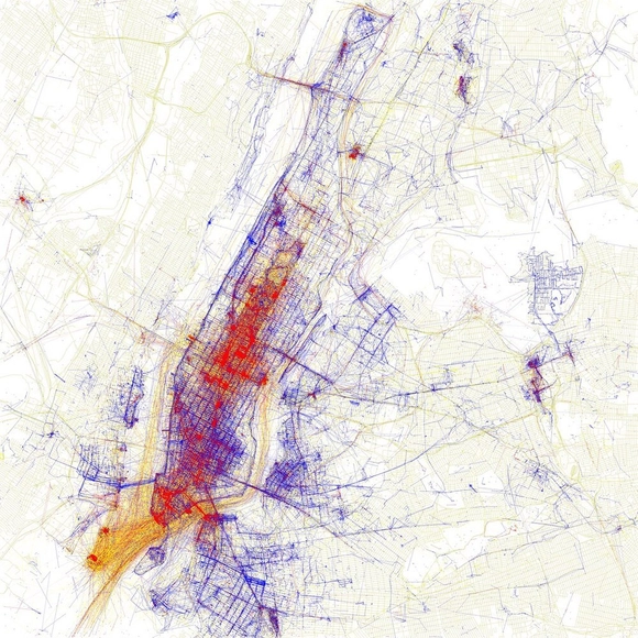
While visiting a city one has never been to before, it is common to go to touristic places, the 'must-see' spots advertised in the media. On the other hand, when establishing residency in a place, it is likely that one will start to attend some less popular locations, and will often spend a long time without passing by the city's most famous touristic sights. Artist Eric Fischer has developed a project that explores precisely the difference in perceiving - and photographing - a city from the point of view of tourists and locals. The work, which is entitled Locals and Tourists, gathers the maps of 136 of the largest - and most visited - cities in the world.
More than 120 old maps from the David Rumsey Map Collection were inserted in Google Maps and Google Earth, allowing us to learn how several parts of the globe were in the past. The maps can be seen by activating the 'Rumsey Historical Maps' layer in Google Earth or through a version of Maps developed for the project.
The second symposium in the ANCB programme Borders and Territories: Identity in Place with Nadine Godehardt, Malkit Shoshan, and Lucas Verweij. After the kick-off event in March 2018, this second symposium in the series will deal with Spatial Representations of Connections and Disconnections and the transfer of geopolitical and socio-cultural imaginaries of the world. Each world map reveals a particular worldview with its deposited moral, political, or economical convictions. But maps can also be instruments to analyse contested political situations. Our speakers will bring together artistic, planning, and political persepectives: Lucas Verweij will look into how maps construct our worldview and