The dawn of nuclear power, dramatic advances in rocketry, and the desire to be the first to put men into space and on the moon, kick-started an era known as the ‘Space Age’. Upon the closure of WW2, both the Soviets and the Allies found themselves in a state of antagonism, as they both began to struggle to make advancements in space exploration before the other, a race for space. The era would give way to rapid advancements in technology and huge accomplishments including the moon landing in 1969. The Space Age aesthetic completely changed the way designers visualized the new world and left a dramatic impression on architecture and interiors. A new vision of futurism and prosperity.
Googie: The Latest Architecture and News
Spotlight: William Pereira
Winner of the 1942 Acadamy Award for Best Special Effects, William Pereira (April 25, 1909 – November 13, 1985) also designed some of America's most iconic examples of futurist architecture, with his heavy stripped down functionalism becoming the symbol of many US institutions and cities. Working with his more prolific film-maker brother Hal Pereira, William Pereira's talent as an art director translated into a long and prestigious career creating striking and idiosyncratic buildings across the West Coast of America.
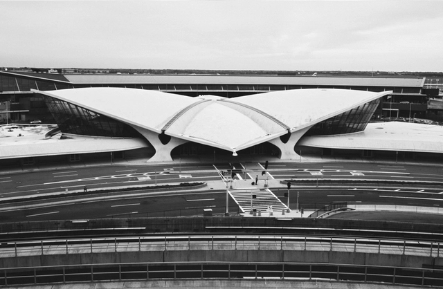
AD Classics: TWA Flight Center / Eero Saarinen
This article was originally published on June 16, 2016. To read the stories behind other celebrated architecture projects, visit our AD Classics section.
Built in the early days of airline travel, the TWA Terminal is a concrete symbol of the rapid technological transformations which were fueled by the outset of the Second World War. Eero Saarinen sought to capture the sensation of flight in all aspects of the building, from a fluid and open interior, to the wing-like concrete shell of the roof. At TWA’s behest, Saarinen designed more than a functional terminal; he designed a monument to the airline and to aviation itself.
This AD Classic features a series of exclusive images by Cameron Blaylock, photographed in May 2016. Blaylock used a Contax camera and Zeiss lenses with Rollei black and white film to reflect camera technology of the 1960s.
14 Short Stories About Architects, Attitudes and Odd Architectural Anecdotes
A new collection of five minute-long On Design stories—developed by the team behind Section D, Monocle 24's 24's weekly review of design, architecture and craft—profile a person, survey a place, or unpack an idea that’s changing or shaping design and architecture today. We've selected fourteen of our favorites from the ongoing series, examining issues as wide as Postmodernism and the architectural competition, to five-minute profiles of Alvaro Siza, Josef Hoffman, Kengo Kuma and Superstudio.
AD Classics: Space Needle / John Graham & Company
The opening of the Century 21 Exposition on April 21, 1962 transformed the image of Seattle and the American Northwest in the eyes of the world. The region, which had been known until that point more for its natural resources than as a cultural capital, established a new reputation as a center of emergent technologies and aerospace design. This new identity was embodied by the centerpiece of the exposition: the Space Needle, a slender assemblage of steel and reinforced concrete which became—and remains—Seattle’s most iconic landmark.[1]
How to Preserve Post-War Modernism
This article by Carlos Harrison appeared in Preservation Magazine as Reinvention Reinvented: Hope for Modernism, and discusses the issues surrounding the (increasingly popular) drive to preserve post-war modernism, including what we can learn from past successes and failures, and what it takes to preserve different types and styles of building.
Columbus, Indiana, is something of a modern marvel. It boasts more than 70 buildings by some of the architecture world’s greats, including titans of Modernism such as Eero Saarinen, I.M. Pei, and Richard Meier. Schools, churches, a library, a post office, and even a fire station stand as examples of the distinctively diverse architectural styles spanning the decades from World War II through Vietnam.
Crisp lines, sharp angles, connected like Lego blocks. Nearby: a 192-foot spire aims toward the heavens like a laser.
Read on after the break for more about preserving modernism
Video: Sheats Goldstein Residence / John Lautner
Question: What does Snoop Dogg, John Cleese, Lucy Liu and Jeff 'The Dude' Lebowski have in common? Simple, they have all, at some point in time, hung out in the living room of the space-age Sheats Goldstein Residence designed by Frank Lloyd Wright-disciple, John Lautner.
Video: Googie Architecture, Part 2
Sunny & Mild Media presents Part 2 of its Googie Architecture Series, presenting design work at the cusp of technological innovations of the 1950s. Emerging out of an obsession with the fast new world of cars, planes and rockets, Googie Architecture became an ultramodern style that sought to encapsulate the spirit of the 21st century. The new forms – sweeping, cantilevered roofs, starbursts, and flowing forms – became a form of advertisement that caught the attention of motorists, for its vibrance along the stretches of highways and for its distinctive style.
This installment features a closer look at the diners and restaurants that thrived in the ’50s and were designed with the Googie style. Even the one of the first McDonald’s restaurants adapted the style to work with its logo. Many of these buildings stand in ruin now, but the style was used in all kinds of building typologies – most of which emphasized the car: drive-thru’s, drive-in’s, car washes, diners, and gas stations. Even Las Vegas, and our associations with the its architecture today, are a reflection of that style.
Video: Googie Architecture, Part 1
Googie Architecture, shared with us by Sunny & Mild Media, is part one of a series that encapsulates the futuristic design found prevalent in the post-war sprawl of Los Angeles during the 1950s. Popular among coffee shops, motels and gas stations, the ultramodern style originated from the Sunset Boulevard coffee shop, designed by John Lautner, named Googies. A Googie building was a symbol that a business was with the times, which in turn brought traffic and attention to its doors. Form followed function, and it’s function was advertisement.
For more, read Googie Architecture: Futurism through Modernism.