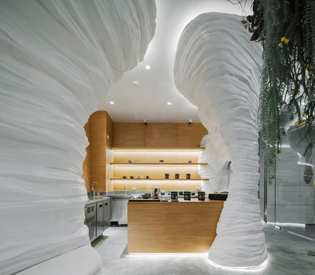
By using ArchDaily, you agree to our Terms of Use, Privacy Policy and Cookie Policy.

If you want to make the best of your experience on our site, sign-up.

By using ArchDaily, you agree to our Terms of Use, Privacy Policy and Cookie Policy.

If you want to make the best of your experience on our site, sign-up.

  1. ArchDaily
  2. Colors

Colors: The Latest Architecture and News

Pink as a Design Tool: Atmosphere, Identity, and Experimentation in Interior Design

In recent years, pink has evolved beyond its traditional associations to become a sophisticated and versatile element in architecture and interior design. Defined by a broad spectrum of shades, pink encompasses both warm and cool tones, ranging from pure red tints (R) to blends with yellow (Y80R, Y90R) or blue (R10B, R20B, R30B), as classified by the Natural Color System (NCS). While difficult to define by a single shade, this color balances vibrancy and softness, making it adaptable across different materials and contexts. As pink continues to gain prominence in contemporary interiors, its role extends beyond being a mere color choice—it is a design strategy. The recent transition from the bold, playful pinks of the "Barbiecore" trend to softer, powdery hues seen in fashion and design in 2025 fashion collections, highlights the color's adaptability. Its presence in Pantone's 2025 color palettes, also reinforces its appeal across disciplines. When applied thoughtfully, pink can transform spaces, making them feel inviting, expansive, or timeless.

Pink as a Design Tool: Atmosphere, Identity, and Experimentation in Interior Design - Image 2 of 4Pink as a Design Tool: Atmosphere, Identity, and Experimentation in Interior Design - Image 4 of 4Pink as a Design Tool: Atmosphere, Identity, and Experimentation in Interior Design - Image 1 of 4Pink as a Design Tool: Atmosphere, Identity, and Experimentation in Interior Design - Image 5 of 4Pink as a Design Tool: Atmosphere, Identity, and Experimentation in Interior Design - More Images+ 7

2025 Color Trends in Architecture: Embracing Earth Tones and Vibrant Hues

Unlike the 2024 Color of the Year selections, the 2025 picks reveal more commonalities among the colors chosen by major paint industry leaders. Each year, designers and enthusiasts from various fields gather within companies worldwide to reignite the conversation about color and its connection to contemporary culture. For the 2025 forecast, earth tones seem to be the big winners: Pantone's Mousse Chocolate is joined by cinnamon, brown, and burgundy shades from Benjamin Moore, Graham & Brown, Behr, and C2 Paint. Companies like AkzoNobel, Valspar, and Comex opted for more vibrant colors to celebrate optimism and joy, while Sherwin-Williams and Jotun didn't limit themselves to a single color. Instead, they introduced entire palettes centered on tranquility and relaxation. These concepts appear to be the guiding themes for 2025.

2025 Color Trends in Architecture: Embracing Earth Tones and Vibrant Hues - Imagen 1 de 42025 Color Trends in Architecture: Embracing Earth Tones and Vibrant Hues - Imagen 2 de 42025 Color Trends in Architecture: Embracing Earth Tones and Vibrant Hues - Imagen 3 de 42025 Color Trends in Architecture: Embracing Earth Tones and Vibrant Hues - Imagen 4 de 42025 Color Trends in Architecture: Embracing Earth Tones and Vibrant Hues - More Images+ 8

Smart and Retro: Advanced Toggle Switches Harmonized with Le Corbusier's Color System

 | Sponsored Content

Barragán, Bofill, Graves, and Le Corbusier are architects renowned for their exceptional and sensitive use of color. In their approaches, color takes on an importance comparable almost to functionality, achieved through a nuanced and comprehensive perception of their context. But what is color? From a technical standpoint, it is a visual perception that arises from the interaction of light with our eyes and brain. However, when we explore its meaning on a more emotional and poetic level, it takes on a deeper significance. For Ricardo Bofill, color infuses life into architecture, while for Charles-Édouard Jeanneret, —better known as Le Corbusier—, it serves as a powerful tool to evoke emotions and create spatial illusions.

In 'Polychromie Architecturale' Le Corbusier argues that color is not only a decorative element but also a fundamental tool for creating environments and enhancing the functionality of architectural spaces. This idea, developed between 1931 and 1959, is articulated around a system composed of a range of colors, where each tone has its relevance and contributes to creating atmospheres that transcend mere architectural design. An example is JUNG's LS 1912 toggle switch range, which combines classic design with advanced control options and showcases the diverse hue variants of the 63 colors in Le Corbusier's color system.

A Multicolored Glass Canopy for Senses, Shelter and Hospitality: The Vertical Panorama Pavilion

 | Sponsored Content

Although the sensory approach in the built environment is often based primarily on visual aspects, such as color and light, as we delve deeper into the relationship of architecture with the senses other essential elements emerge, such as aromas, textures, sounds, and even flavors. These components are fundamental to creating a profound experience between the user and the environment in which it takes place, demonstrating that design and sensory experience are intrinsically connected.

Thus, sensory design offers an immersive atmosphere for a full spectrum of senses where its perception extends beyond physical boundaries. An example of this is the Vertical Panorama Pavilion, located in a region of California (USA) with a strong identity linked to the wine tradition. This structure, with a glass canopy of Color PVB interlayers, serves as a shelter for hospitality. Inspired by nature, the pavilion’s canopy engages all the senses: from the texture of the gravel on the walking path to the wind currents in the area and the characteristic aromas of the region.

From Wood, Stone, Steel, and Uni Colors: A Decorative Collection for Fast-Moving Trends

 | Sponsored Content

Nowadays, the cycles of change around society and architecture have generated new urban models, emerging technologies, and design trends that underline the need for constant adaptability in all areas. In this context, aspects such as flexibility, reliability, and simplicity emerge as distinctive elements, both in architecture and in the components that constitute it, including materials. This is why lines such as the EGGER Decorative Collection 24+, crafted from wood-derived materials, seek to redefine concepts through a rolling series, updated at most every two years. This dynamic enables a more agile response to new trends, influences, and product innovations that arise in the built environment.

Pantone Reveals Peach Fuzz as Color of the Year 2024

Pantone has just just announced “Peach Fuzz” or PANTONE 13-1023,” the 2024 Color of the Year. Known for its color standards and digital solutions in the design community, Pantone announced the color aiming to move towards empathy and understanding. A hue between pink and orange, the color is soft and inviting and offers “tenderness and communicating a message of caring, community, and collaboration.”

Pantone Reveals Peach Fuzz as Color of the Year 2024 - Image 1 of 4Pantone Reveals Peach Fuzz as Color of the Year 2024 - Image 2 of 4Pantone Reveals Peach Fuzz as Color of the Year 2024 - Image 3 of 4Pantone Reveals Peach Fuzz as Color of the Year 2024 - Image 4 of 4Pantone Reveals Peach Fuzz as Color of the Year 2024 - More Images+ 14

2024 Color of the Year Picks Unveiled by Paint Leaders Such as Benjamin Moore and Sherwin Williams

The year 2024 brings forth an intriguing array of Color of the Year selections from renowned paint manufacturers, each offering a unique perspective on the hues that will influence our living spaces. Striving to capture the moods and aspirations of the coming year, color experts have veered towards soft and calming shades, hoping to bring a sense of serenity to counter the hectic and tumulus passing year. Countering the bold color chosen by Pantone in 2023 as their previous Color of the Year, Benjamin Moore embraces a softly saturated and nuanced shade, AkzoNobel emphasizes calmness and stability, Sherwin Williams aims to inspire mindfulness, Graham & Brown fosters warmth and tranquility, and C2 Paint focuses on freshness and sustainability.

2024 Color of the Year Picks Unveiled by Paint Leaders Such as Benjamin Moore and Sherwin Williams - Image 1 of 42024 Color of the Year Picks Unveiled by Paint Leaders Such as Benjamin Moore and Sherwin Williams - Image 2 of 42024 Color of the Year Picks Unveiled by Paint Leaders Such as Benjamin Moore and Sherwin Williams - Image 3 of 42024 Color of the Year Picks Unveiled by Paint Leaders Such as Benjamin Moore and Sherwin Williams - Image 4 of 42024 Color of the Year Picks Unveiled by Paint Leaders Such as Benjamin Moore and Sherwin Williams - More Images+ 2

Balancing Neoclassical and Futuristic Design: The Utopian Dream Bathroom Concept

 | Sponsored Content

Nowadays, the term “utopia” is used to describe an idea that seems unattainable —at least in the contemporary context— intrinsically related to philosophical, scientific, urbanistic, and architectural concepts, among others. The close connection between utopias and architecture is evident, as this discipline is often associated with imagination. Some notable examples include “The Unreliable Utopia of Auroville's Architecture” and “The City in Space: A Utopia by Ricardo Bofill. In this context, architects and designers alike use design as a means to develop innovative and disruptive ideas through various elements.

Although considered an idealized concept that does not exist, some designers have ventured into exploring the notion of utopia. AXOR, in conjunction with the Valencia-based design studio Masquespacio, has turned the page by conceiving and bringing to reality a new bathroom concept for a unique hotel suite that embodies their vision of personal luxury. Titled “Utopian Dream”, this design response blends vibrant colors with unexpected details, a combination that this duo defines as a mystic experience above the clouds.

Energy Efficiency Now Offers a Technical Justification for Colors

Colors have played an essential role in the history of modern architecture - from Le Corbusier's theory of polychromy to the aesthetic conceptions of the Bauhaus. However, we find ourselves at the beginning of an era where the interpretation and implementation of colors in architecture are undergoing a transformation based on their impact on the built environment.

Throughout the month, we conducted an open call to listen and learn from our readers, exploring their predictions and thoughts related to the future of colors in architecture. After reviewing an immense number of comments and opinions, it was surprising to discover commonalities regarding the importance of considering energy efficiency in color choices. Check out the main viewpoints below.