The 2026 Color of the Year selections show a shift toward nuanced, layered palettes and understated spatial calm, moving beyond the saturated earth tones of previous forecasts. Pantone's Cloud Dancer, a soft white, sets a foundation of clarity and simplicity, while Sherwin-Williams and C2 Paint highlight the versatility of mid-tone neutrals and soft ochres, emphasizing material authenticity and adaptability across different interior surfaces and lighting conditions. Benjamin Moore and Graham & Brown explore deeper, atmospheric hues that balance warm and cool undertones, and Behr, Valspar, and AkzoNobel introduce muted greens and blue-based tones aimed at creating restorative, composed, and visually engaging interiors.
Color of the Year 2026 "Cloud Dancer". Image Courtesy of Pantone
PantoneColor Institute has introduced PANTONE 11-4201 Cloud Dancer as the Color of the Year 2026, a soft white selected for its understated presence and sense of visual calm. The hue, described as balanced and airy, appears against a broader cultural context in which designers and creatives are reassessing the role of clarity, simplicity, and spatial quietude. Framed as a color that resembles a blank canvas, Cloud Dancer signals a renewed interest in environments that support reflection and measured creativity rather than constant acceleration.
In architecture, the effect of color is rarely neutral. It has the power to calm or energize, to expand or compress space, to unify or divide. Far from solely being a decorative layer, color is a tool that architects, interior designers, and designers use to structure atmosphere and perception. Alongside light, material, and proportion, it is one of the most precise instruments available for guiding spatial experience. When treated deliberately, it becomes a system — one that allows designers to articulate relationships between spaces, establish moods, and create continuity across various scales.
Color is not limited to paint. Surfaces, materials, finishes, and technical elements all carry chromatic weight. Yet in practice, color often remains uneven across the finest details — switches, sockets, intercoms — frequently appearing as neutral interruptions. This gap highlights a broader question: if color is to be considered a true architectural tool, should it not extend to every detail, no matter how small? Addressing this, German manufacturer JUNG has extended Le Corbusier's Polychromie Architecturale to electrical installations, allowing essential building components to speak the same language as the surrounding architecture.
Kindergarten architecture has long stood apart as a realm where design and imagination converge. Unlike most building typologies, these spaces are conceived not only to shelter and function but to shape the earliest experiences of curiosity, play, and social interaction. Throughout history, the design of kindergartens has evolved alongside pedagogical shifts, moving from modest, utilitarian beginnings to highly intentional environments that stimulate both learning and wonder. In this context, architecture becomes more than a backdrop — it becomes a silent educator, capable of nurturing emotional, cognitive, and physical development.
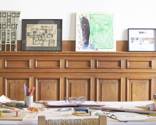
Amid questions, reflections, and debates, the work of Clorindo Testa embodies an innate connection between artistic and architectural experimentation, reflected in many of his built projects, sketches, models, and plans. From the Mariano Moreno National Library to the former Bank of London building in Buenos Aires, his production is of such scope, diversity, and complexity that it constitutes a major source of study, one that also includes unbuilt projects that deserve visibility and recognition on a global scale. In his final years of professional activity, two unbuilt projects of religious architecture highlight Testa’s work not only as an architect but also as a visual artist.
The use of primary colors, pure forms, and concrete represent some of the most distinctive characteristics of Clorindo Testa’s architecture, which is inseparable from his visual art. Reflecting on themes such as living in large cities or the conditions of life in urban spaces, the powerful expressiveness and plasticity of his works, together with the character of the line, his typical color palette, and the frequent presence of the human figure, reveal the importance and meaning he attributed to scales, uses, and perceptions as an architect who never settled for the first idea.
Gallaudet University was established in 1864, becoming the first American educational institution for the deaf and hard of hearing. The university is officially bilingual, with American Sign Language (ASL) and written English used throughout the educational programs. Over the years, the university has grown, adapting both its teaching methods and its spaces to the needs of its students, in turn learning from them how to counter the challenges they face and create a safer and more comfortable environment. These lessons turned into design guidelines, created to educate the architectural community about the strategies they can employ to create more accessible spaces for all.
In recent years, pink has evolved beyond its traditional associations to become a sophisticated and versatile element in architecture and interior design. Defined by a broad spectrum of shades, pink encompasses both warm and cool tones, ranging from pure red tints (R) to blends with yellow (Y80R, Y90R) or blue (R10B, R20B, R30B), as classified by the Natural Color System (NCS). While difficult to define by a single shade, this color balances vibrancy and softness, making it adaptable across different materials and contexts. As pink continues to gain prominence in contemporary interiors, its role extends beyond being a mere color choice—it is a design strategy. The recent transition from the bold, playful pinks of the "Barbiecore" trend to softer, powdery hues seen in fashion and design in 2025 fashion collections, highlights the color's adaptability. Its presence in Pantone's 2025 color palettes, also reinforces its appeal across disciplines. When applied thoughtfully, pink can transform spaces, making them feel inviting, expansive, or timeless.
Unlike the 2024 Color of the Year selections, the 2025 picks reveal more commonalities among the colors chosen by major paint industry leaders. Each year, designers and enthusiasts from various fields gather within companies worldwide to reignite the conversation about color and its connection to contemporary culture. For the 2025 forecast, earth tones seem to be the big winners: Pantone's Mousse Chocolate is joined by cinnamon, brown, and burgundy shades from Benjamin Moore, Graham & Brown, Behr, and C2 Paint. Companies like AkzoNobel, Valspar, and Comex opted for more vibrant colors to celebrate optimism and joy, while Sherwin-Williams and Jotun didn't limit themselves to a single color. Instead, they introduced entire palettes centered on tranquility and relaxation. These concepts appear to be the guiding themes for 2025.
Pantone Color Institute has selected PANTONE 17-1230 Mocha Mousse as the Color of the Year 2025. The warm, brown hue, reminiscent of chocolate mousse and latte coffee, aims to bring a sense of comfort, intimacy, and elegance. This represents a versatile hue that can be combined in a multitude of pallets, from monochromatic earthy shades to mixtures of soft pastels, or even exotic combinations of vibrant colors balanced out with the rich yet subdued tone of Mocha Mousse.
Urban apartments are frequently praised for their clever use of space, but what of their approach to color? Thoughtfully incorporating color is more than an aesthetic decision; it has the potential to shape emotional responses, influence mood, and create spatial illusions. Research in color psychology shows that colors affect our social, cultural, and psychological reactions, making them powerful design tools. Variations of blue, for instance, have been shown to slow melatonin production, keeping people more awake and alert, while shades of green relieve strain on our nervous systems, helping us feel calmer and more grounded. Color in architectural spaces can even alter our perception, creating illusions of depth, movement, and texture that influence how we experience space. Warmer hues like oranges and reds tend to make a room feel more intimate and cozy, while cool whites and blues lend a sense of openness, making spaces appear taller and more expansive.
In the perception of many, the favela embodies contradictory and opposed representations. For those outside its boundaries, the favela is frequently associated with crime, poverty, or illness. Yet, it is also regarded as the aesthetic embodiment of a nation, serving as the birthplace of culturally renowned elements worldwide, such as samba in the case of Brazil.
In recent decades, the term "adaptive reuse" has gained tremendous popularity as an eco-friendly construction approach. But what if there was something more poetic about reframing a space and its stories for new users? These architects show that once-deemed disposable facades, walls, and textures can obtain new meaning through bold and clever juxtapositions. These adaptations proudly display their conversions and layers of historical patina under them as a batch of honor and speak to the permanence of buildings and their impermanence in use and interpretation. Through subtle formal moves and daring material choices, they transformed structures that would have been otherwise demolished and reimagined them in new and intriguing ways.
The influence of design on our physical and mental health has been largely explored in various contexts, ranging from spatial configuration to furniture. The topic has gained notoriety due to the growing awareness of human well-being, especially in recent times. An example of this bond between design and health is the emergence of concepts such as Neuroarchitecture, which seeks to understand the built environment’s potential in our brain. Another case that illustrates this approach, this time in furniture design, is the Paimio Sanatorium, where Alvar Aalto designed the tuberculosis sanatorium and all its furnishings. The chair created for the patient’s lounge —the Paimio Chair— facilitated their breathing due to its shape and the inclination of the backrest.
These approaches are examples of how design can be applied in a specific way to enhance people's well-being through gestures like spatial organization, color and shapes, thereby promoting architecture that contributes to health, care, and recovery, In this context, and as a result of explorations in this field, HEWI has developed ICONIC, infusing emotionally appealing color concepts for its design icon, the 477/801 barrier-free sanitary range. An essential element of this range's design was the concept of "healing architecture" within healthcareand daycare buildings and its influence on not just the physical and mental well-being of patients but also the welfare of other users, such as relatives and staff.
https://www.archdaily.com/1012377/healing-architecture-for-care-and-recovery-iconic-design-with-colorful-conceptsEnrique Tovar
Give your bathroom a fresh look with a modest investment, avoiding the hassle of extensive construction. Transform the space by adding plants, reconsidering lighting, or experimenting with new colors. If opting for a color change, explore painting the walls or tiles to revitalize the environment. To assist you in this endeavor, we present the perfect paints for the job along with inspiring projects to spark your creativity
Known internationally as the world’s foremost voice on all things color, Pantone’s Color of the Year program has been predicting and even directing color trends for 25 years – reflecting the cultural environment across multiple creative sectors that use the language of color and color psychology such as branding, marketing, fashion, and product design to name a few, as well as architecture and design.
But color trends aren’t just about what’s hot and what’s not. Color plays an important role in stimulating the senses, evoking memories or feelings based on past experiences and collective influences around the world. In the color psychology of retail design, for example, specific hues have been found to alter consumers’ comfort and energy levels, ultimately dictating shoppers’ preferences and behavior. In medical environments, combining a neutral base with calming accent colors has been shown to reduce stress and anxiety.
As we head towards the end of 2023, an eventful year that could be defined as the year of "shifts", we take a look at how global events and trends impacted the design of interior spaces. Looking back, people questioned everything, and the architectural practice was no exception. A new voice was given to nations often forgotten as architects searched for alternative ways of designing and building. We questioned colonialism, consumer culture, waste, tradition, and authenticity, bringing about new perspectives within the discipline. Interior design in 2023, however, was reserved; explorative, but a lot more modest and subtle compared to previous years. Following years of constant changes, it seems as though people felt the need to pause, slow down, and embrace simplicity, while expressing their individuality through acupuncture interventions.
Pantone has just just announced “Peach Fuzz” or PANTONE 13-1023,” the 2024 Color of the Year. Known for its color standards and digital solutions in the design community, Pantone announced the color aiming to move towards empathy and understanding. A hue between pink and orange, the color is soft and inviting and offers “tenderness and communicating a message of caring, community, and collaboration.”