1. ArchDaily
  2. Editor's Choice

Editor's Choice

Michael Sorkin On The Guggenheim, Museum Culture, and "The Next Helsinki" Competition

Aside from attracting a huge level of media interest, the record-breaking competition to design the Guggenheim Museum's planned outpost in Helsinki also generated a significant level of criticism - not least from Michael Sorkin and his collaborators, who launched a counter-competition seeking alternative suggestions for how the site could be used. In this article, originally published on Metropolis Magazine as "'We Mean to Be Provocateurs': Michael Sorkin on the Next Helsinki Competition," Zachary Edelson interviews Sorkin on his reaction to the Guggenheim's shortlist, his hopes for his own competition, and the critical role that museums play in the worlds of both art and architecture.

The reverberations of the Bilbao Effect, where a prize museum infuses a region with prosperity and global cache, have concentrated on an unlikely city: the Finnish capital of Helsinki.

The Solomon R. Guggenheim Foundation is famous for its Fifth Avenue museum, but its 1997 Frank Gehry-designed Bilbao outpost famously catapulted its small Basque host city to new levels of international renown. The city’s tourism revenue quickly helped recoup the museum’s extensive costs: $100 million for design and construction, subsidies towards a $12 million annual budget, $50 million for an acquisitions fund, and $20 million to the Guggenheim for its name, curatorial services, and the use of parts of its collection. Within three years, visitors’ spending had garnered $110 million and by 2013 more than 1 million had entered the gleaming metallic structure. Many have tried to replicate Bilbao’s success but opposition against such massive expenditures always looms. In this case, it has manifested in a rival competition led by New York-based architect and writer Michael Sorkin and titled The Next Helsinki.

AR Issues: A Primer From the Prince

ArchDaily is continuing our partnership with The Architectural Review, bringing you short introductions to the themes of the magazine’s monthly editions. In this editorial from AR’s January 2015 issue, AR Editor Catherine Slessor reflects on The Prince of Wales’ ten principles for sustainable urban growth, which sparked widespread debate when they were published online near the end of December, arguing that the Prince's views are not just "some rose-tinted view of the past as the answer to the problems of modern life."

Some 25 years ago, the AR produced a special issue entitled "A Primer for the Prince". It recognised that in Britain, The Prince of Wales had come to exert a considerable influence on architecture, greatly increasing public awareness of the built environment and encouraging debate about the character of buildings and cities.

AR Issues: A Primer From the Prince - Image 4 of 4

Aaron Betsky Appointed New Dean of the Frank Lloyd Wright School of Architecture

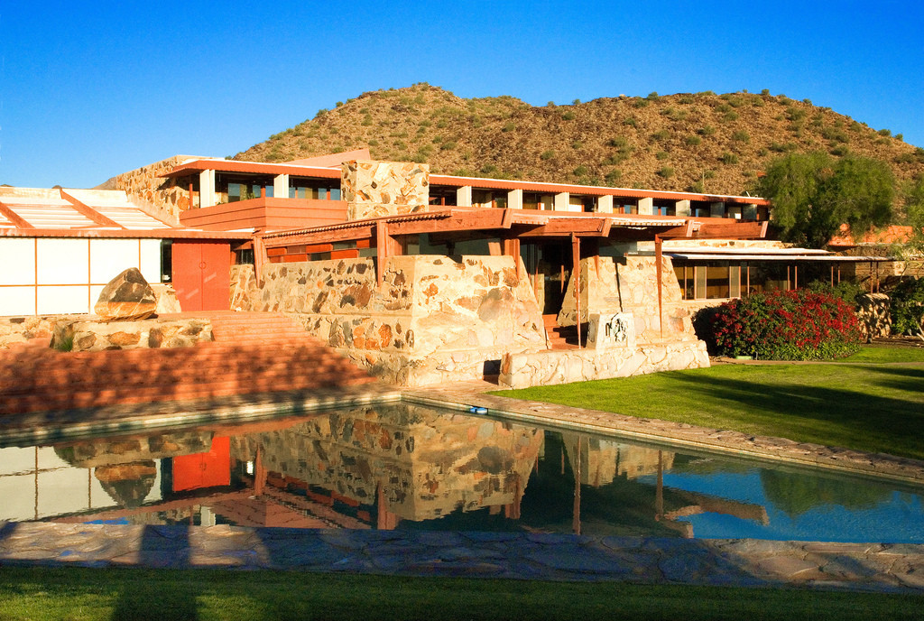
Critic, curator and educator Aaron Betsky has been announced the new dean of the Frank Lloyd Wright School of Architecture. Betsky will assume his role immediately, taking over responsibilities regarding the School’s academic programs, personnel, students, finances, and character, as well as relations with the Frank Lloyd Wright Foundation’s broader programs.

“I am honored and humbled to have the opportunity to continue the work that for so long made Taliesin into a workshop for reinventing American architecture,” said Betsky. “I look forward to continuing its traditions and making the School into the best experimental school of architecture in the country.”

Betsky's appointment comes at a critical time, as Taliesin is at risk of losing its accreditation should the school fail to raise two million by the end of 2015. Read on to learn more.

Archiculture Interviews: James Kunstler

"Suburbia has... several destinies." Author and social critic James Kunstler is one of several contributing speakers in Arbuckle Industries' groundbreaking documentary Archiculture. In the latest extra from the film, Kunstler provides his perspective on the modern housing sector and the shift from city life to suburbia, specifically examining the decline of the city as a result of political upheaval. Additionally, he postulates how architecture will evolve in the future and offers his ideas for overcoming America's suburbia-centric ways by drawing inspiration from the past, advocating that young designers focus on tectonics to shift back to a smarter built environment.

Workplaces of the Future to Abandon the Open Plan and Feed Employees with Sky Gardens

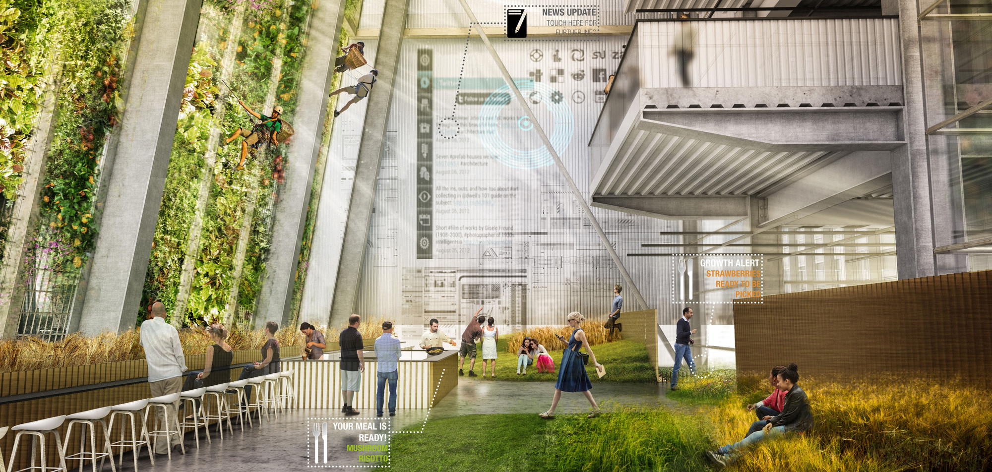
The winners of Metropolis Magazine's Workplace of the Future 2.0 Design Competition have been announced. This year's competition challenged participants to redefine the idea of the office, illustrating their interpretation of the evolution of workplaces within the next 15 years.

Although their approaches are different, each of the winning designs, selected from 153 entries, shows innovation in how they develop new office prototypes by employing technological ingenuity, maintaining much of the same construction while providing different experiences to suit the employees' unique needs. The winning entry (Organic Grid +) and the runner-up (the Hybrid Office) both reflect architecture which is highly receptive to its inhabitants.

Learn more about the winners after the break.

Design Like You Give a Damn: The Legacy of Architecture for Humanity

In the introduction to Architecture for Humanity’s 2006 book Design Like You Give a Damn, founder Cameron Sinclair recounts a story from the early days of the organization. Half-joking yet deadly serious, he describes the day when, while still running Architecture for Humanity from a single cell phone around his day job at Gensler, he was contacted by the UN High Commissioner for Refugees who told him that Architecture for Humanity was on a list of organizations that might be able to help a potential refugee crisis in Afghanistan should the US retaliate in the wake of September 11.

“I hope it’s a long list,” says Sinclair. “No,” comes the answer.

“We’d like to think it was because we had already become a voice for humanitarian design - an unexpected touchstone in the movement for socially conscious architecture,” writes Sinclair of the incident. “The sad truth is that until 1999, when our fledgling organization got started along with a handful of others, there was no easily identifiable design resource for shelter after disaster.”

Now, after their sudden and rather unceremonious demise, Architecture for Humanity has left architecture a very different world from the one it entered almost sixteen years ago.

Dear Martha: An Open Letter to the Pritzker Prize Committee

As the Pritzker Jury begins its deliberations for the 2015 Pritzker Prize, this is a critical time of year for shaping the landscape of architectural debate for the coming year and beyond. The following is an open letter to Martha Thorne, the Executive Director of the Pritzker Prize, from Conrad Newel, author of the popular blog Notes on Becoming a Famous Architect.

Dear Martha,

I have to hand it to you and all the people on the Pritzker committee, you guys are a very crafty bunch. Just when I thought I had you all figured out, you have now - even though only slightly - succeeded in confounding me.

From my 2011 analysis of the Pritzker, I figured that your potential pool of laureates was always a very predictable bunch. In fact anyone could look at my data and predict with reasonable certainty that the next laureate would most likely be an Asian or Caucasian male starchitect from Europe, The USA, or Japan. I further pointed out that none of your laureates have done much in the way of humanitarianism, despite the fact that the mission statement of the Pritzker also asks that the recipient should be making significant contributions to humanity. I maintained that this part of the mandate has been consistently overlooked.

City ID and Billings Jackson's Maps Hope to Make Moscow More Legible

Any system is only as good as its weakest link. A public transport system can have all manner of souped up trains, glamorous transport hubs and turbo-buses, but this can all be for nothing if one station has a confusing layout that unintentionally directs passengers onto the wrong route. For something as interconnected as a transport network, continuous and steady passenger flow is absolutely crucial. With this is mind, the Moscow Department of Transport and Road Infrastructure Development, commissioned City ID - a firm known for their wayfinding solutions in cities such as Bristol and New York - and their frequent collaborator Billings Jackson Design to develop a new system of smart signage for the city.

City ID and Billings Jackson's Maps Hope to Make Moscow More Legible - Image 1 of 4City ID and Billings Jackson's Maps Hope to Make Moscow More Legible - Image 2 of 4City ID and Billings Jackson's Maps Hope to Make Moscow More Legible - Image 3 of 4City ID and Billings Jackson's Maps Hope to Make Moscow More Legible - Image 4 of 4City ID and Billings Jackson's Maps Hope to Make Moscow More Legible - More Images+ 5

Inequality and Informality in New York: SITU Studio's Proposal for MoMA's Uneven Growth Exhibition

When it comes to discussing informal housing, it's usually cities in developing nations that take the spotlight - however, as revealed by SITU Studio's contribution to MoMA's Uneven Growth exhibition, issues of informal housing are indeed present in cities across the spectrum of development. In this interview, originally posted on Arup Connect as "Inequality and informality in New York," Sarah Wesseler speaks to SITU Studio principle Bradley Samuels about their unconventional proposal to address an issue that is frequently overlooked in New York city policy.

Uneven Growth: Tactical Urbanisms for Expanding Megacities, a newly opened exhibit at New York’s Museum of Modern Art, focuses on the complex relationship between urbanization and inequality. Over the 14-month period leading up to the launch, six interdisciplinary teams explored how these issues are playing out in different parts of the world, each developing an architectural response for a specific city.

Architecture firm SITU Studio (together with Cohabitation Strategies [CohStra]) was tasked with studying its home city, New York. (Arup transport planner Michael Amabile also consulted with the team.) We spoke with SITU principal Bradley Samuels about the project.

Inequality and Informality in New York: SITU Studio's Proposal for MoMA's Uneven Growth Exhibition - Image 1 of 4Inequality and Informality in New York: SITU Studio's Proposal for MoMA's Uneven Growth Exhibition - Image 2 of 4Inequality and Informality in New York: SITU Studio's Proposal for MoMA's Uneven Growth Exhibition - Image 3 of 4Inequality and Informality in New York: SITU Studio's Proposal for MoMA's Uneven Growth Exhibition - Image 4 of 4Inequality and Informality in New York: SITU Studio's Proposal for MoMA's Uneven Growth Exhibition - More Images+ 5

Archiculture Interviews: David Byrne

“Architecture affects how we see ourselves fitting into a city, and how we relate to one another.” In this latest video from Arbuckle Industries following its release of Archiculture, David Byrne, known for his music, writing, and art, provides his perspective on some of the issues facing architecture today. In the interview, he addresses the need to rethink design practice as an all-encompassing approach, and advocates the tailoring of designs for their specific purposes. Byrne also discusses the problem of the “starchitect” phenomenon, the relationship of people with the built environment, and the resulting atmospheric effects that spatial and acoustic qualities can impart.

Light Matters: UN Celebrates The International Year of Light 2015

Light is all around us, and it increasingly affects our daily lives. For example, we have started to carry personal light sources around with our smartphones, and in our homes many electrical machines now utilize light to display information and simply to appear more attractive. In a larger context, architecture and cities have also developed a new dimension with the advent of electrical lighting for work and entertainment.

Inspired by the central role of light for our culture and technology, the United Nations has proclaimed 2015 as the “International Year of Light and Light-based Technologies” (IYL2015). With IYL2015 the UN wants to raise the awareness of the importance of light and optical technologies in our lives, our future and the development of society.

Read on after the break for more enlightenment around IYL2015.

Light Matters: UN Celebrates The International Year of Light 2015 - Image 1 of 4Light Matters: UN Celebrates The International Year of Light 2015 - Image 2 of 4Light Matters: UN Celebrates The International Year of Light 2015 - Image 3 of 4Light Matters: UN Celebrates The International Year of Light 2015 - Image 4 of 4Light Matters: UN Celebrates The International Year of Light 2015 - More Images+ 7

Why Putin Likes Columns: 21st Century Russia Through the Lens of Architecture

In August 1932, Stalin, holidaying in Sochi, sent a memo containing his thoughts on the entries for the competition to design the Palace of the Soviets, the never-to-be-built monument to Lenin and center of government. In this memo he selected his preferred design, the colossal wedding cake of a tower topped with a 260-foot (79-meter) high statue of Lenin, designed by Boris Iofan. Just over 80 years later, Sochi again hosted the architectural whims of a powerful Russian leader for the 2014 Sochi Winter Olympics. An oversimplification? Probably. But it’s got nice symmetry to it.

Why Putin Likes Columns: 21st Century Russia Through the Lens of Architecture - Image 1 of 4Why Putin Likes Columns: 21st Century Russia Through the Lens of Architecture - Image 2 of 4Why Putin Likes Columns: 21st Century Russia Through the Lens of Architecture - Image 3 of 4Why Putin Likes Columns: 21st Century Russia Through the Lens of Architecture - Image 4 of 4Why Putin Likes Columns: 21st Century Russia Through the Lens of Architecture - More Images+ 2

Through the Lens: The Social Implications of Green Roofs in Film

Film often makes a mockery of architectural features. Glass facades are obliterated by gunfire, grisly murders are set against a white modernist palette, deconstructed stairs are the cause of nasty accidents or ludicrous slapstick, and you just know a tensile fabric roof will be shredded by the time 007 is finished with it.

There is one architectural feature however that has benefited from very complimentary treatment by the film industry, and surprisingly it is a sustainable one. Green roofs and other “architectural” green spaces have been popping up regularly in mainstream movies over the past decade: blockbusters including The Vow (2012) and Source Code (2011) utilized the greenscape outside Gehry's Jay Pritzker Pavilion in Millennium Park; last year the Vancouver Convention Centre was featured in both Godzilla and Robocop; and Kaspar Schroder’s 2009 uber cool documentary My Playground, about the sport of parkour (the art of bouncing off buildings made famous by the opening scenes of Casino Royale), features BIG’s Mountain Dwellings in Copenhagen. And we cannot forget two of the biggest film franchises in history: both of Peter Jackson’s Lord of the Rings and The Hobbit franchises feature green roofs in their portrayal of Hobbiton – home of the virtuous and incorruptible Hobbits.

ARCHISHAPE: "Architecture Shapes in Minimalist Clothing"

Working in reverse, Italian architect Federico Babina’s latest set of illustrations deconstructs the stylistic forms of 25 famous architects into a series of abstract compositions that embody the essence of each architect's style. This “process,” as Babina says, aims to reveal the “ideal connection between architecture itself as a form of representation and the representation used in its design.”

“The architecture is a set of shapes that draw volumes and voids which sequence generates functions and meanings. These illustrations are one of the possible ways to watch, observe and describe architecture… In these pictures you can read architectural references or simply let your mind get lost between the lines and colors for more imaginative interpretations.”

View all 25 illustrations, after the break.

ARCHISHAPE: "Architecture Shapes in Minimalist Clothing" - Image 1 of 4ARCHISHAPE: "Architecture Shapes in Minimalist Clothing" - Image 2 of 4ARCHISHAPE: "Architecture Shapes in Minimalist Clothing" - Image 3 of 4ARCHISHAPE: "Architecture Shapes in Minimalist Clothing" - Image 4 of 4ARCHISHAPE: Architecture Shapes in Minimalist Clothing - More Images+ 20

AR Issues: The Problem With Memorials and Memory

ArchDaily is continuing our partnership with The Architectural Review, bringing you short introductions to the themes of the magazine’s monthly editions. In this editorial from AR’s December 2014 issue, AR Editor Catherine Slessor ruminates on the contemporary approach to memorials, arguing that “as architecture can rarely truly grasp the notion of absence, memorial culture lapses into comforting banality.

Always uneasy bedfellows, this year the relationship between building and memory has had a particularly charged resonance. The centenary of the outbreak of the First World War has been framed by the familiar narratives of slaughter and sacrifice, while the 25th anniversary of the fall of the Berlin Wall marked the moment when Communism in Europe finally faltered and collapsed. No doubt that these are profound, epoch-defining events, but how they are memorialised in built form is frequently problematic.

AR Issues: The Problem With Memorials and Memory - Image 4 of 4

Videos: Bjarke Ingels on His Europa City Project for Paris

In 2013, Bjarke Ingels Group came first in Paris' Europa City competition, an 800,000 square meter cultural and recreational facility on the far North-Eastern outskirts of the city. In an attempt to explain the design of this huge project, filmmakers Squint/Opera have enlisted the help of Bjarke Ingels and a green screen to describe the project - Minority Report style - with a combination of live action and futuristic video effects. In a second video, a detailed walkthrough of the building enlists both 2D and 3D graphics "to capture the excitement and energy of this unique centre." Read on after the break for both videos.

Bjarke Ingels' Advice for the Young: "It's Important to Care"

The latest in a series of videos from Louisiana Channel sees Danish architect Bjarke Ingels of BIG dispensing wisdom for a new generation of architects. Speaking with characteristic zeal, Ingels advises young architects "to care, because if you don't care, it doesn't matter." "We're not here to build for other architects," Ingels says, describing architecture as "fundamentally the art and science of accommodating life."

Defining a More Purposeful Architecture: A Guide to Current Architectural Trends

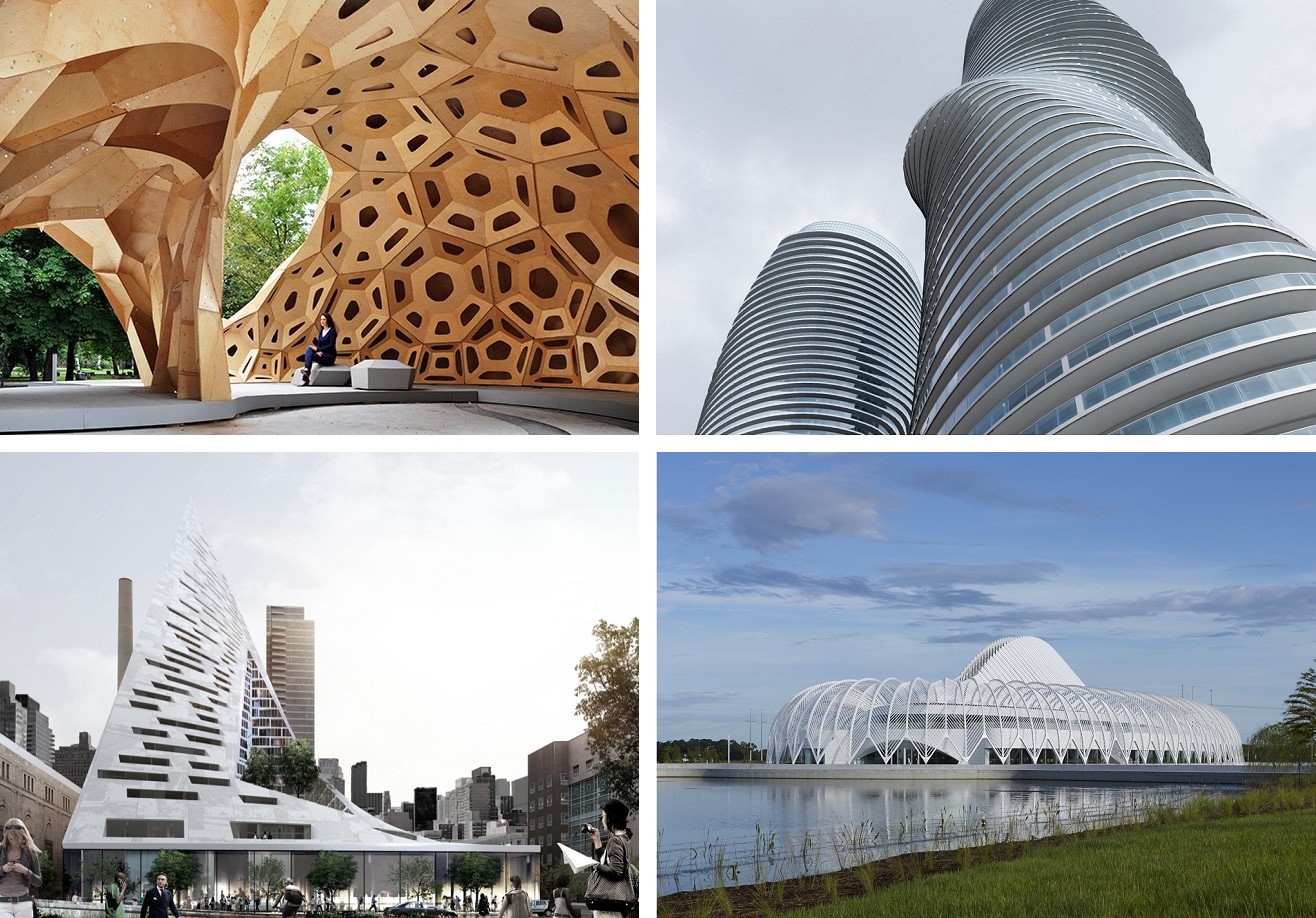
The current state of architectural design incorporates many contemporary ideas of what defines unique geometry. With the advent of strong computer software at the early 21st century, an expected level of experimentation has overtaken our profession and our academic realms to explore purposeful architecture through various techniques, delivering meaningful buildings that each exhibit a message of cultural relevancy.

These new movements are not distinct stylistic trends, but modes of approaching concept design. They often combine with each other, or with stylistic movements, to create complete designs. Outlined within this essay are five movements, each with varying degrees of success creating purposeful buildings: Diagramism, Neo-Brutalism, Revitism, Scriptism, and Subdivisionism.

You've started following your first account!

Did you know?

You'll now receive updates based on what you follow! Personalize your stream and start following your favorite authors, offices and users.