-
Architects: DOMANI
- Area: 800 m²
- Year: 2021
-
Photographs:Minjie Wang
-
Lead Architect: Ann Yu
Text description provided by the architects. HAYDON, an emerging brand in the high-end multi-brand cosmetics retailer favored by iconic venture capitalists, has been expanding its markets from the most first-tier cities in China at an astonishing speed since 2020 and has invited DOMANI to build the first store in Nanjing. The design concept is sourced from pure literature and echoed a wide creative perspective ranging from Wang Xiaobo's The Green-Haired Sea Monster(1997) to the trendy acid visual style in the 2020s. Its hazy and luscious LSD fantasy challenges the boundaries of beauty and desire, and it's rational while the rebellious tone is in line with the structural changes in Chinese retail consumers.
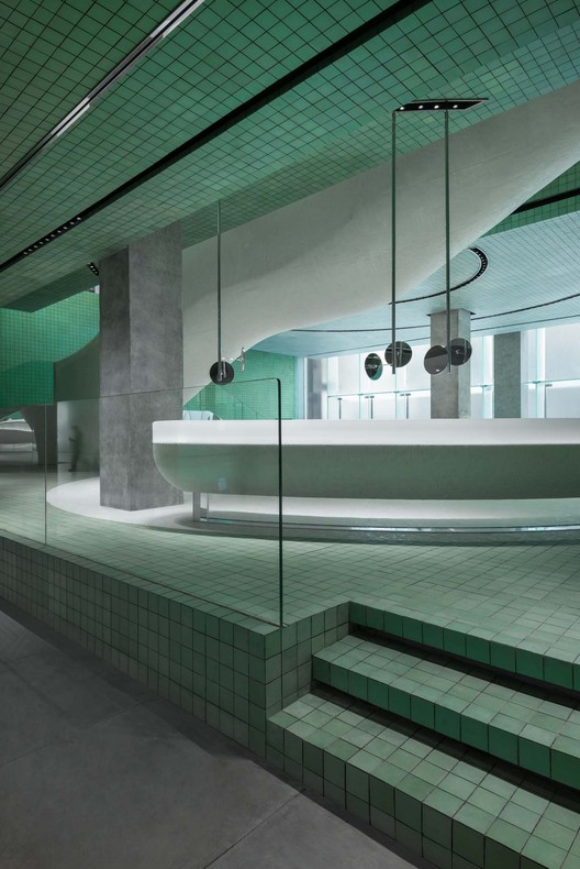
The main interior material is a customized glass tile, which is baked at a high temperature to give a stable color and an illusionary polarized light through a unique glaze formula on the skin. The design core of these materials ensures an advanced tone of color and a polarized metallic texture while maintaining the white balance of human skin and product color in the space.
The fish-belly-shaped staircase that stretches out from the east side of the space echoes the white circular counter in the middle of the room, as an inexplicable intuition appears in a blurred illusion.
The main display area on the first floor is elevated to form a square platform with corridors on three sides, while the north entrance inside the mall is fully open and the west corridor connecting the street with the interior space of the mall, acting as a sample product experiencing and resting area. This hollow structure provided an effective spot for a unique experience.
The "Twist Showcase" raises a question about the stereotypical definition of displaying shelves as "objects". Featuring personified postures and human behavior patterns, either solo or in a group, the iconic showcases are spread out in the space to create intriguing scenes where dialogues are conducted, so as to go beyond the ordinary.
The second floor adopted linear lights that fitted into the ceiling grid and provided a floodlighting, which would be appropriate for any condition as the showcases were flexibly set. Meanwhile, the metallic texture of the tiles is enhanced in such lighting. There are also function-oriented conventional displays. As for the finishing of the display installations, a corrosion texture on the metal surface highlights the acid style, as well as a sense of light punk, together to create a series of blending yet clear flavors, just like what cocktails provide. The metal cabinets with a soot-stained finish have an overall light acidic tone, with a mix of light punk, is as clear and harmonious as a cocktail. When space experience merges into literal text and becomes part of it, the transcendence of idea starts with eliminating the definition of the object.