-
Architects: güey studio
- Area: 77 m²
- Year: 2021
-
Photographs:Eduardo Mendoza
-
Manufacturers: USG, Arkiramica, Gree, Pinturas Berel
-
Lead Architects: Carlo Alessandro, Karen Torrejón

Text description provided by the architects. Located in the context of an over 50-year-old square of the “Viejo Vallarta” heart, Del Río Pharmacy consultorio + medicina is the beginning of a new pharmacy franchise that will be located on different spots of Puerto Vallarta.

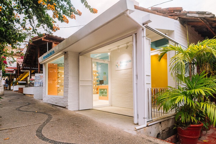
This project’s inspiration comes from an approach to the traditional, combined with a fresh perspective. Seeking the inside-out expression, with a concept of vibrant and striking use of colors, unusual, in terms of what health buildings in the city usually are.

Starting on the outside, the facade blends in with the surroundings, by using local materials that provide natural texture and appropriate colors that maintain the overall urban image. With the purpose of providing joyful and spiritful sensations to a space commonly monotonous, the interior implements a range of tones that generate visual interest as well as an emotionally comfortable ambiance.

In order to attract pedestrians attention, the use of colors in the interior is taken as an advantage and it is visually extended to the facade through a large display type window placed right at the edge of the sidewalk, allowing the spectator and passerby to live the internal space from the outside, as well as capturing as much light possible during the day, and at night, functioning as a large luminous advertisement.

For the pharmacy, the private area is separated from the public with the predominant use of blue, emphasizing this difference by placing a counter painted in a contrasting tone. Cohesively both areas have wood shelving with its natural grain, taken by inspiration from the medical botanic store's naturalness.


On the other hand, the kitchenette seeks to stand out with the implementation of primary colors, neutral lighting and reticular pattern composition. By disrupting the continuity of the space generated by corridors, it distinguishes its use from the rest of the pharmacy and creates a visually fun and attractive image. Along with the establishment, neutral lighting was also essential to highlight colors and patterns without visually modifying them.


Despite the pharmacy and doctor’s office is a part of the project as a whole, this area was separated in the function of the activities played on each one, giving them different entrances connected by a small lobby, accessible for regular pedestrians and wheelchairs.


Considering the dynamics of the waiting room area, the placement of colors was crucial to transmit comfort sensations and allow the user to enjoy the space. Starting with a yellow color representing energy, strength, and happiness, blue symbolizing serenity and calm, last, pink expressing kindness and delicacy.

In contrast to a colorful and lively waiting room, we have the doctor’s office, a quiet and health-focused space. Painted completely in white with touches of colored furniture, harmonizes with the simple and pure, but preserving congruence with the initial concept.


