-
Architects: Fox Johnston
- Area: 212 m²
- Year: 2020
-
Photographs:Brett Boardman, Dave Wheeler
-
Manufacturers: Big Ass Fans, Sto, Fisher & Paykel, Miele, Unios, ARC Roofing, Blanco, Bosch, Cratft Metal, EST Lighting, Eco Outdoor, Euromarble, Hanson, Inlite, Intergrain Ultra, Liebherr, Nash Timbers, Panasonic, Special Lights, Sydney Stone Masons, +1

The site. The compact narrow site was originally one of a pair of Inter-war semis. It adjoins a public walkway to its north-west and its neighbouring semi to the north-east enlarged to two storeys. The slope of the site meant the public walkway presents a privacy challenge. The street is leafy and high, hugging the south Bondi ridge-line, with a sunny northerly aspect.

The brief. The clients wanted a small, distinctive, sustainable house for themselves and their large, well-loved dog. They needed a home office and accommodation for long visits from visiting overseas parents. A private, light-filled sanctuary within the busy Bondi hinterland. While the original house had a car space at the front, they were prepared to forfeit this for the home office but were also mindful of the value of off-street parking in Bondi.


The clients. A mid-life couple: a teacher and sports media professional. They had occupied the original single-storey semi for some years before deciding to rebuild something more interesting and flexible for the future.

“The living level is conceived as a continuous ground-plane from the rear courtyard to the front balcony, to balance the site topography and make the space feel larger than it is.” Conrad Johnston, Director

The architect’s response. The architects used the site topography to carve three distinct levels, modulating materials and form to give the building strength, character and privacy. On a site of just 153 square metres, they engineered a house of 212 square metres, fringed with landscape spaces for the owners to cultivate. The small ground-floor section forms a solid plinth for the upper levels. It contains a private home office and guest accommodation opening to a small front garden where the car space once was.

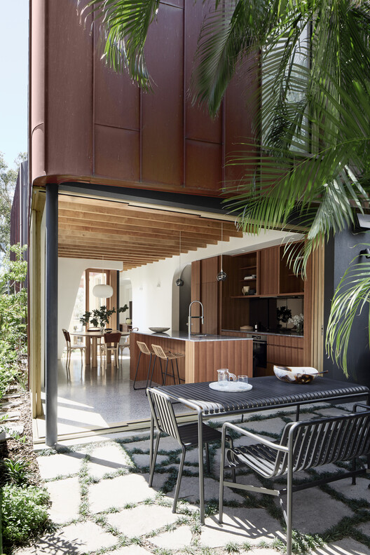
The main living level above uses the full building envelope for a light-filled sequence of spaces. A central courtyard punctuates this level, separating the kitchen (which opens to the rear courtyard) from the living room (that flows onto a sheltered balcony). Curved windows wrapping the courtyard allow sightlines through the entire sequence of spaces.


“The central courtyard was an early idea we developed to gather light and segment the living level into zones, which we think is more interesting in a small space, rather than that feeling of just being in one long room.” Conrad Johnston, Director

The bedroom level above is wrapped in a curved wall of copper that screens for privacy to both the top floor and living level, projecting in a blade out to the northeast. Planting channels along the base of the copper walls wall feed into the central courtyard, further screening the house in time as the vegetation is established.

Materials. Materials were chosen to reflect the concept of a small, strong building that's both defensive and private. The office plinth is clad in Sydney sandstone, while the bedroom and living levels are clad in copper, which over time, will develop a rich patina of colour variations.

Inside, the challenge was to give the relatively compact interior an atmosphere of substance and warmth, without overlaying too many textures. The living room’s concrete floors are warmed with exposed timber ceiling beams and western red cedar windows and doors. The kitchen joinery is timber with dark stone benchtops.

Disappearing act. What can only be appreciated from the outside is how the architects have formed the building to be a generous neighbour, using its setback and deep balcony to offer up extra open space along the tight public walkway, as well as light to its north-west neighbour. Another concession to the street and the owners is that the downstairs home office guest suite has been designed for future conversion to a car space, should the next owner wish to do that.

What the clients say. “We were also really surprised at how the architects solved the privacy issue: the angled walls mean you can't see the house next door. Living here is like being on holiday. On the living level, it almost feels like you're outside because you see right through the house to the trees outside. And mid-winter, if the sun is shining, it actually feels like summer inside.“


