-
Architects: Nestcraft Architecture
- Area: 1200 ft²
- Year: 2021
-
Photographs:Redz Photography
-
Manufacturers: ATOMBERG, Asian Paints, Changi, Fenesta, Finolex, Jaquar, Legrand, TRUTUFF, Tata Steel, Ultratech
-
Lead Architect: Rohit Palakkal
Design Concept & context - A ‘man cave’ for the architect which manifests his life, his inner likings and amplifies his aura as a person. A space for his team, his family and friends and for the people who want to utilize his expertise. A platform that facilitates the exchange of ideas, learning, gatherings, leisure, work and living. A place that perfectly fits his build/make as a person and an Architect. A casual setup for the team suggests a homely but meditative space to keep maintaining the creative mood. We metaphorize the wholesome objective or intention to find out that unique out-of-the-box element, ideology and philosophy in our design as ‘VIOLET’. Violet-The Architects office.
Innovation - The linear orientation of the building in east-west with openings flanking the width of the building (5 m) allows an ever-changing mood of natural lighting inside the space and cross ventilation. The east light in the morning navigates right through the entire length of 15 m of the building and vice versa with the dawn west light.
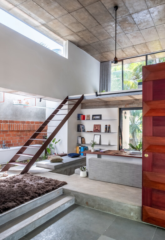
Planning - The plan is having minimum external walls and no internal partitions. It's a single floor room with 5 m height having 2 mezzanine floors at the east and west ends. While the ground level inculcates 12 workstations it has a south entry grant foyer right next to the main door conceiving a waiting lounge and the admin desk. The mezzanine on the west has a mini pantry accessed through a spiral staircase and the one in the east has the Architects space. The east side is more casual and more of an interaction space and the west is dictated to be a formal workspace.
Space - Atypical to any design approach, the project displays a strong sense of desire to get away from the dogma of facade architecture by responding to the grass-root principle of keeping it simple, engaging and blending material and color palette with contemporary undertones. The indoor and outdoor spaces are juxtaposed in such a way that both the spaces merge into one another rendering a feel of the open office concept creating an inspiring place for visitors.
The single room open office concept promotes interaction, transparency, teamwork, open discussions and a vibrant learning atmosphere which helps to create a noble project. The altering space volumes/heights within the hall suggest a variety of spatial experiences. The double height in the grand foyer and the minimum height mezzanine floors at 2 ends suggests an array of visual connections within and outwards the building. The conversation pit, the mezzanine rooms, staff workstation, the patio, the front yard and the terrace offers different permutations of interactive spaces.