-
Architects: Kresings Architektur
- Area: 5640 m²
- Year: 2020
-
Photographs:Nils Koenning
-
Lead Architects: André Perret, Christian Kawe, Anna Wedi, Stephanie Reif

Text description provided by the architects. Standing at the crossroad of demolishing the building and creating something all-new or keeping the exciting design done by someone else. The easy solution would have been to start over. But we didn’t. We believe we owe it to ourselves to try to maximize the lifecycle of buildings and products that we or others put into this world.

The project is located near the Rhine harbour of Neuss - between an industrial area, “aged” office buildings as well as the old village streets lined with small residential houses – a diverse neighbourhood rich in typology and contrast.

The client brief was to retain the existing office building on site and to create a communal environment that combines individual work areas with areas that all office tenants share and use together. There is a small kindergarten with two groups, there is the “Werftraum” living and dining room for everyone’s use and there are the organized sports sessions for all to participate in – fostering a village-like atmosphere within the building.

In regard to sustainability, the task was also to rejuvenate, modernize and extend the project by using predominately low tech/low-cost solutions and to use as few resources as possible.

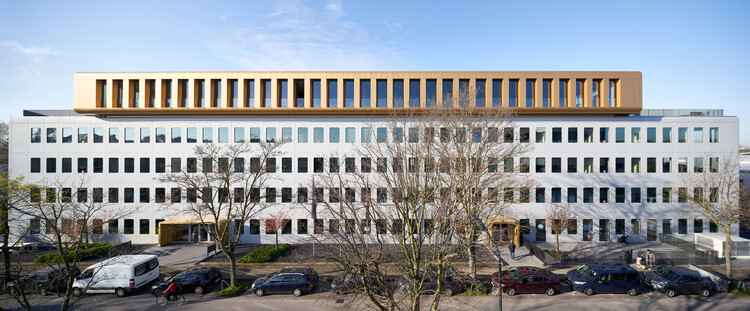
The existing four storey office building from the early eighties with the metal panel curtain wall façade and the distinctive rounded window cut-outs was a sleeping beauty. The original design incorporated the potential for adding two more floors to the existing building at a later stage. The columns had load capacity left and the façade had joints to potentially continue with the panels upwards.


Rather than just adding a floor in the shape of the original building we intended to showcase the rooftop addition as a landmark of change.

Although the round-corner geometry of the rooftop box follows respectfully the DNA of the existing building, the new building volume sits independently on the existing building, proudly cantilevering over the front façade. Full height windows maximize the views out and deep recesses shade the windows to minimize the need for external sun shading.

The gold colour of the cladding material sets a warm contrast to the silver and grey scheme of the base building. The rooftop box opening to the East and West with all-glass facades – maximizing the views of the river and the skyline of Düsseldorf. Wide stairs with seating steps lead down to the terraces.

The interior design of the existing building is derived from the industrial heritage of the precinct. The glass partition walls, the metal washbasins, mailboxes as well as the building and tenant signage are all manufactured by a local locksmith that has workshops within walking distance. Many of the solutions were developed early on in collaboration with local tradesmen and contractors to achieve the best outcome.


The original building structure is being left exposed – the ceilings, columns, and core walls – to tell their stories of the past. Where possible interior finishes – like the white marble for the lobby and stairwells – were kept, fixed up and polished.
The building has proven to be the intended catalyst of change for the area – new faces and new ideas are appearing; the neighbourhood is busier after hours and new rebirth projects are at the horizon for the near future.


