-
Architects: Masquespacio
- Area: 1507 ft²
- Year: 2021
-
Photographs:Gregory Abbate
-
Manufacturers: Complementto, Mosaic tiles
-
Lead Architect: Luca Gobbo

Text description provided by the architects. The aim for the project was to create an identity with a clear focus on the younger generations and at the same time represent a more sophisticated approach for a high-quality hamburger restaurant.

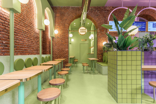
During the last years there is a strong growth of hamburger chains, although most of them are opting for a vintage & industrial look for their spaces. The design developed by Masquespacio for Bun takes the opposite direction and seeks to create an innovative concept that showcases the authenticity of Bun and its smash burgers. This way Masquespacio has used gold touches and terrazzo tiles mixed with a splash of color that creates a sophisticated, but at the same time fresh design.


The project itself although starts from the investigation of the existing elements of the space with the aim to integrate them into the overall design aesthetic.

Ana Hernández, creative director from Masquespacio: “When we saw the beautiful bricks and arcs from the space it was evident for us that we would use these 2 elements as the starting point of the design.”


To create a uniform aesthetic through the space Masquespacio added additional arc forms with a green and purple color through the whole space, some totally independent and others are highlighting the already existing arcs from the interior architecture.


Additionally, the wooden table tops and plants represent the healthy and zero plastic identity from Bun.


