-
Architects: Part Office
- Year: 2017
-
Photographs:Anna Beeke
-
Architect of Record: Creative Space
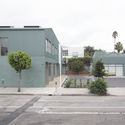
Text description provided by the architects. The Fairfax garage project is the conversion and addition of a former mechanic and auto-body shop to a mixed use retail and office space through the exploration of typologies within the ambiguous setting of a Los Angeles mixed-use district.
Located in the West Hollywood/Fairfax neighborhood of Los Angeles, the site is adjacent to the transition from a smaller, two-lane pedestrian-friendly shopping district to a larger, four-lane driver-based thoroughfare.
The project aims to expand this commercial district by addressing this shift from pedestrian to commuter. Additionally, it had to reconcile the variety of immediate contexts; a former industrial building with new commercial tenants in a relatively residential block.
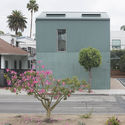
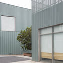
The new aluminum siding is a nod to the metal paneling of the former garage, but is elevated with a jade green color, monolithic application, and minimal details that avoid standard flashing profiles or exposed drainage. The two scales of siding on the larger building shift at the transition from the existing volume to the new addition, while the perforated paneling surrounding the smaller structure maintains visibility of the existing masonry building, which needed to be retained in order to preserve grandfathered zoning allowances.
The sloping rooflines acknowledge the scale the adjacent bungalows, many of which now serve as creative offices. This pitch also directs attention to the rear of the site, where a new courtyard has a shared garden for the tenants. The profile also conceals the mechanical equipment on the roof.
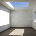
The new storefronts reference the scale and location of the previous roll-up garage doors, with windows on the second story that are more residential in intent. The upstairs tenant also has a large, covered outdoor patio with a skylight, which continues the roofline while avoiding adding additional square footage to the project, which was at regulatory maximum.
Other interior finishes were kept minimal for individual tenant build-out. A mix of high and low characterizes the palette, with graphic linoleum flooring and bleached cork walls in the central stairwell.