-
Architects: HEMAA
- Area: 6888 ft²
- Year: 2019
-
Photographs:Rafael Gamo
-
Manufacturers: AutoDesk, Louis Poulsen, Adobe Systems Incorporated, Grato, Mosti Sistemi, Robert McNeel & Associates, Tua Casa / Arrital
-
Lead Architects: Alejandra Tornel, José Miguel Fainsod, Santiago Hernández Matos

Text description provided by the architects. The project consists in the overhaul of an existing structure that has been subject of several modifications throughout the years. After some research on the property, we were able to trace back to the original documents of the house, designed by the renowned Mexican architect Augusto H. Álvarez back in the `50s.
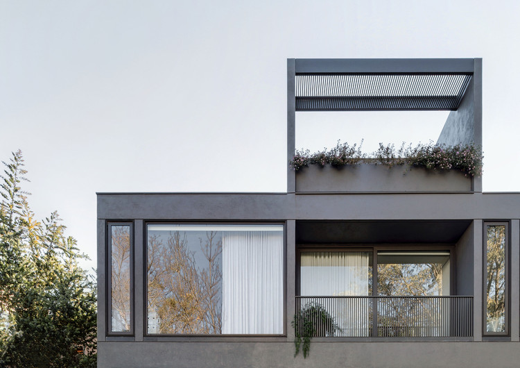


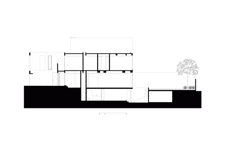
We decided to align our proposal to the base grid plan of this construction, which assembles the distribution of spaces around four structural axes every four meters. We planned on a simple architectural volume facing the interior garden and, upon our client’s request, an appropriate façade towards the street that offers security and privacy.

The intention is that of evoking the lines of Mid-Century Modern Architecture through materiality traits and the exaltation of order and structural elements. The layout of its spaces seeks to convey a sense of constant openness and connection with the exterior.

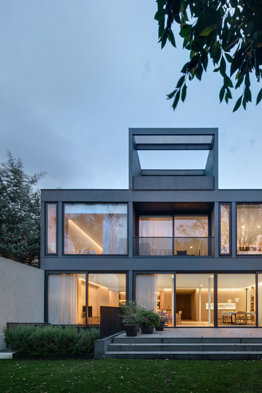
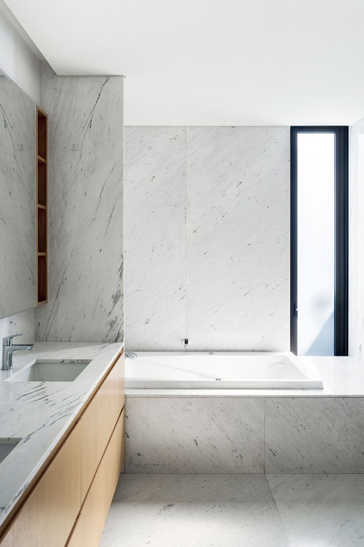
Its dark gray stucco façade emphasizes its tectonic and monolithic essence. On the other hand, light oak wood panels and modules in the interior gracefully marry the contrasts and neutralize the light, creating calm, fresh and organic spaces.

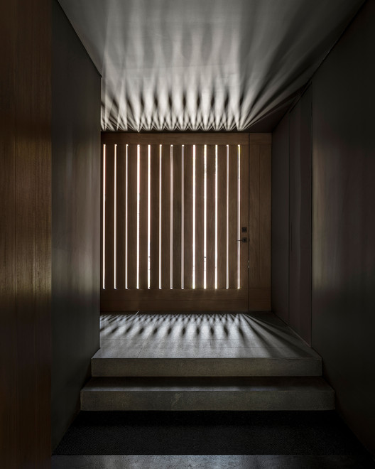
A privacy sequence of the habitable spaces is determined throughout the different levels of the house. The access is located at ground level, right at the front. A chiaroscuro lighting effect welcomes guests into the house’s foyer that leads into the living and dining room areas, which are connected to the library and kitchen. Four bedrooms and a family room are to be found on the second floor. The third level features an exterior terrace and a perfect space specifically designed for wellness-related activities.
The final functionality of the project is in line with the arrangement of its architectural elements. Such is clearly seen on its façade, it works as an X-ray of the building giving us a glimpse into the life within its structure which transforms as the day goes by, thanks to reflections and transparencies that smooth out and blur the lines between the interior and the exterior of the project.
