-
Architects: buck&simple
- Area: 140 m²
- Year: 2018
-
Photographs:Simon Whitbread
-
Manufacturers: AutoDesk, Astra Walker, Brightgreen, Creative Canvas, Escea Fireplace, Mr and Mrs White, Oliveri, Onsite, QUICK-STEP, Smeg, Tera Nova, Urban Lighting, Vental

Text description provided by the architects. Crisp House involved the transformation of a modest 1.5-bedroom brick veneer cottage into a light-filled, environmentally inclusive home for a young family of 6. A calming palette with considered resolve settles the home into its complex context with a sophisticated arrangement of architectural prospect and refuge. The site is quite unique, a 180sqm of useable land and a battle-axe block surrounded by 8 neighbouring properties. The locality allows refreshing vistas of unobstructed natural features in multiple directions from the new first floor addition.

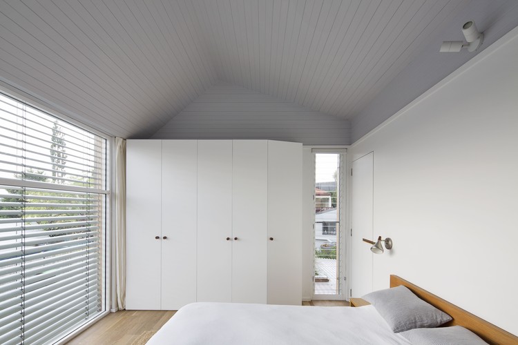
The design addresses heavy planning controls and turns them into opportunities. The resulting form is on the one hand a response to setbacks and neighbouring solar penetration and on the other hand, the roof geometry was driven by environmental consideration. Internally, the pitched upper floor ceiling has been directed to vent rising hot air through various forms of operability and fenestration and turn its back to prevailing storms.


The upper floor is clad in a structural blackbutt screen that acts as a weather barrier. the screen is fully ventilated behind to allow heat to dissipate before entering the outer skin of the facade. lower floor windows are also blackbutt where maintenance is anticipated, upper floor hard to reach windows are white framed aluminium to reflect the heat.


The internal finishes have been developed for a minimal palette of concrete, naturally finished timber or white painted surfaces. every nook has been considered and formed into functional space in order to create variation throughout.


