-
Architects: MAK Studio
- Area: 4509 m²
- Year: 2017
-
Photographs:Brad Knipstein
-
Manufacturers: Alvarado Tile and Stone, COLLIER WAREHOUSE, California Shower Door, Luminalt, Melissa Mac Donald Metalworks, Old World Doors, Warmboard, Wyattstudio

Text description provided by the architects. This project is the transformation of a 1930’s warehouse into a modern, multi-faceted residence and working space. In collaborating with the owners’ vision for space as a center for creative conversation, community, and the arts, the new architectural design facilitates the convergence of various programs while serving the needs of the family. With the intent to preserve the industrial character of the existing warehouse, Natoma works to compose a rich experience of light, material, and functionality.


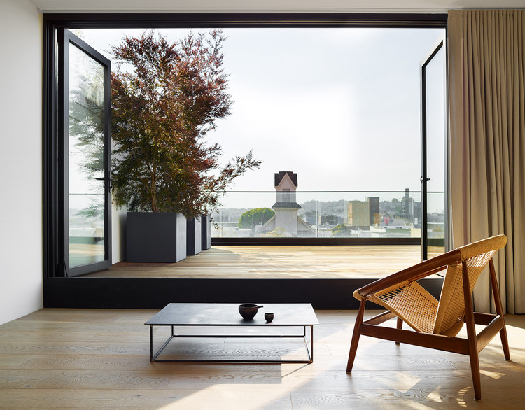
To overcome the light and air flow challenges common to many urban infill sites, the design introduces a series of conceptual vertical voids into the building to allow for natural light to reach the bottom levels. A four-story interior atrium descends throughout the building, gaining access to air and light atypical of many other lots in the neighborhood. Mounted on the four-story wall of the atrium is a 40' long steel sculpture. This sculpture visually connects all four floors through large windows and openings onto the atrium. Decks create additional opportunities for light on the top levels.


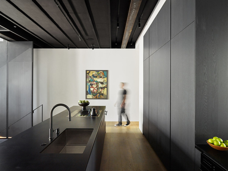
Natoma employs materials that maintain the industrial sensibility of the building while adding an element of warmth. At the core of the living space is a grand, industrial staircase fabricated out of black perforated metal. Upon entering the ground floor, one can look up and see all the way to the top through metal grated stair treads. Walls are often clad in dark bronze mirrors to help reflect light and erase the boundaries of rooms. A delicate black veil of perforated metal catches the soft afternoon light and circulates it down to the main living and ground floors.


The character of the building is kept through exposing the structural steel beams and original ceiling joists. In contrast, the design explores the use of non-conventional building materials. A recycled composite paper material often used at skateparks, is utilized throughout the building on stair treads, kitchen counters, and kitchen island cladding as an affordable, durable, and conscientious choice. On the exterior, the building is clad with vertical steel slats – befitting the neighborhood’s industrial nature while also discouraging graffiti.

Large volumes of space are transformed into welcoming, multi-functional areas that serve the family’s many interests while maintaining a grand sense of scale and openness. A soundproofed room is located downstairs as an office and recording space with a network of audio cables hidden in the walls, serving both the husband’s day job purposes and passion for playing and recording music. An adjacent flex room serves as a gathering space for conversation and collaboration. Its expansive walls are designed to feature the artwork of young artists participating in a non-profit organization started by the wife and son, serving the local community. Rooms are left minimally dressed in order to keep spaces open for private gatherings.


