-
Architects: Bundschuh Architekten
- Area: 6851 m²
- Year: 2020
-
Photographs:Laurian Ghinitoiu
-
Manufacturers: GIRA, Atlas Schindler, Bembe, Durach, Hormann, Lindner, Schüco, Warema

Context. The site is located on a site in central Berlin. After being razed by the authorities at the beginning of the 20th century, the area was developed by the Architect Hans Poelzig as one of the first major urban renewal schemes in Germany and subsequently partially destroyed during WWII. Our design for the Ensemble of german publishing company Suhrkamp references both the physical context as well as the rich history of the surrounding area. Urban scale The project redefines the urban block as a heterarchical antithesis to the standard hierarchic berlin Block which typically articulates a „show“ facade and urban spaces of secondary value in the interior of the block.


The individual buildings of the project cease to have front and back facades but are surrounded by continuity of public and urban space. The private becomes public and vice-versa. The south-facing public square is formed by the positioning of the main building to the north and thus completes the sequence of public squares and parks. It both opens the block and closes the urban figure of „Rosa-Luxemburg-Platz“ which is centered around the Volksbühne Theater. Facing busy Torstrasse to the north, the project presents itself more closed, the cantilevered volume connects the neighboring facades and recreates the historic street front in an abstract manner. The strong horizontality references the formal dynamic of Poelzigs architecture and translates it into a contemporary language.

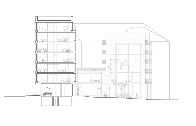
Functionality. The Ensemble consists of three parts: The publishing house, an extension office building, and a residential block. All ground floors have high-frequency uses such as an art gallery, Restaurant, and an e-bike store. Publishing House The 6 floors of the publishing house are connected by a „narrative“stair. This central element of the design enables free movement within the various (vertically located) departments and stages of bookmaking. At the same time, this stair defines a strong concrete pillar that grounds the architectural volume in the urban fabric. Thus, the narrative stair functions both on an urban and interior design level and was one of the central ideas of the spatial conception.


The office floors are divided into the large open-plan spaces to the south and individual rooms (for the editors) to the north. The facade mirrors this spatial approach, with expansive fixed-glazing openings to the public square in the south and smaller, more vertical proportions to busy Torstrasse in the north. The spatial idea of the office thus operates on the urban, architectural, and interior scale. The Shelving and furniture designed by Kinzo complement this approach to include the detail level, creating a unified approach in all scales. Residential The residential units are grouped together in a concrete-faced block, large fixed glazing extends these spaces into the urban realm and connects them to the public square.


Materiality and Construction. All interior surfaces remain in rough, exposed concrete, contrasting with the smooth and sharp-edged aluminum facade with expansive fixed glazing. Operable aluminum panels open like scales and connect the workspaces with the urban realm. Office spaces are mechanically ventilated and cooled through a passive cooling system embedded in the concrete ceilings.


