-
Architects: AD+studio
- Area: 250 m²
- Year: 2019
-
Photographs:Dũng Huỳnh
-
Manufacturers: Dulux, Hafele, Toto, Vietceramics
-
Lead Architects: Nguyen Dang Anh Dung

Text description provided by the architects. Although most of the recently built house rows in new urban areas had planning management advantages, they still faced architectural aesthetic problems. There was also a lack of diversity in space settings and a dull uniformity among modular elements which decreased the area’s uniqueness and vividness.


Those perhaps were the reasons that many people are not interested in this kind of construction. Gradually unused buildings became stockpiled and started to deteriorate which led to the area being deserted. The former state of the building was 2 adjacent houses – one house was sandwiched and the other on the corner of the street - in a new urban area in Ho Chi Minh city. They were identical in appearance, separated vertically. They had the same problem as in many other prefabricated house rows.

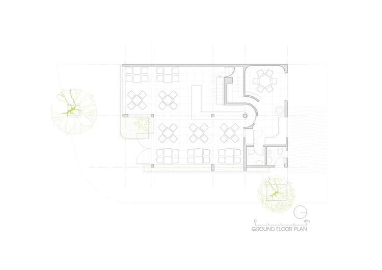
The owners, who are a young married couple, have simple requirements on the house’s function. We take advantage of this by utilizing the house’s on-the-corner-location. The design proposal suggested the majority of ground floor for business as well as installations of flexible window system. This created an open space highlighting liveliness for the area. The wall separated 2 houses was removed. The new design preserved the structure and basic layout with the staircase being reconsidered; the house on the corner was remodeled for communal use. Merging of 2 houses followed the natural horizontal of topography instead of the initial artificial vertical lines.


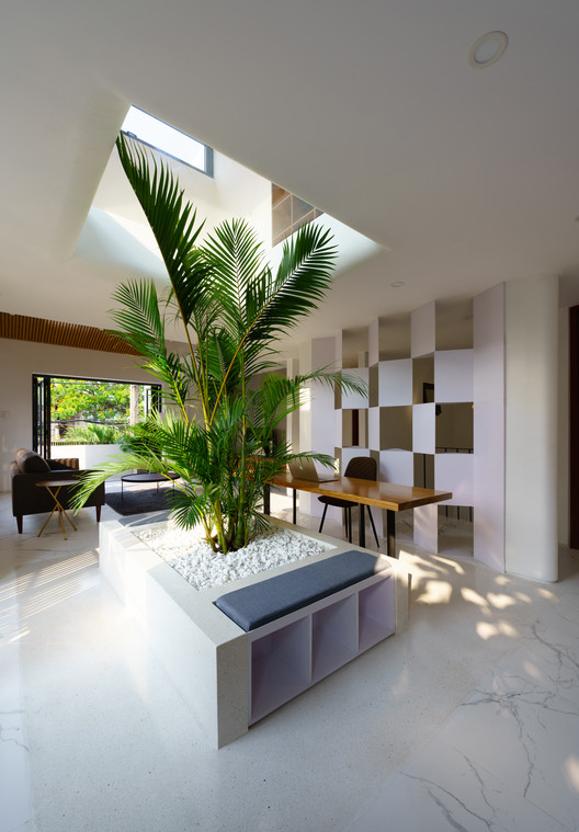
In the new design, we embrace and emphasize the harmony between the slight curvature of the balcony and the changes in level of the 2 houses through the vertical barrier screen surrounding the balcony together with a green buffer zone behind. The ordinary balcony has been shifted to volume, creating an effect of boxes stacking as they bite into each other and hover over the communal space on ground floor.

On the main Western façade of the building, instead of simply blocking blazing sunlight, we used a curved wall made of glass in a sudden manner to cover the staircase, making the most of the sunset view. The staircase area set the stage for the transparent and reflective quality of glass. Light, the color of the sky, views from different step levels, are part of the performance. Altogether they created a diverse and sentimental experience as we witness the space changing through every moment of time.


