-
Architects: T-architects
- Area: 240 m²
- Year: 2020
-
Photographs:Tana
-
Manufacturers: AutoDesk, Adobe, American Standard, Hai Long glass, Kova Paint, Trimble, Uma
Text description provided by the architects. We met the client who had a request to design a new 76-square-meter house (4,5 meters wide and 17 meters long) in the urban area of Thanh Hoa, a city in the middle part of Vietnam. The owner wished to have a three-story house providing a space for a family of four people, a young couple and two children. Before the concept stage, they gave us some requirements to follow: a house differently compared to around ones in the neighborhood and a house with a strong connection between the family members.
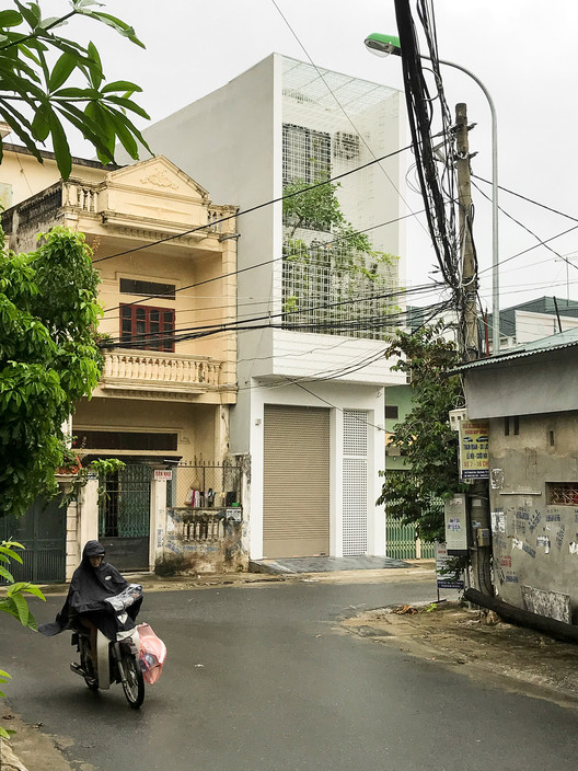
After some discussions, we came up with some ideas for our design which focused on three main points. The first one, we proposed a façade in order to create an open space for residents to have abundant views but they still get a feeling of privacy while living in the house. The façade was made by 10 mm round bars featuring a structure type based on a square-net form. Therefore, people who live in the house could have room for their activities inside but also they still are pretty close to outside space to observe the activity and the natural world outdoor.
The next intention was to design a new way of living for their family by produce many voids in the house. For this purpose, we designed an entre-sol in the middle of the first floor and the second one. By doing this, it has a big void space that links up the living room and the family room so that those spaces are larger for using and could be used flexibly for living activities. Also, there are voids among other spaces in the house, which work as common areas for their family members to share activities in order to build a strong connection between them. Additionally, the voids have brought daylight into the house and produced adequate natural ventilation to give the occupants having plenty of sunlight and fresh air.
The last point, the design has concentrated on user hobbies like to grow trees and keep their garden healthy. To create a small garden in the front of the second floor, the house has a “green face” where tree leaves and climbing plants combine with the round-steel-bar square net, which has contributed a greened surface and defined a new dimension for “art on façade”. We named it “Cage house” since we repeated a design language based on the shape of a cage. The repetition could be seen throughout the house from the square net façade (in front of and behind the structure), the main entrance door, to hand-made bamboo lights in the living room.