-
Architects: BCHO Partners
- Area: 1997 m²
- Year: 2018
-
Photographs:Sergio Pirrone, Kim Yong Kwan
-
Manufacturers: 12Lighting, CNO E&C, CNO engineering
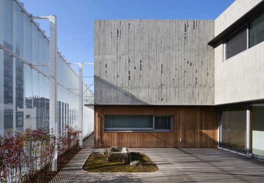
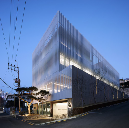
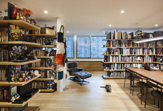
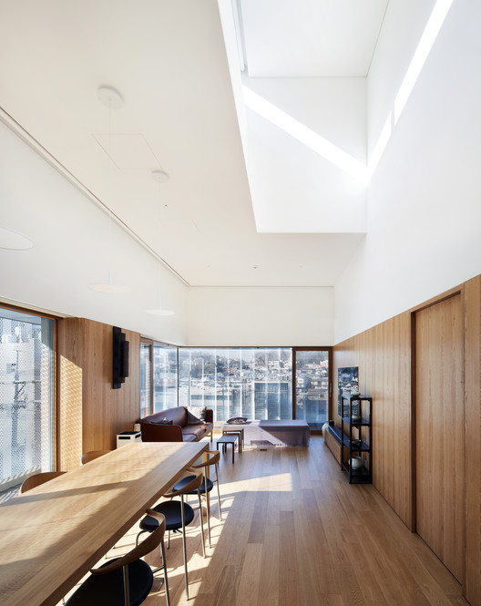
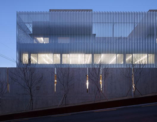
Text description provided by the architects. The GIZI _Art Base is a single building tasked to house four different programs – a commercial space, a gallery, an office and a multi-family housing unit, each of which required a unique spatial definition appropriate to its needs and functions. While the ground floor commercial space demanded easy visual recognition and street access, the gallery, which on the other hand called for a more intimate and private setting for viewing and selling artwork, necessitated a more peripheral placement. The office space needed a calm atmosphere, and the individual residential units were asked to be both separately divided yet connected through a central courtyard. In order to accommodate the disparate and conflicting nature of these programs, each of the four was stacked vertically and unified into a singular mass.
The function of these programs centered around Park Seobo, currently the most predominant living Korean painter. Known for his subtle and repetitive paintings, almost meditative in their consistency and rigorous candor, his ongoing conversation with BCHO on the building became a point of departure for probing a new aesthetic regime for the architecture. These paintings layer their content to such an extent that a subtle depth emerges. The complexity of paint and canvas unites in a mixture which both elucidates the overall concept and draws the viewer into a new level of visual understanding. It is our hope that the various intricacies of the GIZI_ Art Base might too come to reflect this gentle complexity.
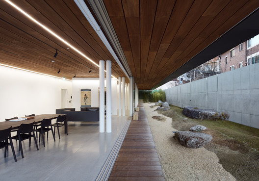
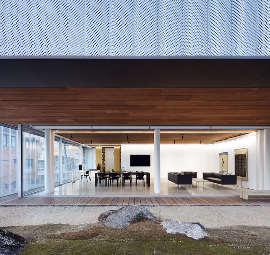
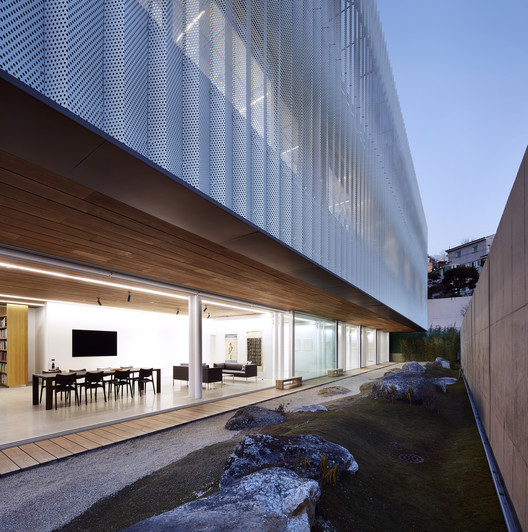
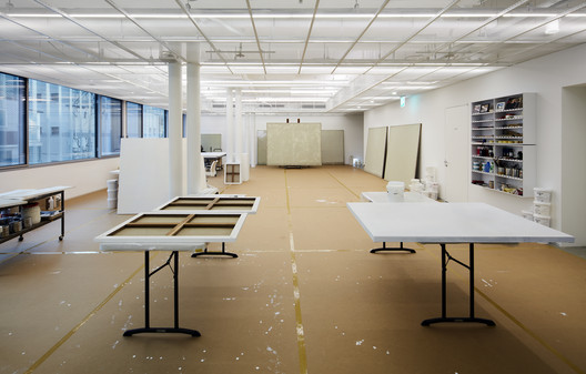
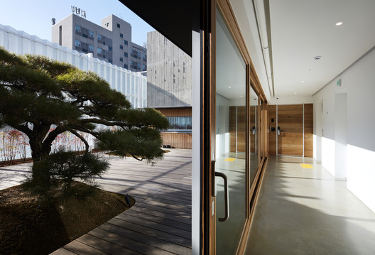
Interior Space and Façade - When designing the ground floor gallery space, achieving spatial and organizational flexibility was a crucial aspect. The size of each vertical support was therefore minimized by using CFT (Concrete Filled Tube) and PT (Post Tension) structural systems. At the same time, utilizing long span cantilevers helped realize a flexible, open space stretching toward the exterior garden. The garden itself was kept simple and abstract, composed only of moss, rock and gravel. This entices a contemplative environment for those viewing the various artworks in the adjacent gallery. Meanwhile above, the privacy of the three households is maintained by dividing the units along a central courtyard.
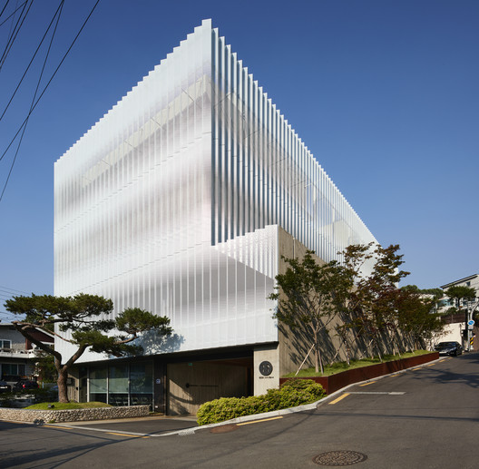
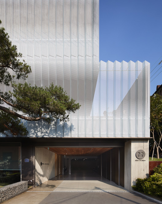
Rather than applying a number of different façades responding to each of the different programs, we devised a singular system that would coherently meet the wide spectrum of architectural needs while simultaneously reflecting a sense of depth and simplicity. It is our hope that it might resemble the layers of complex subtlety found in the artist’s paintings.
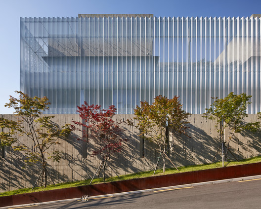
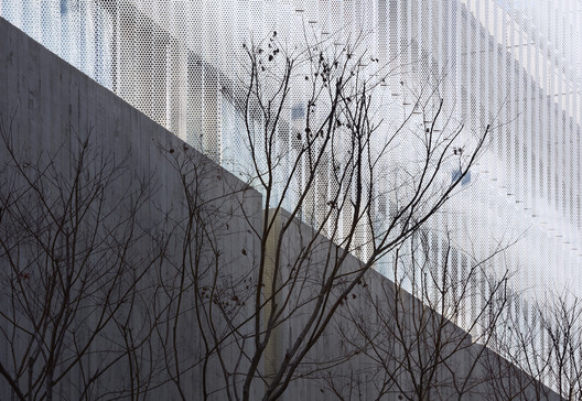
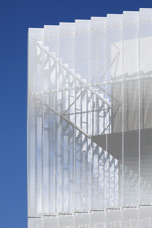
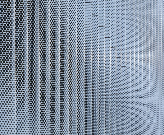
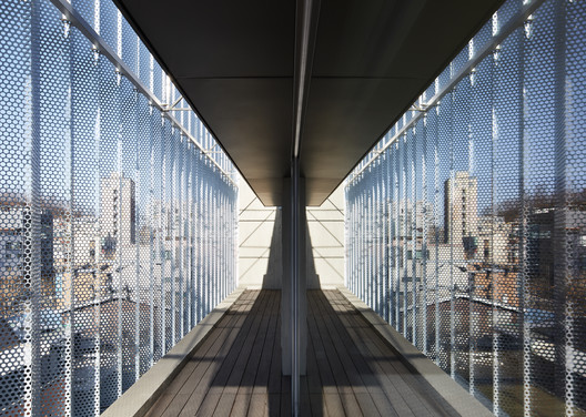
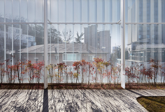
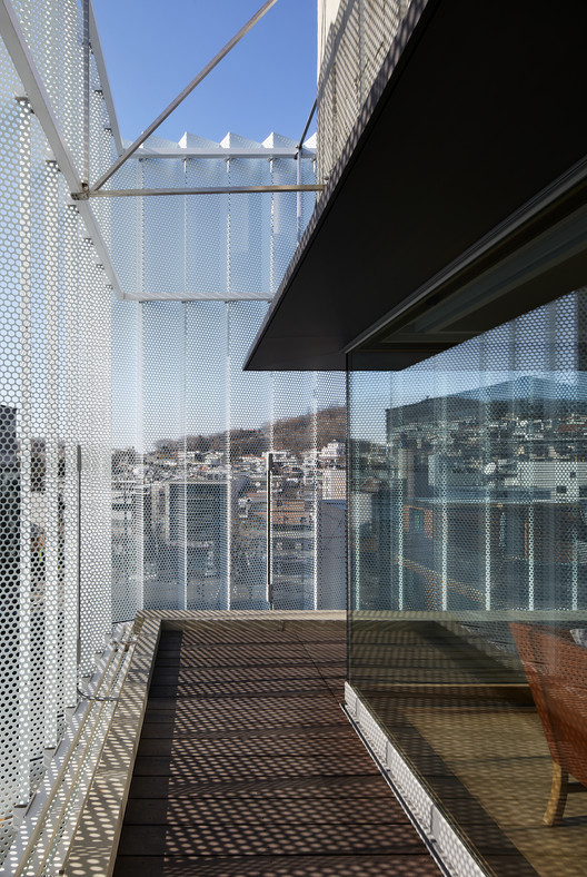
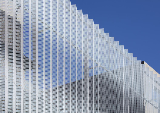
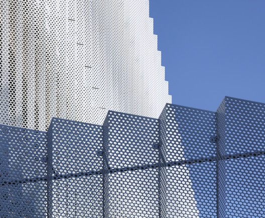
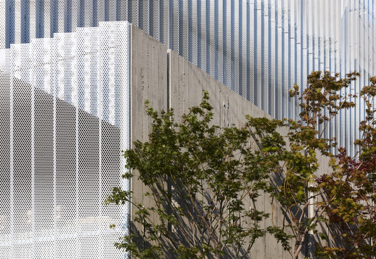
Folded aluminum panels array along the periphery of the building, with various diameters of perforations indicating a hierarchy of visual transparency. Where the panels are most widely cut, they accomplish roughly 70% visual transparency, set between the eye levels of someone who might be standing or sitting. This coaxes a visual connection with the building’s surroundings, while a gradient delineates to roughly 30% transparency along the upper and bottom edges.
The panels are bent at obtuse angles, and, because the folds provide inherent structural rigidity, the need for any additional support systems is negated. In elevation, the folded panels realize a dynamic interface, responding differently to the shifting sunlight and shadow. The changing display of the screen façade adds a layer of depth to the heavy, solid mass underneath.