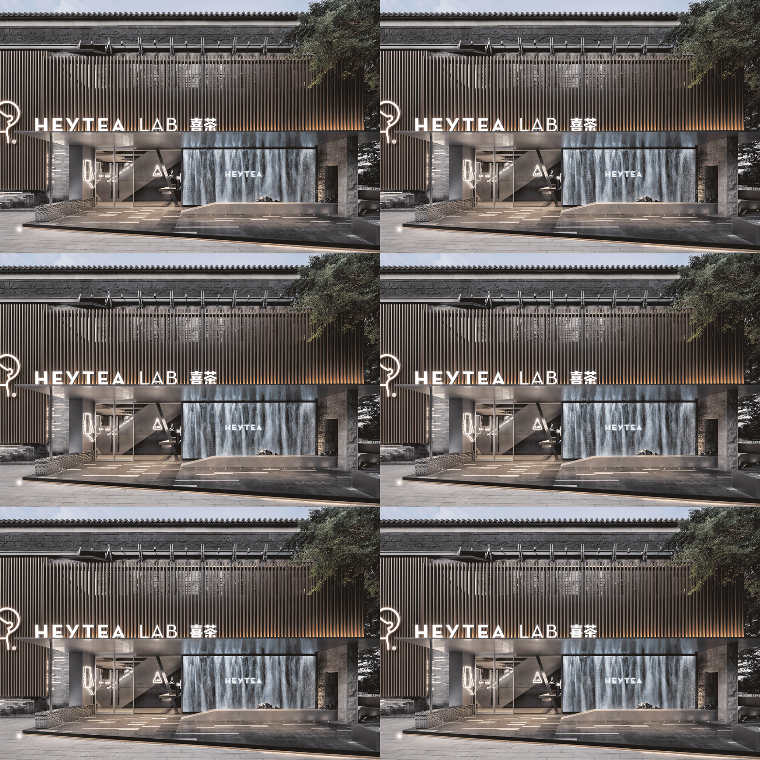
HEYTEA LAB, Shenzhen OCT Harbor Store / TOMO DESIGN

HEYTEA LAB, Shenzhen OCT Harbor Store  / TOMO DESIGN - Exterior Photography, Concrete, CourtyardHEYTEA LAB, Shenzhen OCT Harbor Store  / TOMO DESIGN - Interior Photography, Glass, ColumnHEYTEA LAB, Shenzhen OCT Harbor Store  / TOMO DESIGN - Image 4 of 42HEYTEA LAB, Shenzhen OCT Harbor Store  / TOMO DESIGN - Interior Photography, Kitchen, GlassHEYTEA LAB, Shenzhen OCT Harbor Store  / TOMO DESIGN - More Images+ 37

  • Architects: TOMO DESIGN
  • Area Area of this architecture project Area:  1200
  • Year Completion year of this architecture project Year:  2019
  • Photographs
    Photographs:Sean
More SpecsLess Specs

Text description provided by the architects. The improvement of consumption and the convenience of digitization have promoted the transformation and formation of new consumption patterns and consumer groups. China is accelerating its entry into a new era of consumption. Today, in face of the new consumer groups and new consumerism, how can we help Heytea, a popular new tea brand, to convey its individuality and to demonstrate its business strategies in product innovation, experience innovation and business integration? Optimizing every possible consumption procedure and creating immersive and interactive consumer experience are the basic logic for TOMO DESIGN in the design of Shenzhen Heytea Lab.

HEYTEA LAB, Shenzhen OCT Harbor Store  / TOMO DESIGN - Exterior Photography, Facade
aerial view. Image © Sean

Facing the complex background and business environment, the design is based on the insights of the consumption experiences that the brand will bring to the consumers. The design goes beyond the conventional reference system, deconstructs the consumers’ demands and feelings, and extends the potential value of Heytea in the background. Finally, by planning and operating, TOMO has successfully created the space value and new experiences with unique creativity.

HEYTEA LAB, Shenzhen OCT Harbor Store  / TOMO DESIGN - Image 7 of 42
analysis diagram

Entrance Building
Tracing the origin of the project, the designer interprets the artistic context of the building with a sequence of landscape. The façade of the flagship store is designed by gray bricks, which is interspersed with metal bricks to show both traditional beauty and a youthful atmosphere.

HEYTEA LAB, Shenzhen OCT Harbor Store  / TOMO DESIGN - Exterior Photography, Wood, Facade
GIF. Image © Sean

The large brand logos are placed on the metal grilles and the protruding eaves. The newly-built block is integrated with the existing columns. The stone benches and the metal hills are arranged flexibly for both landscaping and short break.

HEYTEA LAB, Shenzhen OCT Harbor Store  / TOMO DESIGN - Exterior Photography, Concrete
entrance. Image © Sean

At the entrance, the metal grille façade replaces the solid wall, creating a relaxing atmosphere. And the screen behind it displays the beautiful landscape repeatedly. Here, the art of architecture, modern ink paintings, digital technology as well as the “rain curtain” dialogue with each other and show both the collision and combination between tradition and modernity.

HEYTEA LAB, Shenzhen OCT Harbor Store  / TOMO DESIGN - Exterior Photography, Concrete, Courtyard
landscape. Image © Sean

Courtyard Landscape
With a holistic perspective, the designer creates a courtyard landscape with minimalist skills, creating a clear and open pattern which encourages the interaction between landscape, objects and people. Whether it is a sheet-like grille at a 45-degree angle, or the well-arranged seats in the sunken area, or the pavilion designed with modern skills, or the smooth or rough liner benches, it shows multiple aesthetics and effectively activates the ornamental and practical functions of the courtyard.

HEYTEA LAB, Shenzhen OCT Harbor Store  / TOMO DESIGN - Exterior Photography, Concrete, Courtyard
landscape. Image © Sean

The interior space is divided into five different laboratories: the peripheral lab, the ice-making lab, the dessert lab and the illustration lab on the first floor as well as the tea geek lab on the second floor.

HEYTEA LAB, Shenzhen OCT Harbor Store  / TOMO DESIGN - Exterior Photography, Patio
leisure space. Image © Sean
HEYTEA LAB, Shenzhen OCT Harbor Store  / TOMO DESIGN - Exterior Photography, Balcony
leisure space. Image © Sean
HEYTEA LAB, Shenzhen OCT Harbor Store  / TOMO DESIGN - Garden, Courtyard
leisure space. Image © Sean

Peripheral Lab
The peripheral lab is located at the entrance to continue the images on the LED facade and display a variety of peripheral products.

HEYTEA LAB, Shenzhen OCT Harbor Store  / TOMO DESIGN - Interior Photography
H-Gift market(peripheral lab). Image © Sean

Staircase
The geometric staircase leads customers to different labs on the first and second floors, and it is also the visual center of space.

HEYTEA LAB, Shenzhen OCT Harbor Store  / TOMO DESIGN - Interior Photography, Stairs, Handrail
H-Gift market(peripheral lab). Image © Sean

Around the staircase, the metal electronic screens present beautiful scenes of four seasons, reminding people of the limitless vitality and creating an aesthetic connection between customers and the device. When they don’t display special effects, the LED screens also serve as art decorations in the space.

Ice-making Lab & Dessert Lab
Silver metal bar counter, metal grille details, gray emery floor, and sequential bubble lights as well as the ice-making and dessert displays, connect a series of interesting spaces. At the same time, the floor-to-ceiling glass doors create an interactive visual experience between the interior and the outside landscape.

HEYTEA LAB, Shenzhen OCT Harbor Store  / TOMO DESIGN - Interior Photography, Glass, Concrete
ice-making and dessert bar. Image © Sean

Illustration Lab
The illustration lab is open on three sides, enjoying an open and clear view. The designer cleverly emphasizes the brand culture with details and integrates illustration elements into the space. For example, it displays the brand logo on the ceiling lights. Different from conventional commercial design, the seats are arranged in the peripheral, while the center is relatively empty. This kind of arrangement caters to customers’ social demands and provides an immersive experience.

Tea Geek Lab
Stepping up the staircase with LED images changing alongside, you will finally reach the second floor. Here the ceiling is designed according to the pitched roof to form blocks of different textures, against which a moon-shaped art decoration was created. With the moon hanging against the “starry sky” on the LED screen, a beautiful picture is gradually unfolding before us.

HEYTEA LAB, Shenzhen OCT Harbor Store  / TOMO DESIGN - Interior Photography
electronic art decoration. Image © Sean
HEYTEA LAB, Shenzhen OCT Harbor Store  / TOMO DESIGN - Interior Photography
electronic art decoration. Image © Sean

The strip lights and light films are inlaid in the ceiling and the metal grilles to highlight the simplicity and elegance of the space. And the aluminum foam sheet covering the side walls is in contrast with the delicate satin brushed metal. Sitting by the window, you can have a great view of the luxuriant green and feel relaxed and refreshed.

HEYTEA LAB, Shenzhen OCT Harbor Store  / TOMO DESIGN - Interior Photography, Kitchen, Glass
electronic art decoration. Image © Sean

According to its market positioning and business strategies, Shenzhen Heytea Lab is designed as the first flagship store in the city. It is a successful practice based on the analysis of the current consumption habits and trends. By integrating commodity and experience with social function, Shenzhen Heytea Lab is devoted to providing brand new consumption experience.

HEYTEA LAB, Shenzhen OCT Harbor Store  / TOMO DESIGN - Interior Photography, Column
secondary entrance. Image © Sean

Project gallery

See allShow less

Project location

Address:Shenzhen, China

Click to open map
Location to be used only as a reference. It could indicate city/country but not exact address.
About this office
Cite: "HEYTEA LAB, Shenzhen OCT Harbor Store / TOMO DESIGN" 05 Feb 2020. ArchDaily. Accessed . <https://www.archdaily.com/933048/heytea-lab-shenzhen-oct-harbor-store-tomo-design> ISSN 0719-8884

GIF. Image © Sean

深圳喜茶LAB旗舰店 / 東木筑造

You've started following your first account!

Did you know?

You'll now receive updates based on what you follow! Personalize your stream and start following your favorite authors, offices and users.