-
Architects: Macaxá Arquitetura
- Area: 538 ft²
- Year: 2019
-
Photographs:Gisele Rampazzo
-
Manufacturers: AutoDesk, Amanda Lopes Rodrigues, Amorim, Andra Iluminação, Cortinas Carmelita, Fernando Jaeger, Leroy Merlín, Marcenaria Made Marchi, PD Maquetes, Tokstok, Trimble Navigation, Via Narte Revestimentos
-
Lead Architects: Bruna Giannini, Júlia Cabrera
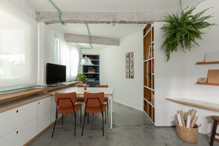
Text description provided by the architects. The Macaxá Arquitetura office headquarter’s project was born with the intention of reflecting in its own space, the main concepts that the architects believe were important for the creation of light and cozy spaces in addition to its identity.
The office that is located in back of a school in the Aclimação neighborhood. It has two floors which helped in the organization of the program, and a triangular plan that was the main challenge of this Project.
On the ground floor, the idea was to integrate the entire environment from the demolition of the central wall that used to divide the space. In the middle of the open plan, the decision was to minimize the corners of the property from carpentry designs that filled them and occupied the maximum of the perimeter, leaving the center free for the meeting table. The old floor was also replaced by burnt cement which starts in the entrance, continuing on the ground floor reaching the upper floor.
In addition to that, the desire to define an identity for the space was reflected in the materiality chosen for the office. One of the walls and the beams were stripped, bringing two new materials and textures to the space: brick and concrete.
Another important element in the property that remained after the renovation was the helical staircase. In order not to make major changes to the structure of the house, the idea was just to restore it so that it would bring more color to the office entrance.
The upper floor followed the main concepts designed for the ground floor. In the same way, we kept the perimeter occupied with work desks, bookshelves and living spaces. Furthermore, the desire to bring light to the interior of the office guided the decision to replace an old piece of furniture embedded in the wall with an extensive vertical window.
Finally, it was decided to carry out a total renovation of the bathroom, keeping only the existing window. We relocated all the hydraulic installations and following the premises of the other ambiences, the corners were also key pieces, one of them was occupied by the stone top and the other by a support cabinet that also helped to reduce the deep look caused by the triangular plant. The floor was given a light blue hydraulic tile and the walls were partially covered with a square ceramic that was highlighted with the earth-coloured grout.