-
Architects: One Plus Partnership
- Area: 1854 m²
- Year: 2019
-
Photographs:Jiangnan Photography
Text description provided by the architects. As a commonly used building material, wood is widely selected for architectural, interior and landscape spaces. Wood pattern always give people the sense of warmth and comfort. Hence, the designers have decided to pay a tribute to this traditionally used material, wood with a modern twist.
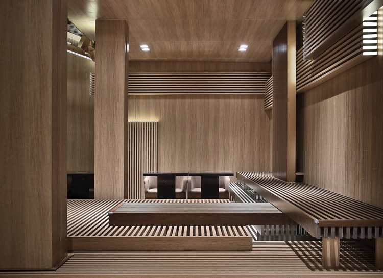
Real wood cannot be used within the interior as a decorative material because of national fire safety standard. The designers have thus thought of using other methods to illustrate the wood textures, e.g. aluminium plates and marbles furnished with wood pattern. The natural forms of trees are very essential during the design process. Trees grow upwards from the ground, then the branches would spread out horizontally - this has built the foundation of the wood pattern arrangement throughout the whole space. Every single detail that you could find in the space follows this natural growing mechanism. From the floor marble combination, dynamic wall installations to the layers of ceiling decorations in various heights - everything follow the natural rule of tree development, which makes the entire space a pleasant organic extension of the wood pattern.
The custom-made seatings in the lobby lounge area also echo with the design concept. Various rectangular-shaped blocks with wood pattern stacked on top of each other playfully to create areas for people to sit or lean on. Through all these careful setups, the designers would like the audience to feel the warmth and comfort that natural wood could bring. The special lightings on the ceiling and wall highlight the colour and arrangement of the wood pattern. The extended decorative lightings on the ceiling and the designated lightings work well together and bring people a sense of ease and comfort. All these lightings interspersed horizontally and vertically, which construct a strong visual effect that is so enduring and remarkable.
In the auditorium, the designers have simplified the design of the overall space and use only the mild contrast of blue and gray to illustrate the vertical extension towards the ceiling. For the choice of the washroom wall material, the designers have picked a marble with a rougher pattern for a distinct touch. The gigantic mirrors that build from the ground create a powerful visual impact for this small area.
The designers wish to bring a warm sensation to the audience through this wood-themed design, which is manifested by these unique wood-like patterns. Every single detail of this design has delicately interpreted the concept in its own way, which has established a contemporary visual style and design effect that is very different from traditional wood pattern design.