-
Architects: Some Place Studio
- Area: 5880 m²
- Year: 2019
-
Photographs:Simon Oberhofer
-
Lead Architects: Some Place Studio (Bika Rebek, Daniel Prost)
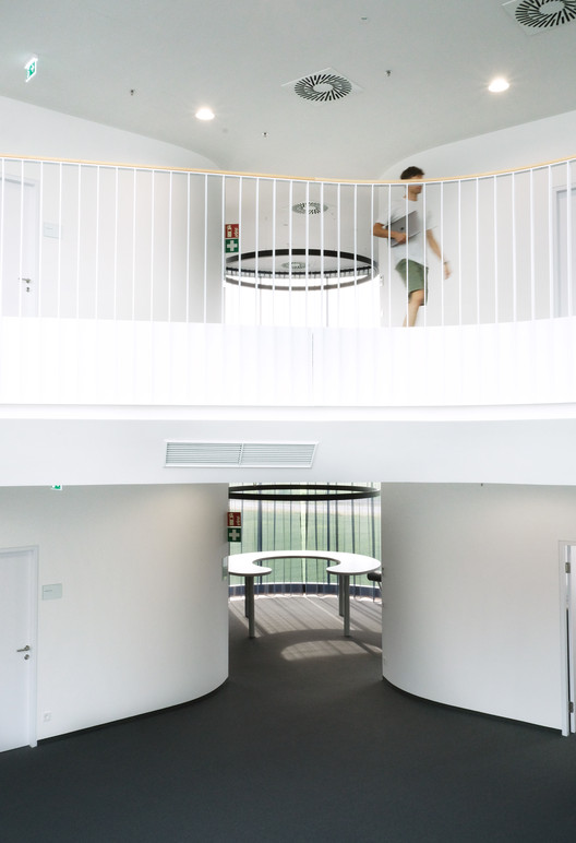
Text description provided by the architects. At the heart of the project sits a light-flooded atrium surrounded by private offices. The atrium is bisected by a sculptural stair, connecting the levels and creating a social condenser. To amplify the connection between levels, the floorplates are changing their outlines, producing overhangs, balconies and unexpected vistas. The offices' spaces are designed to be equitable and provide all employees with large windows, providing natural light and ventilation. A typical office holds 2-4 employees and has direct access to the central courtyard on one side and a window on the other.
Printers and cafeterias are placed strategically to foster encounters and creates zones for casual meetings. On the north side, a circular space becomes a multifunctional space, only divided by a move-able curtain. A kitchen, printer island and circular lunch/meeting room table allow for various uses. The lobby space at the bottom greets visitors with a round desk and a cafe in the back area. The staff cafeteria is also located on the ground floor, offering lunch for all workers from the entire factory.
Through a small cut in the floorplate, visitors enter the ‘market’, the large plaza at the first floor which is also the bottom of the atrium, that becomes the starting point to access a large conference hall, meeting rooms, individual offices or the factory floors. The facade is designed to allow for maximum flexibility on the interior and the equitable office structure, where all offices have similar window sizes. Through a repetitive vertical fin system, the facade is structured to be simple and minimalist, with only one moment interrupting the repetitive system. The rotund encounter spaces become visible on the outside, through a pane of rounded glass.
The ceiling lights, visible from the outside, suggest a cylindrical shape, rotating on the interior of the otherwise opaque building exterior. The landscaping is picking up the rotational theme in a series of wooden platforms designed for the summer months, where employees can sit outside for lunch or coffee breaks. The architectural language takes cues from the machines that the company is building, creating moments suggesting rotating cylindrical shapes and repetitive machinic movements. Combining a metallic, cold color palette, clear cut and precise corners with cylindrical and rotational shapes creates a building in itself reminiscent of a large machine.