-
Architects: saavedra arquitectos
- Area: 220 m²
- Year: 2018
-
Photographs:Onnis Luque
-
Manufacturers: Saint-Gobain, CASTEL, Grupo Arca, MACERE México, Rotoplas
-
Lead Architect: Rodrigo Saavedra Pérez-Salas
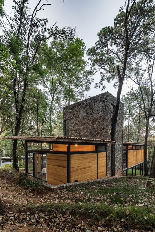
Text description provided by the architects. Casa Luzia is the second country house of a master plan of three houses in Avándaro, Mexico. (the first one is M House). This second land lot has a considerable downslope from the front to the back of the terrain. It rains with intensity most of the year and the lot is located in the natural pad of the rainwater. The big forest trees of Avandaro open to the center of the lot. The architectural program had to contemplate two different scenarios: a young couple with children or two young couples.
Casa Luzia was designed under these circumstances, taking as keys, the downslope of the terrain and the two bedrooms of the program. The rectangular volume rises from underground to float over the gradient. The bedrooms are located on the opposite extremes of the plan, giving privacy and autonomy and creating a tension that it`s solve by the complete openness of the public space.
If in the Mies exercises of the Three Courtyards House aloud the subject (the super-human of Zarathustra) to inhabit the totality of space from anywhere. This house multiplies the subject to co-habit the totality of public space and only found privacy on the bedrooms. This central space is defined by furniture; the chimney and the kitchen bar are elements that hint the limits of the interior areas.
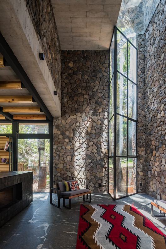
There is something schizophrenic in mirroring modern architecture. Two spaces of similar proportions on opposite arista, that they see them in each other with different definitions, recognizing them in the other but not in themselves. It seems that even though they are identical they will never become homogeneous; summited to the fate of their distance, they create a force that could disrupt the space of architecture. And; as in construction is better to “direct the fissures” the volume of Casa Luzia is broken by stone tower with double height, a heavy and brutal element that “directs the fissure” of space.
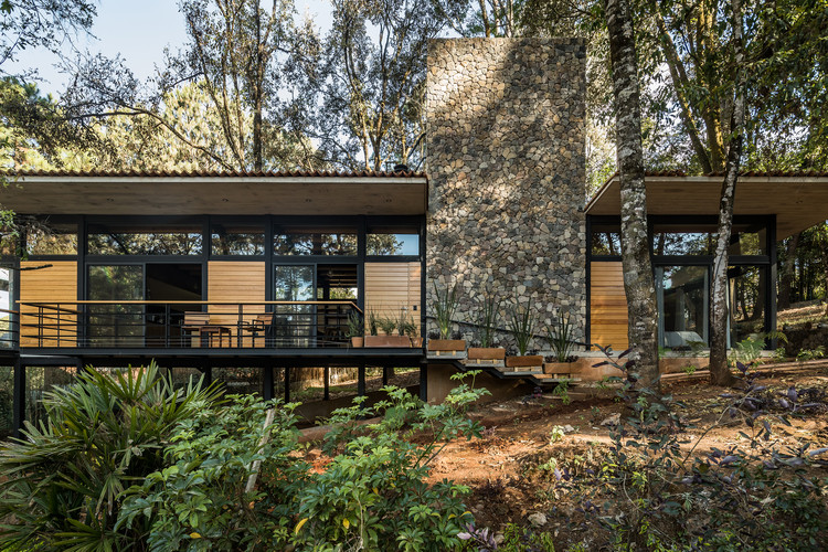
Most of the volume skin is made of wood. It is sustained by a metallic structure that liberates the down part of the house, giving place to a courtyard/terrace that continuous the topography and the vegetation of the terrain.
The wooden skin opens for windows where the orientation and views requires. Two concrete slabs rest over the structure along the volume, only being interrupted by the double height stone tower, which solves the space balance, the material contrasts and the proportion of the house.