-
Architects: Branch Studio Architects
- Area: 85 m²
- Year: 2017
-
Photographs:Peter Clarke
-
Manufacturers: Beeline design, Kartell, Milli, Nest Workshop, Olnee Rammed Earth
Text description provided by the architects. When presented with the opportunity to design this small addition to an existing residence, it was exciting to discover a number of established and significant trees sporadically arranged across the proposed site immediately to the west of the existing building. The brief for a new master-suite consisting of a bedroom, an ensuite and incorporated robes/ancillary spaces also asked for a strong connection to the landscape and the contextual surrounds of the various garden areas. It was resolved early on that the trees on the site would not make way for the new building - and in fact, the concept would explore the opposite - as a more meaningful connection with the landscape could be achieved with the building giving way to, and interacting with, the trees.
The result of this approach is a slender form to fit between the existing trees linking the three distinct programmatic areas in a linear fashion and arranged with an overall modernist logic & aesthetic. Starting as a simple rectangle, the plan evolved through a series of restrained but deliberate formal gestures to directly reference the existing context. A small gouge was made, creating a courtyard space to house an existing silver birch tree to the south. This courtyard acts as the threshold between the bathroom areas and the rest of the pavilion providing separation between the ensuite and the main bedroom spaces. External and internal seating is arranged around the courtyard providing opportunities for contemplation, rest and relaxation.
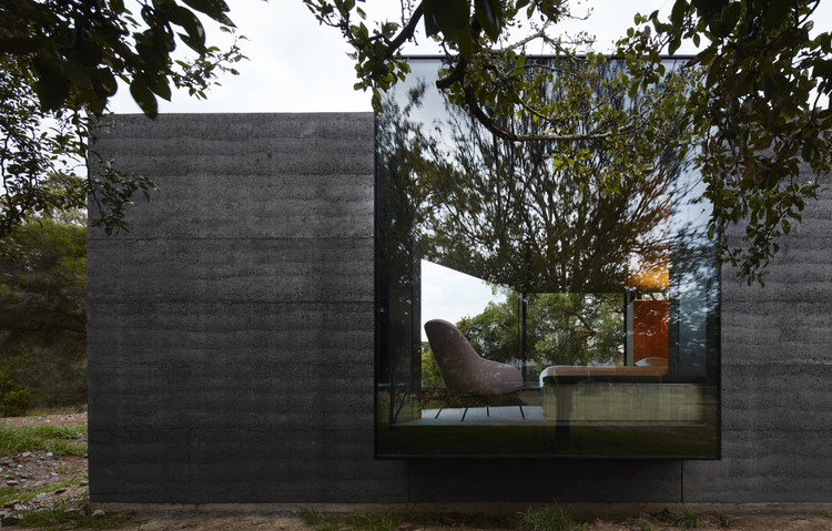
The other formal interventions consist of two extruded window boxes that are pulled out to directly interact with the existing trees adjacent, and, the angular slice to the end of the pavilion to orientate the space towards a view corridor through existing vegetation, towards the setting sun to the west. Entry to the pavilion is provided via the extension of an exiting central corridor from the main house. This central ‘boardwalk’ splits the ensuite areas into two distinct spaces before peeling away into two circulation paths around a central arrangement of joinery dividing and defining the robes. As the spaces unfold the floor level rises gradually (to about 1m above ground level) via a series of platforms that subtly ascend and divide the spaces across the length of the building. With the rise of the building, each programme internally possesses a different relationship with the garden context.
The external material palette of charcoal rammed earth, timber, steel, and glass is purposefully natural and raw in response to the rural context, designed to weather and patina naturally, the building will continue to embed itself into its surrounds over time. Internally the materials are of a similar aesthetic although the detailing is treated with a preciousness which gives the unpretentious materiality a sense of finery. Charcoal rammed earth, timber and honed bluestone are the predominant internal materials with concrete and steel also used for some of the joineries. Brass trims accentuate material junctions, celebrating these intersections and expressing the construction methodologies.
Creating the right atmosphere was a major focus internally. Given that bedroom areas are habited predominantly at the beginning and end of each day, it was important to adequately capture the moods of these times (waking-up/unwinding, washing, and dressing) within the space. This master- suite pavilion aims to provide its occupants with space away from the influences of excessive artificial light and create a more natural atmosphere in which to begin and end the day. This is achieved through the use of indirect lighting, which ensures that the rooms are not overlit, and thus provides the apparent quietness and intimacy appropriate for such spaces.