-
Architects: Schemata Architects
- Area: 85 m²
- Year: 2019
-
Photographs:Kenta Hasegawa
Text description provided by the architects. We designed a rental kitchen named "SUIBA" located in Kyobashi, Tokyo. Due to the spread of the internet, people have grown accustomed to two-way communication between customers and suppliers, and they are therefore no longer satisfied with food and beverage businesses based on one-way communication. As a result, there is a growing demand for shared kitchens for rent.
They are used for various types of participatory events related to food and beverage including exchange parties between different sectors or dinner gatherings where guests can enjoy cooking for each other instead of simply going to reserved restaurants where they just wait for food and drinks to be served. In addition, they serve as showrooms where businesses offer customers opportunities to try their food and products.
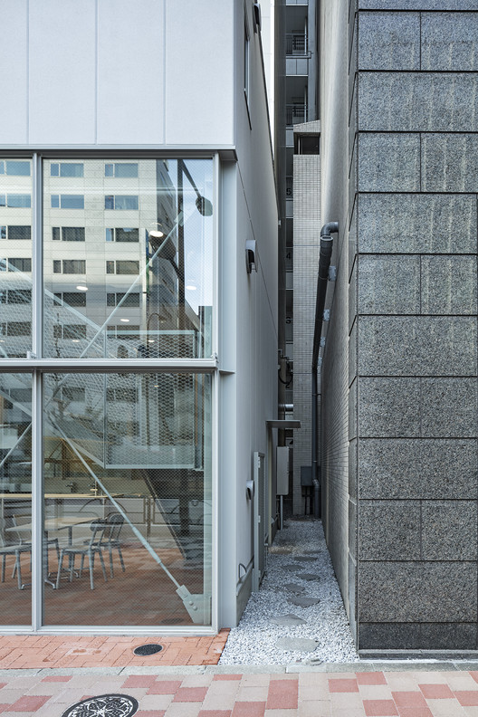
One of the unique characteristics of this building is that people can enjoy looking at it from two different viewpoints––firstly from a close distance and secondly from some distance away from the site––because it is situated along Showa-dori Avenue with a very large road width. Our design was developed in two directions based on the two different viewpoints, namely a "close-range" view and a "distant" view. The owner of this building also owns adjacent properties on both sides, which allowed us to take a closer look at "gaps" between the building and the adjacent buildings and actively incorporate them in our design.
On the other hand, we looked at the building from the other side of the road and designed an extremely small volume (disproportionate to the adjacent buildings) with a high level of transparency that makes one want to peek inside. The two different viewpoints also resulted in two different entries to the building, namely an extremely large sliding door (disproportionate to the building volume) in the front facade and a narrow approach way through the gap between the buildings (on the right side when viewed from the frontal road) leading to a small entrance in the back.
On the backside of the building, we installed a counter outside between the buildings, where people can enjoy good times. As for the interior floor finish, we used the same material as the sidewalk to highlight the highly transparent expression of the front facade (but the pavements were unfortunately and unexpectedly replaced with different materials just before completion).