-
Architects: Núcleo de Arquitetura Experimental
- Area: 1227 ft²
- Year: 2018
-
Photographs:Marcelo Donadussi
-
Manufacturers: Granisul Pedras, Hunter Douglas, Steimebel, Vidraçaria Illusion, Vértice Iluminação
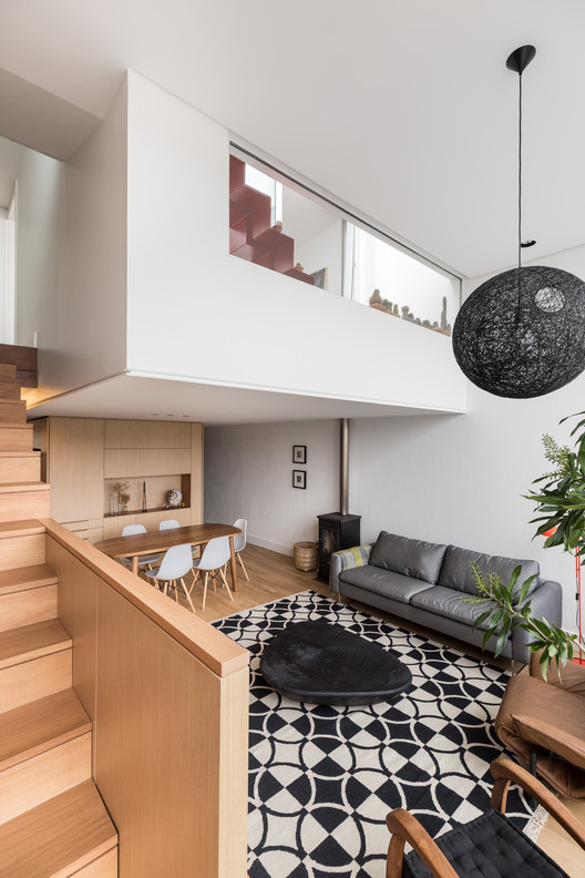
Text description provided by the architects. As the interior design was conceived in conjunction with the building design, there is a close relationship between both styles.
It is a two-storey apartment with a roof top terrace. The first floor is mostly open-plan, combining dining room, living room and kitchen. Just the laundry and the toilet are enclosed by walls. On the second floor, there are two bedrooms with two bathrooms. At the top, there is a two-level terrace with a bathtub and a vegetable garden.


There is a significant difference of height in the first floor. In the dining area the ceiling is extremely low, while in the living room the ceiling is much higher. This marked contrast impacts directly on the user’s perception.

The main concept was to create a minimalist atmosphere mainly using light coloured wood and white-painted walls. There is only one element which was chosen to have a bright-blue-color, the kitchen cabinet. The colour distinguishes this part of the apartment giving it a jaunty personality.

The extensive use of wood reflects the architect’s passion for this natural material. The use of natural materials such as wood and stone create a warmer ambience. As the kitchen is visible from the living room, appliances such as fridge and oven were located where it is not possible to view them from the living room. The microwave and the air conditioner are kept out of sight in cupboards.

Adjacent to the stairs there is a long shelf to display art and books. The stairs are a key element in the project since their design combines the TV furniture. There is also storage space under the stairs.
The lighting design is also minimalist, with a pendant light in the living room acting as an object of sculpture.

O projeto de marcenaria buscou equilibrar a funcionalidade e a estética sem utilizar soluções recorrentes de mercado. Os puxadores, por exemplo, foram desenhados e executados em madeira maciça, de forma que oferecessem conforto e durabilidade, mas que possuíssem tonalidade condizente com a madeira já presente na edificação. Da mesma forma, as soluções adotadas para o deck e para as escadas foram detalhadas a fim de possibilitar harmonia entre o projeto de arquitetura existente e as novas propostas originadas do processo de detalhamento do projeto de arquitetura de interiores.


