-
Architects: D.LIM architects
- Area: 659 m²
- Year: 2018
-
Photographs:Youngchae Park
-
Manufacturers: Co-lux, Dain E&M, DuraVent, FILOBE, Yujinmibang
-
Lead Architects: Yeonghwan Lim+Sunhyun Kim

Text description provided by the architects. 3+3+3
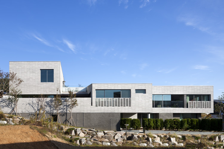
This house is a three-story house with three gardens, designed as a dwelling for three generations. The site runs along the range of a small, densely wooded hill. This small hill became the most crucial element when determining the layout of the house. The house was aligned with the shape of the site and placed parallel to the axis toward the hill, in order to draw the hill’s natural flow into the house. Moreover, the end of the sight line, which binds the long-lined spaces together, was always directed toward the hill.


Spaces that are divided into few parts here overlap, going beyond the simple boundary between the interior and exterior, but they never block the view of each other. The definition of the three gardens in this house is quite flexible: including a yard with granite stone inside the main gate, a soil cement yard in front of the guest room, and a green yard in front of the dining room, as well as a dirt yard for children, a grass yard for adults, and a vegetable garden for the lady of the house. Sometimes they are simply defined as yards on the first, second, and third floors. Based on the needs, they become yards, gardens, passageways.

Not fancy, nor simple
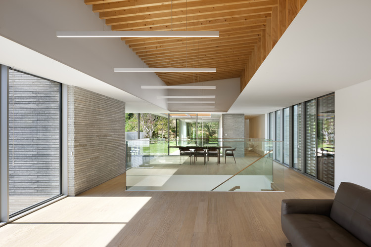
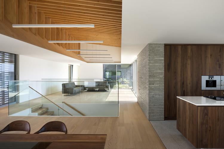
The building is mostly finished with a lithin coat on the stone and long, light grey concrete bricks. Phosphate panels in-between connect and separate stones and bricks, filling the empty space of the façade. The long wall – which could easily be seen as a barrier when viewed from the road – has been segmented into similar colored materials of different textures, blurring the sense of scale.


The neighbors’ gaze is not fixed on the building. On the inside, the wooden structure – which is placed on top of the reinforced concrete structure – is directly exposed to the ceiling, as revealed through the window. As a result, the building is a light gray tone overall, but it does not seem too dark or too bright due to the addition of warm wooden materials and dimmed lighting. The house is not fancy nor simple, just as the client desired.


