-
Architects: Estudio Astiz
- Area: 35 m²
- Year: 2017
-
Photographs:Fernando Alda
-
Manufacturers: JUNG, Azulejos Peña, Años Luz, Cassina, Vitra

Text description provided by the architects. Along the years many high standing residences of the XIXth Century expansion of Madrid have been modified to convert some rooms with little use into independent small apartments with minimal surface and optimum situation. In this case, it is a 35 m2 wine cellars which were adjacent to the kitchen of one of these residences. We are convinced that a small apartment cannot be a reduced large apartment since the scaling would always remind us that it is not what we would want it to be, the lost dimensions, the complex of inferiority with respect to a “real apartment”. As mentioned before, the apartment has 35 m2 (actually 30 m2 after taking into account the corridor).

The 30 m2 are a large surface for a living room, excessive for a bedroom and unbelievable for a kitchen. They may be considered a luxury since they are very unusual for such purposes. Then we reached the conclusion that the basic working modulus, the minimum common denominator, should be the complete surface, the 30 m2 which can be compared to other larger apartments with pride. 30 m2 for a living room, 30 m2 for a bedroom, 30 m2 for a kitchen, 30 m2 for a bathroom, 30 m2 for a dressing room, or 30 m2 for a dancing room, a movie room or a playing room… 30 m2 for 30 diverse uses, an apartment of 30 times 30 m2, the world inside a bottle. Ultimately, the goal is to recover the initial void, the concept of a unique room and to understand that a very small apartment may be a very large suite.


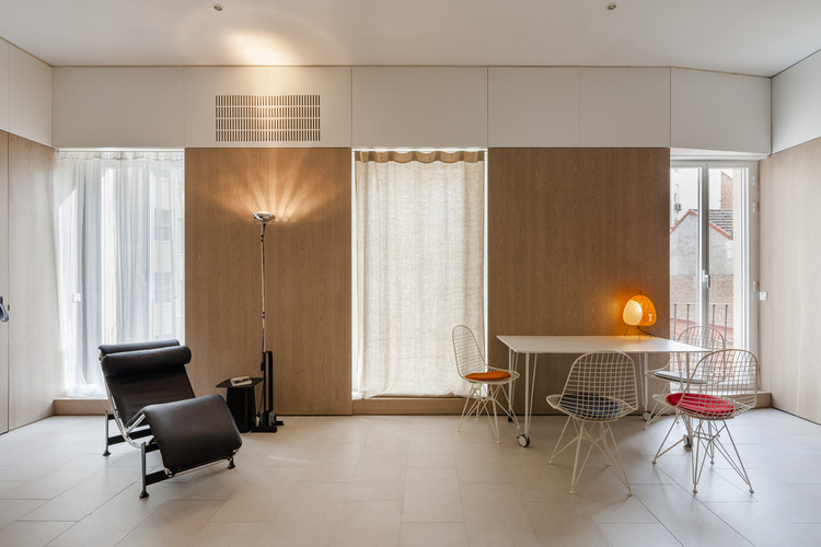
This “tabula rasa” has obvious immediate benefits since it recovers an ordered and coherent space, very frequent in Madrid with three narrow balconies, regularly spaced, Nevertheless, the void may be “qualified” by including service spaces to complement and to allow the usual domestic tasks. These service elements, such as lockers, kitchen, fold-away bed, closet, shower or bathroom, bookshelves, curtains or heaters shall be located strategically and orderly along the contour of the room by playing with the different thickness of the walls and building a uniform surface by means of wood panels to unify the whole utilities in a single space.

This concept of perimeter server space, or packed space, is known since the XVIIIth Century as “poché” and it is the same which is used by the automobile industry (at a different scale) to locate the engine, the trunk, the glove box or the cabin instruments. The resulting space is what we will call the “technified void”. It is an abstract void in which even the handles will be reduced to simple leather bands to avoid giving hints about the function of every one of these panels.
A residence kept in the wall and a space to dance… the best home in the world!


