-
Architects: TACK architects
- Area: 5568 ft²
- Year: 2013
-
Photographs:Tom Kessler
-
Manufacturers: AGC, Armstrong Ceilings, CB, EFCO, Lithonia Lighting
-
Lead Architects: Jeff Dolezal, Rebecca Harding, Chris Houston

“Funky, fun, hip, and a rad space.” That’s what the client, a young website and branding company, asked for. They needed a combination of open work areas, collaboration spaces, enclosed offices, and conferencing space. The typical office layout features a grid of cubicles surrounded by private management offices. This floor plan layout emphasizes collaboration and active workspaces, so employees are constantly drawn to what’s going on around them.


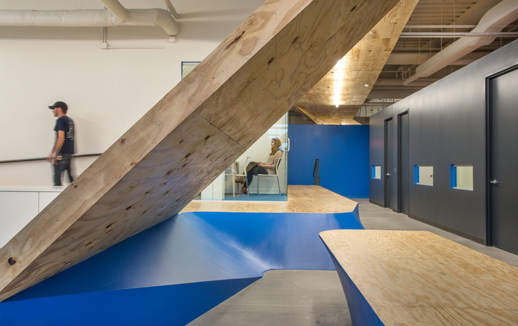
The obtuse angles form an ‘armature’ as a design feature that organizes the space into clusters while creating a way-finding element through the space. Through iterative concept sketches, the ‘armature’ became an angled steel structure that is clad in plywood to appear as a folding ceiling plane. The organizational plane strategically touches down to denote collaboration spaces. Additionally, it defines the open work areas and carries you through the space. The ‘armature’ provides seating for users, as well as a ramp and stairs for the raised conference room.


The use of bold color assists in the playful nature of the space, as well as reinforcing the client’s brand and culture. Floor-to-ceiling whiteboards activate collaboration and allow employees to sketch thoughts on the board throughout the day. The incorporation of a garage door allows the company direct access to Aksarben Village’s live-work amenities and Omaha’s fastest growing neighborhoods.


