-
Interior Designers: Zones Design
- Area: 350 m²
- Year: 2018
-
Photographs:Hui Wang
-
Manufacturers: LG-nw100

Text description provided by the architects. ZONES DESIGN recently completed the design of its new office space. The project is located in the Creative World Park of Hongshan District in Wuhan City. The space of 6.5 meters is divided into upper and lower layers by means of slitting and reorganization, and the parts are made overhead. Overhanging treatment. ZONES DESIGN has always hoped to capture the hidden design logic in space by adopting a simple and effective design method to enhance the spatial level while adding a unique design perspective.

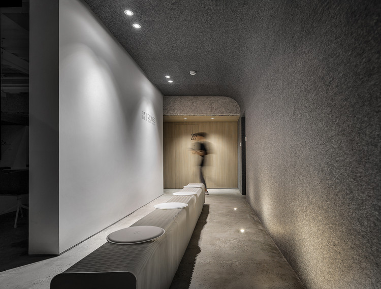
Use the arch to create a sculptural streamlined body that makes the interior look pure and powerful, inspiring visitors.The perception and resonance of space. The office area and the entrance area are effectively separated by a partition at the entrance, allowing visitors to There is a transition here, and the two areas are undisturbed and the moving lines are smoother.

The retractable paper chair at the entrance can be changed in different forms, making the space here more flexible and interesting, while reflecting the vertical stretch of the space.


By adding some simple rules of operation, the internal space is further separated or overlapped, and the space of different heights is continuously continued on the basis of maintaining the functional volume partition. The spatial volume and frame structure bring a variety of interesting spaces and unexpected spatial continuity to the office, creating a unique structure.

The curved shape of the spiral staircase echoes the arched wall shape. The exposed beam structure brings a simple temperament to the whole space. The surface is transformed from the ground to the sky, and the surface is covered with fiber material, which can not only reduce The noise transmission achieves the sound absorption effect, which enhances the purity of the space atmosphere.


The simple white wall is matched with the gray felt wall, and the three-dimensional effect of the space and the style that symbolizes simplicity and freedom are interpreted incisively. The original wood-like walls and door panels are used on some of the materials, as well as the simple furniture selection, making the interior natural and eye-catching. Surface modeling of different materials enriches the level of space

By inserting a curved staircase between the beam and the groove of the wall, it can be used as a "link" for connecting the upper and lower spaces, or even as a white body to "accommodate" the background color of the wall. In the middle, a rich spatial effect is formed


