-
Architects: United Design U10 Atelier
- Area: 3800 m²
- Year: 2016
-
Photographs:Guangyuan Zhang, Daqian Yin

Text description provided by the architects. Located in Chaoyang District, Beijing, the hospital affiliated with Beijing University of Technology is a building with a height of 22m and a total construction area of 3,800m2, adjacent to the South Side of East 4th Ring Road, lying at the north entrance of the campus.

It was a building in the 1990s without reasonable planning for the ground floor, leading the north entrance of the campus into chaos day by day, the original granitic plaster façade heavily exfoliated, outdoor units of air conditioners and related wires cluttered by irregular disassembling and installing again and again. In addition, the hospital sits on the boundary between the campus and the city street. The boundary zone needs to be improved to create a brand new public space for hospital staff, teachers, students, and the public to enjoy interactive communications together. Hence, two main tasks are included in this project: to reconstruct the façade and to redesign the boundary zone.

Design Concept
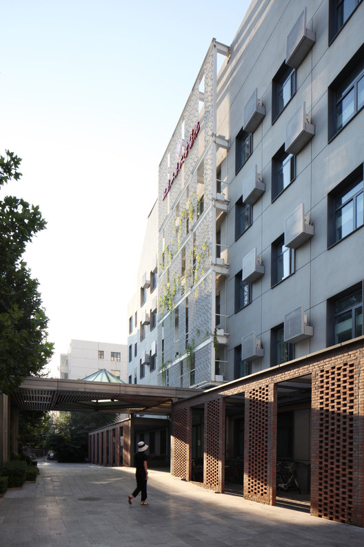
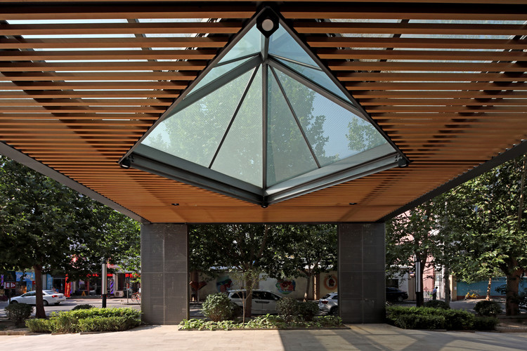
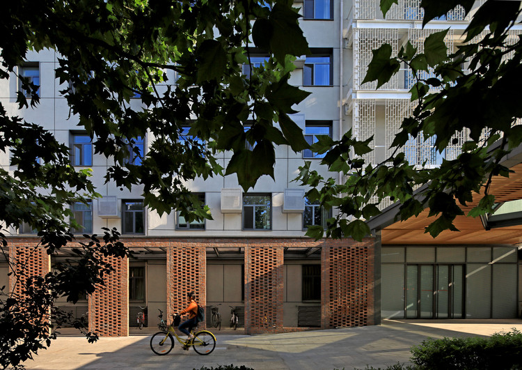
The design begins with thinking about the boundary improving. Conflicts among people on the boundary from the hospital, the campus and the city street should be resolved by the design of following three hierarchical spaces. As the outer part, the main awning of the building built on a mini ramp plaza faces the city street to play a role of transition. Integrated with the ground floor space, the existing parking area for bicycles is designed as the middle part to be a lattice red brick corridor, so as to ease the problem of untidy bicycle parking.

The corridor, including the main entrance to the hospital, also acts as a transition between its outdoor and indoor spaces. The façade, dotting designed and landscaped by vertical greening, is built to be the inner part of three hierarchical spaces to enhance the appearance of the hospital, and to improve the environmental quality in the boundary zone.

The three hierarchical spaces are reconstructed with different expressions due to the use of different materials and colors. The space penetration from the outside to the inside is practiced by dark grey cross-punched steel plates, lattice red bricks, gray tension meshes, white planting steel meshes and silver-gray perforated aluminum plates.

The design of three hierarchical spaces is followed by further detailed designs for the problems existing in the building itself. It is vitally important to get the strong polluted existing façade refurbished at first by spraying granite-like coating on the old finish instead of by directly scouring with hydraulic giant to avoid the original keeping exfoliated. On this basis, dark grey outer window grill design is introduced, integrated with perforated air conditioning panels to create a dotting-like façade.

A sunshade system is set at the new southern entrance to ease large-scale insolation, and a light-steel awning and aluminum grilles are built with the original heavy concrete structure removed. An auxiliary entrance is built on the west by the tension mesh half-occluding the line of sight and simultaneously enclosing a space to enlarge the original relatively small entrance space facing the garbage station.

On the northern façade, a white steel screened vertical greening system is introduced, easy to be planted, irrigated and maintained. The lattice red brick corridor is built with single-layer masonry, the bricks closely combined with the steel structure to ensure both architectural beauty and load-bearing factors in a single-layer space.


