-
Architects: China Architecture Design & Research Group: Land-Based Rationalism D-R-C \ United Design U10 Atelier, China Architecture Design & Research Group
- Area: 108500 m²
- Year: 2017
-
Photographs:Guangyuan Zhang
-
Manufacturers: BC Stone, SYP
-
Lead Architects: Kai Cui, Haiwei Yu

Text description provided by the architects. Shenzhen Branch Office Building of China Merchants Bank is another important project to have the corporate image well shown in Shenzhen after its Head Office Building Completion. It was designed by China Architecture Design & Research Group who won the design competition in 2007 and was completed in 2017.

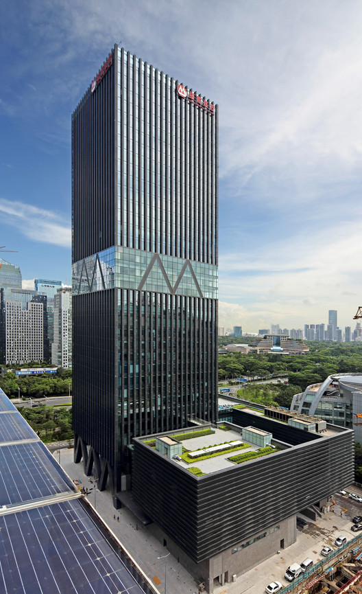
Adjacent to Shenzhen Stock Exchange (SZSE) on the east and to Shenzhen Media Group on the west, the project site is well located in the CBD on the north of Shennan Avenue in Futian District, Shenzhen with about 100,000m2 built-up area, and the main building with its super height of 160m. It is designed by focusing on the continuity of existing urban public space and the identification of the building itself, to create an iconic image for the Branch in this CBD and well integrate with SZSE on its east. Meanwhile, landscape, natural lighting and ventilation are needed elements in the design for its function of office space.

Nevertheless, the effective public space is unavailable by setback lining for extremely tight property providing and complicated functions of the site. The design lays out the property line and tears the property apart to form a cross-shaped public space axis, so as to echo with existing urban space from all directions. The complicated functions in need are embedded into relatively independent blocks of the site.


Structure-conversional columns are designed as “M” shape at the bottom and middle of the building to echo with the LOGO of the Bank visually and functionally. A brand new landmark is built up in the CBD by this ingenious architectural design to well integrate with the eye-catching huge podium of SZSE on the east, and the commercial culture and corporate strength of the Bank is also well expressed and highlighted.

The facade is lined by cylindrical structure units made of dark gray perforated aluminum panels, inside of which are hidden openable aluminum sashes with the width of 600mm to ensure both natural lighting and comfortable ventilation, in order to avoid direct sunlight, reduce energy consumption and improve indoor lighting environment.

Lighting design for the main facade integrates with cylindrical structure units. The LED lighting is reflected through perforated panels to highlight the “M” LOGO at the middle of façade, the corporate image and vitality dynamically presented. Lighting on the ground floor façade is designed to visually emphasize the special M-shaped supporting columns, creating rich architectural layering and an attractive night view with permeable interior lighting from the lobby and atrium.


