-
Architects: aoa architects
- Area: 485 m²
- Year: 2017
-
Photographs:Hyosook Chin
-
Manufacturers: Luxmall, REHAU, Sto Limited
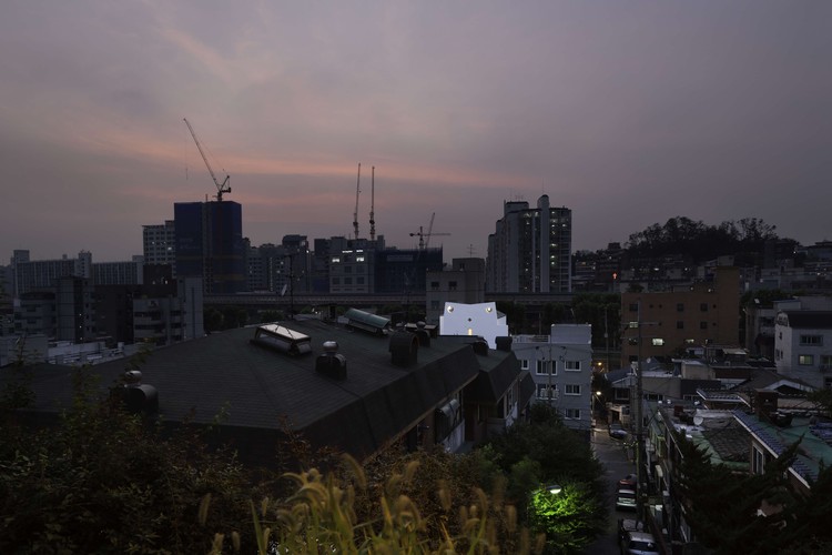
Text description provided by the architects. Since the site was located at the end of a dead-end street and surrounded all over by buildings, it needed something that allows the building to be recognized at least from the main road. As shown in a typical Seoul neighborhood, Seongsan-dong is also full of irregular buildings by unknown developers and local builders, so if one elevation of the building becomes one large flat surface, it could not only highlight the presence of the building giving it a unique impression, but also be helpful to promote sale of units. Since the land owner was also a typical local developer, he undoubtedly demanded a unit-configuration that would maximize profits for the given conditions. Attempt to squeeze in a maximum number of units given the floor area ratio resulted in somewhat uneven floor plans, and the building section also had to be in accordance with the lines of the setback regulation of solar access right. This results in the typical consequence of the ‘economic necessity’ to accommodate as many units as possible in a relatively small plot and the complicated “auto-generative mechanism” created by the setback lines of building regulation which are inherent in many medium-size residential buildings in Seoul.
If this mass of capital and functions generated by the structure of the Korean real estate market coexist with the large flat surface reacting to the surrounding, it could be interpreted that the building, like a man wearing a mask to conceal his face, wears a mask to veil a heap of greed behind. The flat surface seen on the road becomes an exaggerated free-standing wall, thereby becoming a kind of ‘decorated shed’ which denied the proposition of modernism ‘form follows function’ and thus broke the typical cohesion of form and space. Furthermore, the representative building elevation, ‘the facade’ adds some satirical humor by associating certain shape or figure. One day, if a giant cat or owl appears reminding of a scene in a Japanese animation, it will be sure to liven up the neighborhood adding fun and pleasure.
While the ground floor is reserved for parking, the upper floors consist of 13 units in total: 4 units each on the 2nd and 3rd floor, 2 units with terraces on the 4th and 3 units with attics on the 5th. For privacy and convenience, main layout is designed around corridors on the one side of the building. Although each unit is quite small, all rooms are standardized without jagged corners for maximum efficiency and equipped with big windows for openness. The ceiling is left without light fixtures and the door height is slightly reduced than usual to achieve the sense of openness. In consideration of its complex form, the exterior was finished simply with white stucco and partially with blue tiles for concerns of contamination.