- Area: 36000 m²
- Year: 2013
-
Photographs:Lund+Slaatto Architects, Espen Gees, Marte Garmann
-
Manufacturers: ABS Parkettgruppen Norge AS, Bolseth Glass AS, Bosvik AS, Buskerud Spesialinnredning AS, Skanska, Trysil Interiørtre AS
-
Lead Architects: Pål Biørnstad

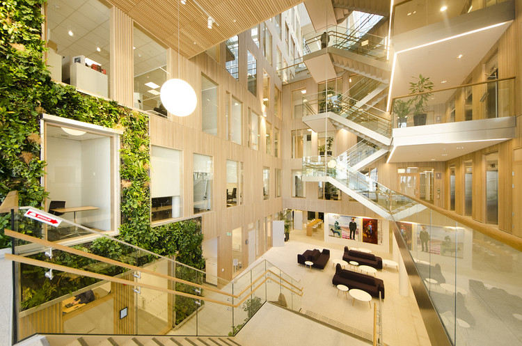
Text description provided by the architects. The award-winning buildings Schweigaardsgate 21 and 23 were designed as one architectural composition. Each of the two building volumes appears as almost perfectly cubic shapes. Within each there is a glazed atrium that provides daylight into the office floors. The office plans are mainly based on a U-shape, where the central atrium opens towards the main road on the lower floors, and then as on ascends up the space rotates incrementally toward the opposite direction and the view out over the main railway station to the south. The two buildings were given distinct characters in the facade cladding. Both buildings are clad in granite, but on S21 the stone is light grey, while on S23 it is almost black. The internal facades in the atrium are clad in oak, and the warm timber surfaces together with the characteristic daylight have created spaces that give strong experiential associations to Norwegian nature.

The primary challenge of this double project was the high density required for such a tight site limited by the urban structure and the planning limitations restricting the building height. Our goal was to combine the tight, external physical framework with a sequence of more varied internal spaces. The buildings appear from the street as two precise urban volumes, but both buildings contain a complex central atrium that steps gradually up from the entrance to a public canteen on the fifth floor. This intricate sequence of intimate spaces evokes an atmosphere reminiscent of a typical Norwegian forest landscape with its hilly terrain and complex vegetation.


The exterior of both volumes relate in their solidity and cubic form to the project's hard urban context, with a materiality consisting mainly of natural stone and glass. The two buildings share the same facade concept but are given opposite coloration: one is bright (almost white) and the other dark (almost black), as two complementary "sibling-buildings". In each of the two primary volumes the "carved" central space constitutes an inner lining of contrasting materiality. Here the floors, walls and ceiling surfaces consist of oak panelling, which creates an internal world that is intimate and warm.
The project won the Norwegian Award for Building Design in 2014 and was the first commercial building in Norway to be certified with BREEAM-NOR "Excellent".


.jpg?1509154831)


