-
Architects: 3rd Skin Architects
- Area: 180 m²
- Year: 2017
-
Photographs:Deed Studio
-
Lead Architects: Samaneh Ghasempour , Amir Ghasempour
-
Lighting: Daya Group, Flos

Text description provided by the architects. Increasing the quality of indoor and outdoor spaces by mixing them together and reinforcing special quality is a result of the main idea of the project. The location of the project has a unique feature, attention to this feature was one of the design priorities. Placement of the project on the last floor of building with having space of the terraces and roof is equivalent to the closed space. The privileged position of the building in terms of its proximity to the urban spaces (Tehran's mosque, Mir-e-Jam Park) was excellent project feature. This position ensures the visibility and urban landscape forever.

This great opportunity is the starting point of Fantoni office design. By extending interior space to the exterior and combining indoor and outdoor spaces we used potentials of the project in case of architecture design. The designing aim of this project is to form a transparent interior space using extensive panorama windows and to expand and intensify interior functions to the exterior via designing and developing the roof as a terrace.

The quality of workspace was the design strategy goal, using of roof space were taken into account to achieve this goal. The definition of the chat and rest space for the office was made possible by considering the capabilities of the project. This increase in quality, which seeks to increase productivity, on the one hand, by assigning roof space to users, and on the other hand, with the connection between the studio and the roof.

Having a practical approach, abstraction and in conclusion, minimalist styles are obvious in both internal and exterior spaces of the project. One way to support this connection is stretching the user’s line of sight and virtually placing them on the roof. In this regard, the project is defined in section, and the idea of the project is emphasized on by extending users' desks outdoors, and even defining the level of green space equal to users' line of sight.

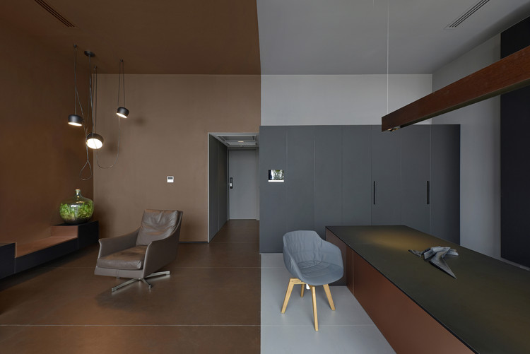
The basic idea in interior design is, defining frames and separating functions by emphasizing on them. Frames are defined in two ways: volumes and in-wall frames. The volumetric spaces are containing intermediary spaces like corridors, waiting room, and etc. in-wall frame description, the frames make access to open space and define an opening.


Green spaces on roof are designed based on some points; the first one is to emphasize on the main Idea of extending indoor space to outdoor one, in accordance with users' line of sight, and the second one is to define some green spots in the outer space in order to create continuous view from interior to roof and from roof to city; the last reason is the fact that green space is like a qualified wall that is able to control adverse factors in some parts of the roof which have inappropriate light or view. By dividing space to 2 different color volume, one as the work area (manager desk and private area) and the other one as seating space with furniture for guests.


