-
Architects: Schwartz and Architecture
- Area: 3500 ft²
- Year: 2016
-
Photographs:Bruce Damonte
-
Manufacturers: Ann Sacks, Floorpros, Haussmann Natural Stone
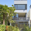
Text description provided by the architects. It is often difficult to create a sense of openness and continuity in multi-level urban homes. By allowing the staircases of this three-story structure the freedom to shift location on each level -- defining a continuous flow of space and movement -- we turn this challenge on its head, elevating the prosaic stairwell into the key architectural and unifying feature of the home.
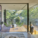
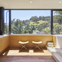
In this four-level project, a series of stairwells take you from the lower garden level to the uppermost roof deck, each treated as a sculptural object and with the interior stairs uniformly clad in rift-cut white oak. On each level we permitted the stair to find its own best location, open to the concept of a vertical path which meanders through the home in a way that is more landscape, less urban.
Although the living spaces are often compressed by the tight urban site, this meandering stairwell unites the home functionally, visually, and spatially, making it feel much larger than it really is.
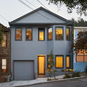
We lifted a diminutive, 850 square foot Queen Anne Victorian and inserted a new garage and ground floor underneath. But our solution was somewhat more radical; given the opportunities of our down-sloping site, we created a two-car garage on a very steep ramp in order to free up the new street-level area for much needed family living space. This logical yet idiosyncratic move set in motion a series of further architectural decisions that define the project.
The hugely over-scaled stadium staircase in the living room actually hides the parking ramp below, creating additional social space for the long and narrow living room. For us, the over-scaled staircase is perhaps "odd" in a positive way; it is clear that there is likely some hidden reason for its being, yet totally unclear that that it results from the prosaic yearning for off-street parking. This stair then became a leitmotif for the entire project.
San Francisco’s dense urban neighborhoods are based on a grid of narrow 25’ wide lots -- conducive to the small defined rooms of a traditional Victorian, but challenging for modern California living with its premium on connection to natural light and the outdoors. With the width of the lots often further reduced with required neighbor setbacks on either side, we understand the imperative to go vertical – here we meet the challenge with a concept that is unusual and ultimately elegant.