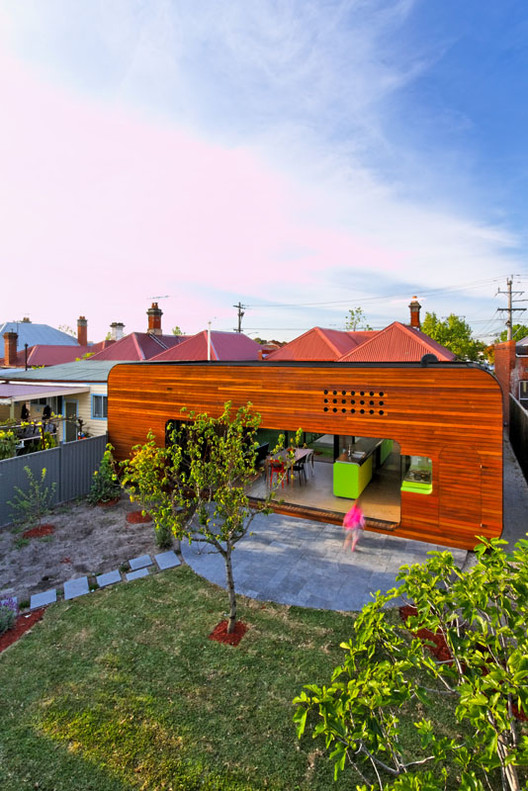
Text description provided by the architects. The approach taken for the Mash House is one which celebrates outdoor space. The original double-fronted Victorian house offered a plethora of challenges including limited solar access. In predictable fashion, services had been attached to the rear of the dwelling over time, effectively dislocating the living areas from the backyard. A belt of space to the east of the house laid bare where a driveway once existed. An old shed, stretching the width of site, sat idly to the rear. These elements combined, meant the overriding feel of the house was one of disconnection.
The design by Andrew Maynard Architects offers a sound, simple solution to a rather challenging site. The concept was driven by obtaining passive efficiency, via shrewd siting and orientation. Quality insulation, ample double-glazing and in-slab heating all combine to make this home a sustainable exercise in modern house renovation. Sketches and photographs of Mash House following the break.
The young family desired, above all, a functional living and kitchen space. Squeezing in an en-suite would be a bonus. Instead of jamming further additions to the back of the house, a glass walkway pulled from the existing dwelling allows a distinct, spatial break between old and new. The residual space is framed as a courtyard, meaning the new living area has direct access to northern light and associated passive solar gain. In place of the old binary layout of external vs internal, the house is now articulated as three masses - the original dwelling, addition and garage, each punctuated by outside space. A blurred line exists not between old and new, but inside and out. The result is a collection of connected spaces, spoilt for light and air.
Beyond siting measures, every effort has been made to minimise the ecological impact of the extension. Where plausible, new materials have been shunned in favour of their reclaimed counterparts. The entire original dwelling has been re-floored in recycled spotted gum. Where the house sees greater light exposure to the rear, a concrete slab works as an oversized thermal sink. Heat absorbed during the day is radiated throughout the night, helping maintain a constant and pleasant temperature. Ample double glazing and quality insulation throughout furthers this effect. Another significant consideration was that of the carbon footprint; demolition was proposed only where necessary and specifically to break open the stifling internalisation present to the rear of the dwelling.
Internally, radiating from the kitchen, the layering of spaces affords great flexibility. With doors fully open, the living space is transformed into a deck between court and backyard. The flow between spaces is palpable, but not without undulation. Walking from entry to exit, the procession is marked by altering moods. The existing hallway terminates in a fully-operable glass link, allowing light to drown the traditionally under-lit corridor. The bulkhead of the linking passage sits lower than the ceiling of the adjacent living space, augmenting the feel of spaciousness once traversed.
The kitchen, prominent in its location, is strategically modest. The clients, both caterers, were adamant that work need not be brought home. Conversely, having resigned to the fact kitchens get messy, the walk in pantry is relatively large in desire of keeping any mess out of sight. Beyond providing plenty of workspace, a lengthy island bench, breaching both original and new spaces, offers a linking element.
The main addition sits as though it was dropped from the sky; whereby the new sits detached from the old, allowing a conversation between masses. The aim is to compliment, not dominate. With three of the four inhabitants female, the form of the building abstractly reflects this. The softened, bevelled edges of the box lend it a softer, more feminine feel. Further to this, the spotted gum cladding of the new placates the robust masonry of the existing. Internally, snippets of primary colour and shapes lend the spaces a subtle yet conscious playfulness.
Flanking the master bedroom, and making good use of the defunct driveway, are en-suite and walk in robe, plugged to the side of the original building. Mimicking the form of the main addition, simply scaled down, these lusciously green pods provide a hint from street level of what lies behind. Inside, the white walls of en-suite and bathroom are splattered with a pattern of red tiles, providing an another unexpected focal point.