-
Architects: Sarsayeh Architectural Office
- Area: 1100 m²
- Year: 2016
-
Photographs:Farshid Nasrabadi
-
Manufacturers: Azarakhsh Brick, Nova, schomens
-
Lead Architect: Behnam Sefidi

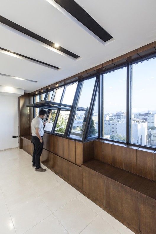
Text description provided by the architects. This project referred to our office when its structure was totally built. And according to client’s demand the ground and basement floor were assigened as commercial spaces and every other levels designed as official saloons with enough flexibility to be divided into different patterns.

After visiting the project site one point attracted all attentions and it was the constant green line of trees across the street that they were hiding the most part of all neighbor buildings façade behind itself. But because of our building extreme height it was appearing as a disharmonious spot across the street and trees were unable to hide its face.

So minimizing this disharmony and adopting our building with its context was the main goal in designing procedure.

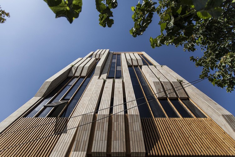
We decided to choose a linear and vertical geometry for the main division of façade as we had this geometry in trees standing across the street. And also we tried to find a way for continuing the greenery of trees on building’s face. After primary division on building facade we assigned some parts as green zones. And by transforming the surfaces to volumes we had some double skin and semi-opened spaces for making greenery in there.

So with this method not only we had many freshness inside, but also the movement of plants toward outside and running on building face could create some relation between building and its context in people minds.

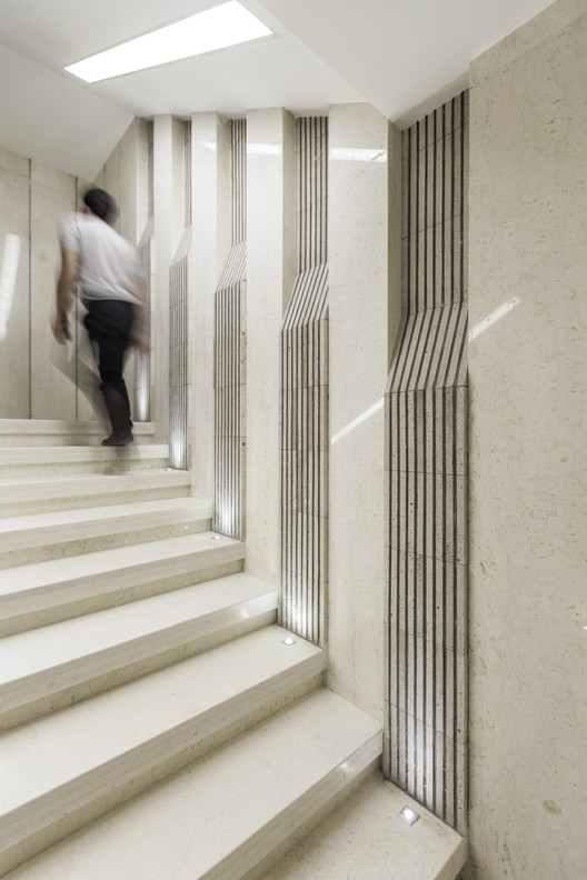
We chose brick as main material because of historical characteristic of our city and we used wood as a complementary for having more harmony with environment.


