-
Architects: Josephine Hurley Architecture
- Area: 300 m²
- Year: 2015
-
Photographs:Tom Ferguson
-
Manufacturers: Forbo Flooring Systems, Centor, Lysaght

Text description provided by the architects. This warehouse conversion is in one of Sydney’s most recognised heritage buildings, the distinctive Edwards & Co. building. The building is wedged into a narrow street in the fast regenerating inner-city suburb of Surry Hills. Formerly a tea factory in the 1920s and more recently an advertising agency, the brief was to breathe new life into the 300-square-metre space as a private residence that spans two levels. Level 6 with the iconic arched windows was completely gutted and the former caretaker’s office was demolished and replaced with a guest retreat on the roof, located behind the emblazoned parapet.
The client brief focused heavily on the notions of comfort, practicality and respect for the building. The client, an architect-turned-talented-musician wanted the architecture to be a backdrop that would facilitate everyday living and transform depending who was there. The concept employs a collection of restrained and understated installations that uncovered, retained and celebrated the existing heritage fabric of the building.


The site had very difficult access with the rear lane too narrow for a crane and the heritage significance meant that craning over the front facade was out of the question. The builder designed a custom pulley system and all building materials were slowly pulled up to the roof deck.

The building is culturally significant and the project facilitated the upgrade of building services and modernisation of facilities so that the building can continue to contribute to the city’s building fabric for generations to come.

The existing column and beam system allowed for a degree of flexibility in planning, however the warehouse had very few service risers. In order to retain the existing concrete slab and beam ceiling system the floor surface was stepped and manipulated so that services could be installed. An elaborate acoustic system was employed in the flooring design so that the client could pursue her love for music without disturbing the other occupants of the building.

Spatially the plan works hard. Spaces double-up on functions, such as the lift-well wall supports bikes, the entry channel of marmoleum defines the circulation and is also an art area. Lines between functions are blurred with baths entering bedrooms. There are no residual areas, however great care was taken to not over-design the interiors.


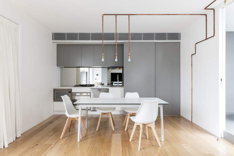
A refined and highly-considered minimal material palette of warm grey, timber and smooth white integrated surfaces was chosen for its cost-effectiveness, but also for durability and practicality.

The project is not only sustainable, it’s recycled and it’s full of charm and character. The warehouse is embraced and the conversion lets the layers of history enrich the interiors. The finished apartment is calm, livable and welcoming.


